Tuesday, March 30, 2010

Kilauea Color Scheme


I kept thinking about Kristin's color palette thinking of how familiar it seemed to me. Then I realized it was my Scorched Earth piece. Maybe I will just shrink it down to 12 X 12!!

Monday, March 29, 2010

Ready to start

Today I printed some fabrics, and I think I'm almost ready to start sewing this Kilauea quilt.

Countdown for Australasian Quilt Convention

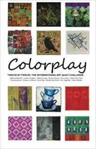
It's only a month until the premiere exhibition by the Twelve by Twelve Collaborative Art Quilt Project. Lark Books have completed photography of our quilts for our forthcoming book and the quilts are winging their way down under. All 144 quilts from the first Theme Series will be on exhibition at the Australasian Quilt Convention in Melbourne from 29 April to 2 May and Kirsty and I will be there too. Don't miss our floortalk at 1pm on Satuday, 1 May!

Here's a sneak preview of the special set of 13 postcards that will be available for sale at the Australasian Quilt Convention and the Textile Art Festival in Brisbane (25-27 June 2010). I picked up the postcards from the printer today and they look super!  At this stage, the postcards are only available to personal shoppers at Pompom Rouge in Townsville and at these two Australian exhibitions but we will review these arrangements as our international exhibition tour develops.

Sunday, March 28, 2010

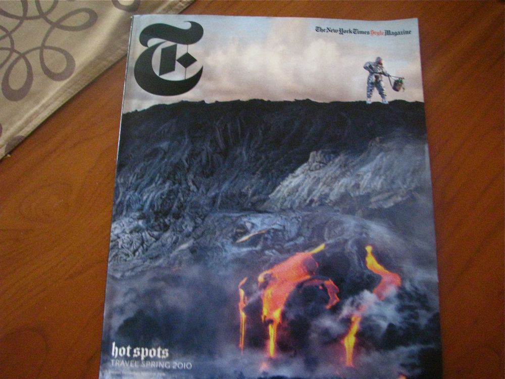
New York Times Inspiration


Look at what the New York Times has in the travel mag today. Hawaiian volcano pics. It is part of a fashion spread with accessories photographed in wild nature scenes. I love the Naughty by Nature title.


I am very taken by the sensuous curves and molding of the lava.

Thursday, March 25, 2010

Continuing the Quest for Lava

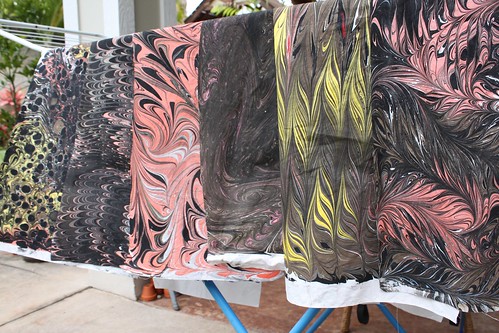
After teaching a fabric marbling workshop, I was inspired to make lava-like fabric. I really liked the way such a classic surface design technique, usually associated with foliage and feathers, also worked so well to convey molten rock. However, I felt like my colors weren't hot enough.

The next step was to over-dye the fabric with an intense red. Unfortunately, the red turned out more bloody than lava-like, and the intensity of the marbling paints wore off in the wash-out (though it still looks pretty rich in my photo). Gerrie suggested that I try discharging the fabric to see what happens, so I did. I used Jaquard Discharge Paste, which works nearly as well as bleach on hand dyed fabrics and is a bit less toxic. I slopped it around on some of the dyed marbled fabrics. It definitely lightened things up, but the results look more worn and scuffed to me than hot and molten.


I think this photo shows better how the black paint has faded than the pre-discharge photos do. What it also shows is a few pieces of very hot orange fabric from my quilt mom Gerrie, which I think are great candidates for more marbling. I also have an interesting piece of orange flowered fabric from blog friend Mary that's been twisted and dyed black, which has some lava potential as well.


For me, this challenge is less about producing an image that says Kilauea, than about having found an interesting and appropriate surface design technique (marbling) and working with it until I get the results I really, really want. This has become a great experiment. I could have stopped with the first marbled fabrics and used them, but they didn't feel quite right. I could have used the red dyed ones, or given up completely, but my curiosity was sparked. I probably ruined the fabrics with the discharging, but how would I have known if I didn't try? I may use a few tiny bits of these fabrics, but I am inspired to keep attempting other things until I get the finished result I can see in my head.

I'm pretty sure that marbling on orange will get me the colors I envision, but I'm not wild about how the marbling paint behaves after washing. I have marbled with paint which gives great control, and I have dyed with fiber reactive dyes which give good color and hand, so now I am keen to see if I can combine the best of both worlds and try marbling with fiber reactive dyes next. I've queried the dye and marbling source, Dharma Trading Company and though they had no formulas for me, they did think I was on the right track.

Monday, March 22, 2010

A Quarter of Twelve

Karen, Gerrie and I met last night in South San Francisco for dinner!  Gerrie and Karen were attending the SDA/SAQA conference, and even though I wasn't, I took the opportunity to drive down and get a few hours with them.  They'd spent the day touring artist studios and they were glowing with excitement and inspiration.  So we headed out to a local italian restaurant, ordered a bottle of wine, and had a lovely dinner and long chat.

Not one of us remembered to take a picture -- that's how engrossed we were!  But we talked art and kids and families, and all sorts of other stuff.  We heard about Karen's construction on her house, and Gerrie's amazing works in progress, and we all agreed that we're finding the Kiluea-inspired colors for our upcoming challenge to be a Challenge indeed!  (But in a good way!)

We marveled at how far we've come as a group, and how we never would have imagined that we'd be where we are as a group.  Of course, we talked about how lucky we feel to be in this with the rest of you twelves.

Wish you could have ALL been there!

Monday, March 15, 2010

Forthcoming Presentations & Floortalks

In just over a month, the Twelve by Twelve exhibition tour will be launched at the Australasian Quilt Convention . Here is advance notice of  some special presentations and floortalks:
  • 9am, Thursday, 29 April 2010 - exhibition floortalk for AQC delegates presented by Brenda;
  • 1pm, Saturday 1 May open floortalk at AQC presented by Brenda and Kirsten;
  • Monday evening, 10 May slideshow presentation at Be Creative by the Sea retreat; and
  • Saturday, 22 May - slideshow presentation to the Quilters Guild of NSW Inc. Visitors welcome! Indeed, you are invited to bring along your own 12x12in quilt to share in a mini-exhibition for the meeting. This can be a quilt already in your collection or you are welcome to follow along with the next Twelve by Twelve Colourplay challenge - Kilauea , a palette inspired by the volcanos of Hawaii.
In addition, there will be floortalks and demonstrations for other events on the Twelve by Twelve exhibition tour. More details to follow.

Saturday, March 13, 2010

Dallas Quilt Show Appearances

I entered my Fractal Tree (from our Mathematics theme) in the Dallas Quilt Celebration last year. One of my local art quilter friends thought it was wonderful, but wondered if it was a bit lost among the larger works. So... she hatched a plan to gather several 12x12 quilts for a special exhibit.

She and the rest of the "twisted stitchers" (our small local art quilt group), made 12x12 quilts and invited other friends to join us. We exhibited 65 quilts! They looked great. I had initially considered inviting all the "twelves" from this group, but I didn't want to flood the exhibit or seem like I was showing off with such a huge group of brilliant friends.

Here you can see two of the three quilts I made for "blue, white and a bit of black" and my pink quilt.
It really was inspiring to see so many quilts in this format!

Tuesday, March 9, 2010

Volcano colors

Last week when I was in Cleveland I went to the wonderful Cleveland Art Museum. Their newest exhibit was actually opening the very day I was there—a collection of American Indian Art from the Thaw collection. It is an extraordinary show, very diverse. In the very last room this Seminole patchwork man's long shirt stopped me in my tracks. First, because I love the look of Seminole piecing and this was such an exquisite example and second, because it immediately reminded me of Kristin's volcano theme palette. Pretty close, eh? It is only lacking a bit of chartreuse, I think.

It has me thinking.

Kilauea?..

I found a few volcano fabrics in my boxes... I think I'm going to overdye some of them before doing anything else.
The only little problem is that if I think of volcanoes, I think of Japan, Mount Fuji and Hokusai. But is it really a problem?

Sunday, March 7, 2010

Lava?


I gave a workshop to my local quilt guild on marbling fabric. We had a great time, and I realized that marbling might be an appropriate technique for my volcano/lava theme! Back at home I tried my hand at lava colored patterns. I love the designs I achieved, but want the color to be a bit deeper and more saturated. I probably should have started with colored fabric instead of bright white, so I am going to work a bit backwards and try dyeing these this week with some fiber reactive dyes. My hope is that the fabric paints on top of the fibers that I did the marbling with will not be affected much and the fiber reactive dyes will seep in underneath to create a richer base. We'll see. It's all part of the experimentation and the search for the right medium for the message.

Wednesday, March 3, 2010

Out of the Blue

The website gallery has been updated to display our latest BlueWhiteBlack Colorplay challenge quilts:

The artist gallery pages have also been expanded.  In addition to the artist galleries from the first Theme Series, you can view the colorplay works as completed by each Twelve so far in the Artist Colorplay Gallery. Use the "Next" and "Previous" buttons to scroll through the relevant gallery. Francoise looks like she is on her way to another cohesive collection!

All these updates involved considerable changes to the navigation menus.  Please contact Brenda if you find a broken link or any other glitches.

Tuesday, March 2, 2010

Our Next Colorplay Theme

If you were expecting a Hawai'i-inspired theme you'd be right. I felt compelled to choose something to reflect my island home, as temporary as it may be.

Our third colorplay theme is called "Kilauea" after Hawai'i's active volcano.


When I think of Kilauea, I think of the blackness of cooled lava, and it's myriad textures, from slow moving undulation, to glassy bits spewn forth, to the bubbly a'a rock formed when hot lava meets cool ocean. I think of red heat, and the red lehua blossom sacred to Pele the volcano goddess and Laka, the goddess of hula. And I think of the chartreuse of the young uluhe fern barely veiled by the sulfur mists of the volcano's steam vents.


This theme could be interpreted as volcano in general, or Kilauea specifically. You can use my photos as inspiration, or work with the palette of red, orange, chartreuse, black and greys. Choose the jumping off point that excites you!

Monday, March 1, 2010

A Feeling for Snow

Growing up in a temperate zone in New Zealand, I did not experience snow until I was ten years old but, when I did, it was magic! 30cm of fresh powder surrounding the volcanoes in the Central Plateau of New Zealand. I remember being surprised at the consistency of snow. I guess I was expecting something more like talculm powder.This quilt is dedicated to my sister Chantel, a snowboarding enthusiast with a great affinity for the snow.  I was inspired by blue and white folk embroidery and Nordic knitwear.  I created my snowflakes with freezer paper scherenschnitte stencils and fabric paints. 
 A Feeling for Snow by Brenda Gael Smith
I chose this piece because its Scandinavian vibe best captured the fresh palette that Francoise presented us with in this challenge but I made two other pieces. 

Ice Crystals (or as my husband calls it, Rabbit Proof Fence in the Moonlight) is hand stitched shibori. And Once in a Blue Moon is the first, somewhat indistinct itajame shibori piece that I made using some new clamps.  It demonstrates that I occasionally depart from abstract piecing to make more representational pieces.  Apparently, there have been three "blue moons" in and around this challenge period.  After this month, the next occurence of two full moons in one month is not until August 2012.

It's often hard to select which piece to declare as my "official" contribution to the Twelve by Twelve project. I'd be interested to know which piece calls to you.

You Know How I Feel


Blue and white with a bit of black.  Well, to me that was sky, of course, with the silhouettes of birds in the distance.   The image came to mind immediately, but it took me a bit longer to decide on how to execute it.

I finally settled on something I've been wanting to try for a long time.  I started with a piece of hand-dyed blue fabric, painted on the birds, and then heavily quilted "wind lines" around them.  Then, using a white oil pastel crayon, I rubbed the crayon over the surface apply white where I wanted it and to emphasize the texture of the quilting lines.  Here's a detail shot:


I really liked the effect, but observed several things I would do differently were I to do this again.  First, and most importantly, I would NOT use a typical oil pastel crayon. I'd use a Shiva Paintstick or a Watercolor crayon.  The soft texture of the oil pastel crayon worked great to apply color, but the surface of this at present has a slightly tacky feel to it.  Maybe it will dry at some point (one friend suggested that oils can take up to 6 months to dry.  Sigh.)  I tried ironing this to set the white marks, but the heat just melted the color into the fibers of the blue cotton and started to vanish.  I had to reapply the white.  So, I'll keep this hanging on my design wall for some time until it feels dry, and THEN try ironing again.  In the meantime, it makes me happy.

Oh, I should mention that this is the first time I've done any piece with half of a binding and half of a turned-back facing.  But this just wanted that, so there you have it.

The title comes from the old Nina Simone song:

"Birds flying high
You know how I feel
Sun in the sky
You know how I feel
Breeze driftin' on by
You know how I feel
It's a new dawn
It's a new day
It's a new life
For me
And I'm feeling good"

* I'm editing this entry to add that Lynn Kough has reminded me that this song actually comes from the musical "Roar of the Greasepaint, Smell of the Crowd" and was written by Anthony Newly and Leslie Bricusse.  Thanks, Lynn!