Showing posts with label Kilauea. Show all posts

Saturday, September 6, 2014

Colourplay Countdown: BWB and Kilauea

Here are three images from my trip so far that fit the BlueWhiteBlack palette.  This is on the Hawkesbury River, part of the scenic train ride from Gosford into Sydney.

On my way to the Colourplay exhibition in France, I am spending some time in the English Midlands, an area well known for its black and white timber-framed houses:
And this vintage textile (circa 1930s?) was in a historic home we visited today:
The Kilauea palette proved to be more challenging.  There is not a lot of orange,charcoal and chartreuse in the English countryside. But then I found a tractor!

Monday, November 14, 2011

Ted's Plate for Me: Slice

 It sounds like my experience was much the same as everyone's elses:  taking delivery of an unexpected and heavy box, wondering WHAT it could possibly be, and then opening it to a jaw-droppingly wonderful piece of glass art by Ted Rips.

Ted chose the quilt I made for the Kilauea color challenge, which I called "Slice." It's one of my favorites of the colorplay set so I was delighted that he picked it.  Here's the actual quilt.  I love love love how Ted got the texture in the colored stripes.


Since receiving it, we've had this in the center of the dining room table where we admire it daily.  It gets lots of rave reviews from visitors, too.  It even coordinated nicely with the Halloween quilt I bring out for the holiday.


To Karen and Ted, this was such a lovely and surprising idea.  Ted, I'm in awe of your artistry in glass and am thrilled to have a piece of your work.
Thank you both so much!

Friday, November 11, 2011

Another Glass Quilt

This is my beautiful plate, made by Karen's husband Ted. Isn't it wonderful? I really love it! It is based on my Kilauea quilt for the colorplay challenge.

I have a little story to tell about mine. The first time I met Karen, a couple years ago, she brought beautiful gifts of Ted's specially designed glass plates to me and Gerrie. Gerrie's was very clearly based on her "mathematics" quilt. It wasn't until later that I realized that mine was based on my "water" quilt. Some designs are clearly much more difficult to render in glass than others. My plate was beautiful, I thought, but not as close a match to the original as Gerrie's. I loved looking at it, displayed on a shelf in my dining room. A couple of months ago a box arrived in the mail with the plate you see above and a short note from Karen. She said Ted had never been happy with the piece he'd made for me and had made another! I was speechless. When the subject of the plates came up in Houston I didn't tell my fellow Twelves that I actually have TWO of Ted's beautiful pieces. I knew they'd be jealous! Now the secret is out. What a very special gift.  And while I still love the first plate, this one just knocks my socks off.

Thanks, Karen and Ted!

Thursday, July 7, 2011

Photo Transfers

THANK YOU to everyone who joined me for my presentation to Canberra Quilters last night. For those that were interested in the photo transfer technique used used on my two quilts  Harakeke#1 and Harakeke#2 made for the Kilauea challenge, here is my blog post all about Photo Transfers with Orange Power.
Harakeke #1  Harakeke #2 by Brenda Gael Smith

Wednesday, November 3, 2010

The Colourway Collection So Far

The Twelve by Twelve website has now been updated to showcase the Rusty Colorplay challenge quilts. In addition to checking out the Artist Colorplay Gallery pages for each Twelve, it is instructive to review the Colorplay mosaics so far as we reach the midpoint in this series:
Pink Colourplay   Blue White Black Colourplay
  Pink                                  BlueWhiteBlack
Kilauea Colourplay  Yellow Purple Colourplay
Kilauea                            PurpleYellow
Lorikeet Colourplay   Rusty Colourplay
Lorikeet                                Rusty

I have found that the inspiration and design process is quite different when a colour or palette is your springboard rather than a theme word. As Diane mentioned in her rusty reveal post, a theme word was useful in narrowing down the options and providing focus.  Fortunately we all revel in colour so this new series is keeping us engaged and challenged.

Wednesday, July 7, 2010

You never know..

where you might find a 12x12 reference! I found this at the roadside fireworks stand while we were visiting Illinois.
I think it's so funny that the packaging really does include Kristin's color palette from our Kilauea challenge: red, orange, chartreuse, black and grays.

In fact, there was a whole box of "volcanic vortex" fireworks, each named for a different volcano. Ultimately, we chose Mt Etna.
When Claire was about three months old, Jeff was on a six-month deployment with the US Navy in Sicily. Baby Claire and I went to visit him and we enjoyed many wonderful Italian adventures including hiking up Mt Etna. (That was before digital cameras, otherwise, I'd include a photo.)

Wednesday, May 5, 2010

Kilauea Colorplay Website Update

The Twelve by Twelve website galleries have been updated to display our latest Colourplay challenge works - Kilauea:
Kilauea Colorplay
It's also interesting to view the individual artist galleries.

With an ever-growing website with numerous cross-links, it is not surprising that I miss things from time to time. Thank you to readers who e-mail me let me know about broken links and other small glitches.

Sunday, May 2, 2010

Kilauea Mosaic

I will be updating the website shortly.  In the meantime, here is the Kilauea mosaic.

Kilauea

Saturday, May 1, 2010

Underground


This was a very challenging color palette for me, and I have to say that I really enjoyed it.  It reminded me of why these are called "challenges!"  Like most of you, I looked at a lot of pictures of volcanoes and of Hawaii in general, seeking inspiration.  But I didn't come across anything that lit the spark, if you know what I mean.

Eventually, I found myself thinking of volcanoes (how could I not, with what has been going on in the news over the past month) and thinking about what is going on underground before a volcano pushes up out of the earth and erupts.  Well, I didn't go do research, or anything --but I found myself remembering how I'd been interested in the cut-away views of things when I was in school, and that formed the seed for this.

My challenge to myself in these Colorplay challenges is to head toward the abstract.  Playing with batiks and the underground layers idea led to this.  In some ways, I'm somewhat embarrassed about presenting it here: it's so simple.  In fact, I tried adding hand stitching, which I ripped out because I didn't like it and it just didn't suit.  I considered other embellishments -- but really, what I like about this is how it emphasizes the patterns of the fabrics.  So, simple as it is, this is my response to the challenge.

And, once again, I'm photographing black and bright colors so the stitching detail doesn't show much.  Here's a detail shot to show the quilting: 


Thanks, Kristin, for this challenging challenge!

***Now that I've posted this, I've gone and looked at the other challenge pieces -- and I'm amazed at how many of us went for linear designs.  I think this may be our most similar bunch of pieces yet, and that is quite unexpected to me.

Harakeke

Harakeke  (commonly known as flax) is a species of lily unique to New Zealand and grows throughout the country. My inspiration came from photos taken by my sister Chantel on one of her many excursions to Tongariro National Park in the centre of the North Island in New Zealand - home to three volcanoes, including the distinctive cone of Mt Ngaruahoe, and skifields.
 

For a fleeting moment, I considered merging the two images to make kind of  a kiwi companion piece to Terry's Mt Hood in Winter but I wasn't sure how I would deal with the designated palette which, after all, is central to the challenge.

Instead, I decided to focus on the flax flowers which incorporated most of the palette.  I stripped out the blue background in Photoshop and manipulated the image to create two sprays  and then tried a variety of commercial products and printing methods to create a viable photo transfer.   I lost count of the duds I made along the way.  Eventually, I decided to try the Citrasolv method and refreshed my hazy understanding of the technique by reading the tutorial on Lisa's blog - Something About Nothing.  Magic - it worked!  I printed out the colour photos on my laser printer onto white fabric and then painted on a sulphur-coloured chartreuse background before quilting:
Relieved that at least I had something to put forward on reveal day, I still felt an urge to create a second piece.  This time, I used another tool in Photoshop to create a black image which I printed on to some hand-dyed fabric.  I then auditioned the photo transfer piece against some fiery shibori and you see the results above.

I also made a shibori magma piece but have not had a chance to complete the hand-stitching (I don't what I've been doing lately!) and it is not especially photogenic.

Lava flow

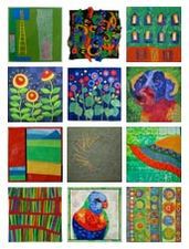
This is my Kilauea quilt.
I first dyed some fabrics in the colours Kristin gave us for her scheme. I then printed them with black paint. On the red and the orange, I did some monotypes that made me think of lava flow. A sort of mountain shape also appeared by itself on the orange fabric. On the chartreuse fabric, I used a thermal screen made from a picture of water reflections. (I had already used that same screen on other fabrics before.)
The piece is mainly machine quilted. Almost no hand work this time.
I've posted more pictures on my blog.

Lava Flowers


This color scheme was somewhat of a struggle for me, for some reason. I took just about the full two months to contemplate this palette. Because Kristin associated the color palette with a volcano, I landed on an idea.

My quilt is a scene from my imagination. It's my own little fantasy world. The flowers are Lava Flowers, Rufus ignis. The red petals mimic oozing lava as it slowly rolls down the hill. The orange stamen mimic spewing hot stuff coming from the top of the volcano. I outline stitched the flowers and flower parts with black thread.

The ground that the flowers grow from is cooled lava. Imagine a flower growing right out of lava.....perhaps it really happens...I don't know as I don't live near a volcano. The ground is made from two shades of gray fabrics. The background in the upper portion is the chartreuse color from Kristin's color palette. I used many different fabrics and created this section in a mosaic collage technique.

Volcanic


This was a tricky palette for me - not a preferred colour scheme at all! But, as usual, with the passage of a little time and the constant mulling that happens inside the head of a Twelve, a plan presented itself.

Although I didn't plan to follow the source of this colour palette so closely, as a New Zealander (and a North Islander at that) I have a sense of connection to volcanoes and I was immediately able to relate the darkest colour to the volcanic scoria rock that is seen in so many New Zealand gardens. The little fern in Kristin's photos wasn't so familiar but there are plenty of other ferns in NZ...

My thoughts were very much about direction - the powerful vertical thrust of the eruptions and the gentle horizontal growth of the ferns.So the quilt has two distinct parts - the Volcano side which is expressed vertically, and the Fern part which sits more quietly to the side and has short horizontals. I pulled a great pile of fabrics from my collection and was ironing them and choosing colours when I realised that the gradated Nancy Crow print was all I needed for the Volcano background. I subscribe to the principle of twenty greens being better than one green, so this is a small departure for me from my usual fabric selection process. It's also as close as I will ever come to bargello. At first I planned lots of small handstitched sparks of bright orange but they would have been superfluous. Instead there are a few couched lines of hand-dyed perle cotton and, on the fern side, a few lines of couched polymide knitting yarn in that fabulous mucus green.

Now that this quilt is done, you know, I actually like it!

Molten Rebirth

I survived the challenge, and a challenge it turned out to be! I jumped out of my comfort zone and enjoyed experimenting. I'm not totally happy with any of my quilts, but I had fun with the process. I couldn't get the imagery of a "volcano" out of my mind, so most of my designs focus on lava flowing through the lush forests of Hawaii. The sharp contrast of the hot lava and the vegetation is amazing. The beautiful islands were formed by what seems so destructive on the personal scale. The heat and fire bring forth new land and life. What a metaphor for so much of our existence.
Here are a few more of my experiments as I tried to capture the contrast of life, destruction and the hope of rebirth:
All the while I was working on the perfect 12x12 quilt design, I really wanted to be working on this piece, a 3D volcano. The theme was just begging to jump off the flat surface. She really needs a lot of embellishment. I am seeing beads and wire and perhaps an explosion of fiber from the top. I will keep you posted on my progress.

Mango

When a new 12x12 theme is announced, I usually ponder the new color palette for quite some time. I just take note of what draws my attention -- if it's a particular composition, technique or material. I try to notice the colors from the palette in my every day life. So when there was a huge bin of mangoes at my grocery store, I was stunned to find all of Kristin's colors in the fruit.
I decided to make my quilt all about the mango and the colors.I actually painted this mango. I was inspired by the class I recently took from Judy Perez. She gave me a bit more confidence with paint and painting techniques. I think it turned out pretty well.
I tried to keep it simple this time around. Just fabric, a bit of surface design, simple embellishments.I didn't use anything that wasn't in the color scheme. (Well, that chunky glass bead is more emerald, than chartreuse. Forgive me.)

This is an unusual group of colors, but I really like it. Working on this project reminded me that if a color scheme appears in nature -- on the skin of a mango or on an island in Hawaii -- it has built-in beauty.

Simply, Kilauea

The first thing that comes to most peoples' minds when thinking about Hawai'i and color would probably be sunsets, blue ocean and white sand, or the floral colors of the ubiquitous lei.

I wanted to push things a little farther for my theme. Hopefully my choice of a volcano for theme has been challenging -- in a good way!

Conceptually, I had decided early on that I would stay abstract and probably work with simple patchwork shapes like squares and half-square triangles. This meant that the fabrics would have to tell a good part of the story. Finding just teh right fabric became the biggest challenge for me this time around.


First, I pulled all my grey, chartreuse, and molten lava colored fabrics out. Perhaps 144 one inch half square triangles would be dynamic -- with one half hot lava colored, the other half cool lava greys and black, with a scattering of ferny green triangles.

Then I taught a fabric marbling class and was pleasantly surprised at how lava-like traditional marbling patterns are! What followed was an odyssey into creating the most lava-like marbled fabric I could (see the whole story on my blog here).


My Kilauea is a simple patchwork of squares that hopefully lets the fabric tell the story of the sparse black landscape of the lava field. Molten lava bubbles below the surface and sometimes oozes forth. The little green checked and velvet triangles edged in french knots represent the leaves of the uhule fern found in and near the steam vents at Kilauea's caldera (crater). A few squares of hawaiian "Aloha" print fabric hint at the volcano's location and echo the movement of the wind above and lava below.

Hot, Hot, Hot


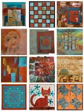
I loved the color palette for this challenge. I decided to use hand-dyed silk for this because I had the reddish orange fabric that was perfect. I had the chartreuse shibori in my stash, also. The other fabrics were dyed or painted. I could never quite get the gray and taupe, from the color palette that Kristin gave us, with dye. I ended up painting the fabric and had much more control. My inspiration was the way lava flows down the volcano in undulating fashion.
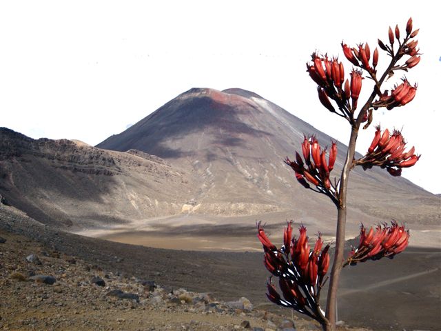


While I was making this, the volcano in Iceland was spouting off. I saw many photos of red hot lava leaping into the air with sparks flying. I decided to make a second piece which I call Red Hot Lava. I used red and orange beads to represent the sparks.


Now, I need help deciding which piece will go into the Twelve X Twelve collection.

Flow

The volcano theme was an opportunity to stretch myself and try some things that have been in the back of my mind. First of all, I had already decided that the next piece, regardless of what the theme was, would be non-representational. I was also wanting to try some work using strong, solid colors, as opposed to my favored prints and to create a very flat, strong design.The colors threw me a bit at first. It is always a little odd to see a palette of colors presented in a block, with each color of equal size. What I always used to teach in my color classes was that the proportion of each color used in a piece is what creates the interest. I had to remind myself of that.

Early in my process, before any real planning was done, I went to Cleveland to tape a TV show and visited the wonderful Cleveland Art Museum, where I saw an exhibit of Native American art and craft. One of the pieces was this Seminole pieced shirt and it immediately struck me as very similar to Kristin's volcanic color scheme. Its strong geometrics and stripes became an inspiration. As I began playing with sketches I began to see concepts that reminded me of geological earth layers and I thought of how molten lava and magma moves beneath the earth and eventually finds its way to the surface as volcanic activity. I also remembered seeing lava formations called "ropey lava" where the molten material had hardened into sinuous strands. This became inspiration for my quilting design.

I had such a good time with this challenge! It pushed me into a direction I have been thinking about for a long while and taught me things about interpreting concrete images into abstract impressions of those images. I also thought it ironic that my last piece, for the blue/white/black challenge was an actual image of one of our local dormant volcanoes, Mt. Hood.