Showing posts with label Pink. Show all posts

Thursday, September 4, 2014

Colourplay Countdown

Today marks the 7th anniversary of the formation of the Twelve by Twelve International Art Quilt Challenge.  Little did we know that our collaborative work would still be on tour in 2014!

Our Colourplay exhibition opens at the European Patchwork Meeting on 18 September and I (Brenda) am travelling to France via England.  One of the things I enjoyed about our challenges was how attuned you would become to the challenge theme or palette.  As a mini-challenge to myself, I am goiing to share travel photos for each of the Colourplay palettes over the couple of weeks in the lead up to exhibition.  First up is Pink (clockwise from top left): pink heather at the markets; wild flowers; pink keg; William Morris wallpaper at Grange Court (Leominster) and sweetpeas (centre):
It may be autumn but there is plenty of pink to be found in the English countryside.  There is even a bright pink pub just a couple of miles from where we are staying!  Blue and white with a dash of black might be more difficult.  Let's see what the day brings...

Wednesday, November 3, 2010

The Colourway Collection So Far

The Twelve by Twelve website has now been updated to showcase the Rusty Colorplay challenge quilts. In addition to checking out the Artist Colorplay Gallery pages for each Twelve, it is instructive to review the Colorplay mosaics so far as we reach the midpoint in this series:
Pink Colourplay   Blue White Black Colourplay
  Pink                                  BlueWhiteBlack
Kilauea Colourplay  Yellow Purple Colourplay
Kilauea                            PurpleYellow
Lorikeet Colourplay   Rusty Colourplay
Lorikeet                                Rusty

I have found that the inspiration and design process is quite different when a colour or palette is your springboard rather than a theme word. As Diane mentioned in her rusty reveal post, a theme word was useful in narrowing down the options and providing focus.  Fortunately we all revel in colour so this new series is keeping us engaged and challenged.

Saturday, March 13, 2010

Dallas Quilt Show Appearances

I entered my Fractal Tree (from our Mathematics theme) in the Dallas Quilt Celebration last year. One of my local art quilter friends thought it was wonderful, but wondered if it was a bit lost among the larger works. So... she hatched a plan to gather several 12x12 quilts for a special exhibit.

She and the rest of the "twisted stitchers" (our small local art quilt group), made 12x12 quilts and invited other friends to join us. We exhibited 65 quilts! They looked great. I had initially considered inviting all the "twelves" from this group, but I didn't want to flood the exhibit or seem like I was showing off with such a huge group of brilliant friends.

Here you can see two of the three quilts I made for "blue, white and a bit of black" and my pink quilt.
It really was inspiring to see so many quilts in this format!

Wednesday, December 16, 2009

Changing Palettes

After weeks of "thinking pink", I was naturally drawn to this unusual anenome at the aquarium at the California Academy of Sciences yesterday:

but I found some blue and white (with a dash of black) jellies too!

Sunday, December 13, 2009

Into the pink

Thanks to free wifi at a neighbourhood cafe, I have been able to update the Twelve by Twelve website gallery to display our pink Colorplay challenge quilts:
Pink Colorplay Gallery
Please e-mail me if you find any broken links or typos and I will fix them up when I next have access to broadband while travelling.

Saturday, December 12, 2009

Pink


This seems to have been The Little Quilt That Didn't Want to Happen!!
You may notice that the photo has a (badly) photoshopped edge simulating a facing? Yes, well, late last night I heard my father's voice saying "Measure twice, cut once". "Yeah, yeah," I replied, "I do know how to use a rotary cutter and ruler, you know". And cut off the seam allowance. My due-to-be-faced quilt will now sport a jaunty binding when I regain my composure. In the meantime it is having to settle for a clean-up in photoshop.


I decided at the beginning of this round that I would learn from my lessons of last round.
Point 1 : no last minute rush jobs. Time to stop kidding myself that I work best under pressure. No, I don't. I just settle for less.
Point 2: no trying to be clever, fraught with meaning and significance. Just have fun.


How did I go with the Pink quilt? Point 1. FAIL FAIL FAIL. Point 2. MASSIVE SUCCESS!!!
It means NOTHING! There is NO significance!! I'm so proud.


Seriously, I did make a personal commitment that this time I would continue with my original Twelve by Twelve plan to just have fun. I intend to relish this experience a whole lot more than I perhaps did last time and to use it as a bit of relaxation time. Life has managed to become even busier this year and a regular reason to quieten things down is a very good thing.

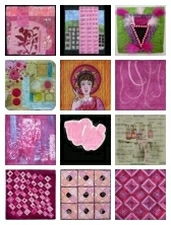
I should probably talk about the quilt? I have a strong love of contrast in all forms but especially in colour and I immediately knew that my quilt would feature the use of pink and her complement, green. As you can see, I'm not ready to leave circles behind, either. I started with circles of pink that I appliqued to the green background fabrics, then I cut them up and sewed them together in a piecemeal fashion. The hand embroidery was especially enjoyable (partly because it made me sit on the sofa for a while!!) and I thought of Jude Hill and her wonderful spontaneous stitching as I wandered my needle hither and yon.

The placement of the circles was a bug bear from very early on in the piece because my chosen construction technique limited their positioning and I still don't like where they ended up. I tried to redress things a bit with the darker pieces of teal, but they definitely don't work for me. If I had my act together and this was a Study instead of my final piece (which it truthfully should be) I would reposition those circles. But, in the Spirit of Fun and Relaxation and Letting Go, I smattered some buttons and knots and said to myself, "Live with it, kid. Do better next time."

This quilt has genuinely taught me a lot. I feel a series coming on... or at the very least, more small abstract quilts. I'm happy to keep making quilts that, even if they don't quite work, teach me something and make my heart beat faster.

AIDS is not just a Pink issue

As we reached the start of our new round of 12 challenges I paused to take stock of which of the myriad of tempting projects on my wish list I was realistically going to be able to achieve over the next year or two and to think about the direction in which I wanted my textile art and quilting to go. Of course, planning and reflecting do not always mean the end result is the same as the projection - I had no idea I was capable of what I did in the last round of challenges when I joined this group. But with our three months round the world trip, new work challenges and a new Twelve by Twelve series all coming up together, it seemed a good idea to consolidate and try and focus a bit.

So, I thought and pondered and drew spider charts and wrote lists and still had too many ideas/projects and too little time. And I still, if the truth be known, was a little under-stimulated with the simple idea of one colour as a theme compared to the concept themes we had been working on. So I decided to combine three goals of mine into one:
1. To participate in Twelve by Twelve
2. To focus more on translating inspirations from other cultures, particularly African into my own work and
3. To continue to develop the social issue commentary that surprised me by coming out naturally in my earlier Twelve by Twelve work.

So, for pink, I started to look for inspiration by googling 'pink Africa'. I very soon found this fabulous bamileke headdress. ( Thanks to Africa Direct for permission to re-post the photo from their shop). I was instantly inspired which is just as well as I had only a few days to create this before we left the country.


I combined this African inspiration source with the initial musings I had with the association of pink with gay issues and of gay issues with the AIDS epidemic, particularly in the 1980's. Of course, AIDS is no longer a gay only issue ( if indeed it ever was).

At the end of 2008 22.4 million adults were living with AIDS in sub-Saharan Africa. Around 14.1 million children are AIDS orphans. Anti-retro viral drugs are not always readily available. there are issues of pricing, of distribution, of concepts of time and lack of wrist watches ( the drugs need to be taken at regular intervals), of the regular nutritious meals that need to accompany the medication and of a shortage of health care workers caused by the disease itself and the temptations of emigration.

This quilt is made with pink striped fabric sources from The African Fabric shop and originating from West Africa. I have used the pink triangle symbol often associated with the gay rights movement but inverted to its original orientation when used as a marker for homosexuals in Nazi Concentration camps. Its original symbol of potential death is further alluded to by the addition of a black triangle. I hope that the whole looks like a version of an African shield, which is what the drugs would provide against the devastating physical and societal effects of this disease.

The embellishments are not beads but pink pills as a comment on the fact that medication in Europe is so cheap it can be used as a play thing - but in Africa only 42% of people who need anti-retro virals get them. They are slippy little beggars and so they are glued on and then a cradle of stitches added. The green silk background, which is seed stitch quilted, symbolises the new lease of life drugs can give. Although the photo may not reveal it well, the black triangle is textured to mimic the inspiration piece by machining diagonal strips of black knitting tape onto black fabric.

If this topic interests you you may want to look at the quilts and website of Mary Fisher who is a UN AIDS ambassador. She has quilts also with messages on this topic but done so much better than I achieved in a hurried few days - I do not think this is my best Twelve quilt.

Petal Pink


Flowers! One of my most favorite things. I love including flowers in my art. Since pink is a common flower color, I decided to create a flower quilt. I’ve seen other quilts made in a similar fashion where the blocks are created, cut up and then the block parts are swapped around to create new blocks. I wanted to do that with my pink flowers.

When we first decided to create a round of quilts with colors for the theme, I entertained thoughts of creating abstract quilts. I seem to struggle with abstract designs more than figurative quilts. But for some reason I couldn’t bring myself to create a pink abstract quilt. I have no idea why.

I’m not afraid of pink or find it a color that I don’t like, so I don’t have any problems with using this color in my work. The first image I envisioned for a pink quilt was a big eyeball all in pink, to represent pink eye. The day that Diane announced the color for our first round, was the day after my husband came home from work and said a worker on the job has pink eye. Eeeek! I like flowers much more!

Whimsy in Pink


I hope you've all enjoyed this Pink challenge as much as I have. I'm excited that we're launching a whole new set of "Colorplay" challenges -- I wonder if it was easier or harder that the theme this time was stated in one simple word? I know the color pink proved difficult (and even unpleasant) for a few of you, and I appreciate your moving forward and working with the theme anyway. That's why they call these "challenges," right?! (Hmm, just gets me thinking -- I wonder if there's a way to "illustrate" a color without using that color?)

Anyway. My personal challenge to myself is to try to stay away from literal or representational
responses in these challenges -- that's the first place my mind goes and it's hard for me to go anywhere abstract. I'm thinking that these color challenges will be a good exercise for me and I plan to force myself to do abstract responses. We'll see how that goes.

With that in mind, I set out to create something that illustrated the feelings I think pink evokes for me. I thought about softness -- no straight lines, no angles, just curves and flow. I wanted to try to convey a sense of happy whimsy, something that made me smile without thinking about why. I sketched lots of lines, and ended up with this. I never specifically thought about "ribbons" and once I got this together, it reminded me of strands of girls' hair. So there is a sense of femininity about this, which seems fitting.

My original plan was to applique the two curls (in commercial fabrics) and have the others just indicated by stitching lines. I actually did a bit of trapunto by putting double layers of batting behind the strands but not the backgrounds -- it's not really evidence in the photo but adds some slight dimension in person. However (maybe because of the mottled background?) the curls that were only defined by stitching just didn't stand out very well. Out came my trusty Neocolor crayons, and I gave them more definition.

I auditioned lots of quilting lines, and ultimately went for the overall curly look.


I am exercising great restraint, writing this up before looking at the pieces that have already been posted. I can't wait to see what you all have done!

Pretty In Pink


When Diane first picked this color to play with, I groaned a little at the thought as I don't tend to use pink much in my work. I was, however, able to overcome my despair, and turn it into an opportunity to explore something I wouldn't ordinarily have done.  I rarely wear pink, I do however sometimes choose pink for my nail polish color.  Last time I had a pedicure I started looking at the bottles of polish and saw all the cute names they give these colors. I wanted to  use these names as a background to highlight some pink polishes, so I typed them up in the computer using different fonts, and printed it out on white background fabric on my husband's extra wide printer.  I had my background, and I knew I wanted to show polish dripping down, but wasn't sure how to go about this.  I ended up setting up a little stage with a white sheet background and taking several photos of spilling nail polish.


After deciding on the above photo, I took it to photoshop and made it black and white, and then printed it out on my thermofax.  After printing it with black paint on a sheer fabric, I just got out my water color pencils and colored it in, easy - peasy!  To finish it up, I machine stitched around some of the edges of the bottles and put a pillowcase backing on it.
I do think that using color as our "theme" is going to be interesting and I'm looking forward to the next challange

Pink Refractions


Pink Refractions, the quilt that wasn't sure it wanted to be made! I had the desire to explore pink using prequilted and painted fabrics from the beginning of the challenge. Somehow important to dos kept popping up and delaying me from starting. That's fine, we had an extra 12 days this challenge. Then I had several custom orders for cards, notebooks, a journal and a mini quilt at the beginning of December. Not to mention field trips, concerts and office parties. Finally, early this week, the time came to get work. And what happened next, the sewing machine started acting up while free motion quilting. The thread was shredding and it was making a clunking sound. Not good, but I did my best to keep my frustrations at bay and kept going. I didn't have time to take it in for service. I made it through the quilting, painted the fabric, cut the strips and went to sew them together. The feed dogs didn't advance the fabric. No forward motion. The machine was down. Thankfully, we gave my daughter a little Brother from Costco for her birthday last month. Annaliese gracefully let me borrow her machine, "as long as you don't break it Mom!" I was able to finish shortly after dinner last night. Next challenge, I'll start earlier -- I promise!?


Despite all the headaches and tears, I like how the quilt turned out. I'm one of the few Twelves that likes pink. I have pink clothes and touches of pink in my decorating. Plus, three young girls, although they are now starting to outgrow the intense pink desire. I'm even planning on decorating for Christmas with pink and green. I love how the quilt dances and glows with the different shades of pink. The texture of the quilting further splits the light and adds to the appeal. Now that I have a bunch of pink painted and quilted fabric, I plan on further exploring the theme. In all of my free time of course.

Big Pink


Big Pink is the nickname given to the second tallest building in downtown Portland seen in this photo. The US Bancorp Tower is the second tallest skyscraper in Portland, Oregon. The windows can absorb or reflect light depending upon how much light is upon them, while the surrounding granite may appear darker or lighter than the window pieces depending upon the time of day. The building can be described as being pink, orange, purple, or even gray all in the same day. Pietro Belushi was a consulting architect and chose the windows and granite surface for their reflective properties.


This was my second attempt at portraying this. My first attempt did not have enough detail of the interesting grid that you see from the eastern side of the building. Because Big Pink is the US Bancorp building, I decided to use the money/credit card business in the details of the building. I created a thermofax screen with dollar signs and a Bancorp stock graph which I screened onto pink fabric that I had painted with metallic paints.


For the windows, I found some free clip art of a fake credit card which I changed to hot pink. I printed different sizes of the card on Lutradur that was treated with Golden's digital ground. After the Lutradur dried, I painted the cards with Golden glossy gel medium, to give them a shine.


As you can see from the photo of Big Pink, it dominates the skyline and I wanted to show that in this piece so the other buildings are done very simply in neutral colors. I also decided to make Big Pink go off the edges of the 12 inch square.

I am not thrilled and ecstatic with this piece. It is somewhat of a departure for me. I must admit that when I hung it on the wall to photograph and stood back, I actually saw Big Pink so on some level, it is successful. Attaching all those credit cards was the most difficult task of this piece. I guess it bothers me that they are not perfectly gridded, but it is what it is. Right?

Owning Pink

Oddly, I have embraced pink more as an adult than I did as a kid. Maybe it's more confidence in myself as a woman. Instead of feeling confined to the girliness it connotes, I can celebrate it. That's what my piece is about -- being strong in one's femininity.


I take a women's kickboxing class twice a week for the fantastic workout if provides. At least half the women in class have pink boxing gloves and wrist wraps. It's not unusual to see pink T-shirts either. These are not prissy woman-girls who glow rather than sweat. They are regular women with regular jobs and they (we) pack a mean punch (and sweat a lot).


So with this piece I celebrate both the inner and outer strength of women. It's made of (pink!) leather like my kickboxing gloves, and black velvet like that other symbol of classic femininity, the little black dress. For a little added oomph, it's embellished with crystal beads, sequins and french knots ('cause I think deep down we all like a little sparkle). Pow!

Dripping in Diamonds

The Argyle Diamond mine in the rugged and remote East Kimberley region of Western Australia is the world's primary source of rare pink diamonds which attract, on average, 20 times the price of an equivalent white diamond. Argyle pink diamonds come in a range of stunning hues and intensities, from a purplish pink to a blush pink champagne. I endeavoured to capture this range in my dyeing exercise. However, I found it challenging to incorporate many different values into a small work whilst still retaining the diamond shapes inspired by the Argyle pattern from Scotland which is derived from the tartan of clan Campbell.

This quilt wanted to be a diamond, not square, but eventually I coaxed it into shape.


Argyle Diamonds © 2009 Brenda Gael Smith

A rose in autumn

When we decided to work on a "Colorplay" series, I thought this was the perfect opportunity to just do that: play with colours, and experiment with different surface design processes, and not worry too much about the meaning of my quilts.
But almost as soon as Diane said "pink", I thought "rose", (pink in French). And an epicurean poem by Pierre de Ronsard kept coming to my mind... "Mignonne, allons voir si la rose...", where he compares the brevity of youth to the fragility of a rose.
In the meantime, I stuck to my idea of simply experimenting with colours and surface design, not willing to embark on philosophical and complicated thoughts about my age, my growing children, my wrinkles, my cute granddaughter, my emptying nest...
I held on and I started to screenprint fabric with pink and turquoise dyes. I experimented and played on the design wall with the resulting fabrics ... One of the pieces I got made me think of fading rose petals...
Then, one day I found a tiny pink rosebud in the garden. I took a few pictures, burned two screens, and decided to incorporate it into my quilt.
But you know, I just made a pink quilt. And I like it.
More detail pictures on my blog.

Pink Pencil Experiment

I had so much fun creating this quilt. I like pink more than I thought I did. What a surprise!I returned to my favorite general composition concept of a shrine/altar format. (It will play nicely with my Dandelion and Water quilts.) I also knew I wanted to incorporate sheer fabrics, surface design, handwriting, embroidery and some unusual embellishments. I went about gathering and auditioning materials.
I found a scrap of the exact same pink fabric to which I had added handwriting and used in my Chair quilt. I loved the sheer piece with the velvet floral motif. My friend Hannah let me glean from her stash on my trip to Maine, including the pink and white floral print I used on each side. The pink pencil seemed a fun embellishment. Plus, it's linear and conveys a message of creativity.Pink is very peppy and fun. Seeing that pile of fuchsia, magenta, blush and rose on the table in my studio, I just couldn't help but get a bright, enthusiastic feeling. Don't you think? I thought I didn't really like pink. Of course, I also thought I didn't like asparagus, until I had a few spears that were grilled to perfection at Jasper's.

It's good to experiment.

Thursday, December 10, 2009

Prediction

I'm finishing up my pink piece and I've been thinking about the reveal tomorrow. I think it's been more challenging than I anticipated to switch from the concept of a word for our theme to a color for the theme.

Since a lot of my work is abstract, it may have been easier for me to just yank out a bunch of my pink fabrics and put together a composition. (Ahem. That's exactly what I did.)But, I have a prediction...

I imagine that some of the other twelves will reveal quilts that are inspired by the meanings, implications and symbols associated with the color pink. I know Gerrie was working on a quilt inspired by a building known as "Big Pink." So, is that an embrace of the color or the meaning? Or both? It doesn't really matter since I think she's revised since then.

Will we see quilts about breasts or breast cancer? Will there be quilts commenting on femininity? Is someone getting a pink slip? (I hope not.) Are there some cute baby girl items being sewn on quilts? Does pink still make people ponder homosexuality?

Obviously, these ideas all run together. It's impossible to say exactly where inspiration comes from and what it means. Diane wrote a post asking about our aversions to pink and why it seems many of the Twelves grumbled a bit at the color (including me). After pondering a bit, I concluded that there are not too many colors that carry so much symbolism. (I think black is heavy also -- evil, darkness, grief, etc. And green certainly has gained a lot of symbolism lately.) Considering all the "baggage" that comes up with pink, I am so eager to see how it's represented -- or nor -- in our first reveal of the ColorPlay Series!

See you tomorrow! I'll be the one with the pink quilt.

**That picture above is my very small collection of pink fabrics. It's squeezed in with the oranges and the purples. Luckily it doesn't take much yardage to create a 12x12" art quilt.

Sunday, December 6, 2009

The Value of Pink(s)

While it is not my favourite colour (that honour belongs to green), I have no grudge against pink and have made many quilts using pink. However, this is one of the few times that I have tried to make a quilt using ONLY pink. No dipping into complementary green hues; no sliding into analagous purples or oranges; just pink in all its glory. I dyed up a full gradation from soft blush to deep plum. However, when it came to putting my pink piece together, I found that I discarded many middle value fabrics. With only 12x12 inches of quilt estate, I needed the contrast of the dark and light values to give definition to my design. Bring on 12 December so that I can share it with you!

In the meantime, here are some photos taken in Golden Gate park before the fog rolled in.

Rose prints

This tiny rose was looking somewhat different a few days ago...
I made two screens from the picture, and used them to print some of my pink fabric...
Now, I'm almost finished wih my pink quilt.