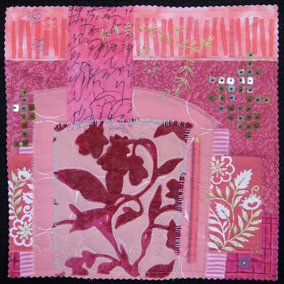
 I returned to my favorite general composition concept of a shrine/altar format. (It will play nicely with my Dandelion and Water quilts.) I also knew I wanted to incorporate sheer fabrics, surface design, handwriting, embroidery and some unusual embellishments. I went about gathering and auditioning materials.
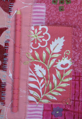
 I found a scrap of the exact same pink fabric to which I had added handwriting and used in my Chair quilt. I loved the sheer piece with the velvet floral motif. My friend Hannah let me glean from her stash on my trip to Maine, including the pink and white floral print I used on each side. The pink pencil seemed a fun embellishment. Plus, it's linear and conveys a message of creativity.
 Pink is very peppy and fun. Seeing that pile of fuchsia, magenta, blush and rose on the table in my studio, I just couldn't help but get a bright, enthusiastic feeling. Don't you think? I thought I didn't really like pink. Of course, I also thought I didn't like asparagus, until I had a few spears that were grilled to perfection at Jasper's.
It's good to experiment.


8 comments:
Deborah, you do such beautiful handstitching. I love looking at your pieces closeup to see all the detail work you put into them. This is really nice.
So far, the piece I wish I had made. So many special details. You can go back again and again to look at this piece.
I agree with Gerrie -- the one I wish I'd made! This has so many of your personal elements and, as usual, I'm impressed at how you incorporate them into something new but also definitely you. I especially love the embellished areas with those square bead thingies -- wonderful. I would love to see this in person!
How fun! And I see you've "Pinked" your edges too! I think this could be the garden of Terry's St. Rose. :-)
The is such a fun piece. My eyes keep traveling around and discovering new little treasures. I really like the addition of the hand stitching. My favorite part is the band across the top with the stamped(?) bars.
Deborah, it is hard to believe you started this not liking pink because this is a valentine to pink! Like Francoise's, to me the bit of lyrical white really brings it all to life. I also love how you have combined warm pinks with cool pinks to give it just enough discordance to keep it lively and save it from nicey niciness. Delicious!
Oh, it's beautiful!! And with a pencil,too! I could happily live with this one on my wall :)
Wonderful balance with a casual look! Just super!
Post a Comment