Showing posts with label Inspiration. Show all posts

Monday, December 3, 2012

Bittersweet Study

Bittersweet This will be my last Twelve by Twelve challenge. Sweet is thus bittersweet for me. 
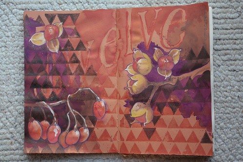
So, I'm currently exploring ways to express the word or feeling. I thought it almost wonderfully symmetrical that something like bittersweet chocolate could be my last challenge piece when Chocolate was one of our first. It was second though, so it's not quite as elegant as I would hope. Anyway, I was also unaware that there is a climbing vine called Bittersweet. There are actually several varieties, first being Bittersweet Nightshade from Europe with it's lovely ovoid red berries and purple flowers, and the second being American Bittersweet named for it's resemblance to the former, but having a wonderful trefoil orange husk. American Bittersweet 
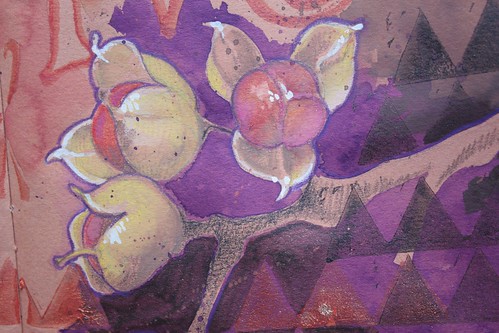
In addition to my usual word association scribbles in my working sketchbook, I've decided to draw some of the more literal bittersweets. This drawing/painting is totally overworked and tortured, but the point of making it was to explore the plant, it's colors, and shapes. I may harvest elements for my Twelve by Twelve piece, I may not. Nine more days to pull something together.

Saturday, May 26, 2012

Studio hopping

Whenever I look at Deborah's Twelve theme piece Seven Houses, Five Trees I think how fun it would be if I could just skip over the hill and visit one of the Twelves.  Fortunately the internet allows for some virtual studio hopping. After I conducted a chakra-enhancing purge of project piles and paperwork, my studio is once again fit for visitors.  I invite you to take the Serendipity Studio Tour:
I have a view of the ocean while the vista from Helen's studio is more bucolic. The building project, painting and decorating are over and Helen is happily esconced in her new creative space.  Check out Helen's Studio Tour:
Helen's Studio View Meanwhile, thanks to the magic of video, you can some of the Twelves over to your place anytime. As outlined in Deborah's blog post, this week there is some special pricing on the STITCHED - a collection of 20 online video workshops including Deborah's Branches, Buds and Blossom: A Botanical Collage and Nikki's Mini Treasure Box of Dreams:
Also, Deborah's new Quilting Arts video workshop, Contemporary Fabric Collage: Design, Stitch and Finish, is now available for download! It's just like taking a workshop with Deborah. As she prepared for the shoot, Deborah made long lists about all the tips, suggestions, ideas and directions she wanted to include. Plus, there are lots of visual aids and examples throughout the DVD. The video workshop includes chapters on fabric selection, composition, using sheer fabrics, stitching by machine and by hand, and unique finishing options.

Thursday, March 29, 2012

Where I've been, Where I'm going?

My family moves house. Not as much as some, but I think more than most. It's part of being in the military. While the Army often asks us where we'd like to go, when it comes down to it, they make the final decision of where my husband is needed. This makes mapping out future plans a bit difficult. But we've been fortunate enough to live in many very interesting places along the way. Where we've been and where we are going has been the focus of my pondering on the Twelve by Twelve map theme.


Usually, I ask myself if there are any textile references related to a given theme or subject I want to pursue. My first thoughts were of maps printed on the silk linings of some WWII era bomber jackets. According to Wikipedia,
Some jackets had a map of the mission area sewn into the lining, which could be used (in theory) for navigation if shot down. Some jackets (famously, those from the China Burma India Theater, and of the Flying Tigers) had a "Blood chit" sewn on the lining or outer back, printed on cloth, which promised certain rewards to civilians who aided a downed airman.
I liked that a map could signify the future, or a road out of danger. I wrote in my sketchbook that perhaps I could embroider on silk, but have it be a map of an inner journey. What do I want? Where do I want to go? Dead ends? Dangerous or unknown places? Rewarding places?


Then I got to thinking that all of that might be a bit obtuse, and considered souvenir state tea towels like these from the Sundance catalog. If nothing else the size and proportions are much closer to our 20x12" vertical format. Conceptually, this idea would be less "escape route," and more "banal life in general." And I'm OK with that.

So, I set about listing things I could incorporate. Thoughts on moving. Places we've lived. Icons of those places. The sense of criss-crossing the globe. Then I started drawing. With Google Maps to help I made drawings of neighborhoods in which we've lived. With tracing paper, I finessed placements.


My next step will be to transfer my drawing to a plain tea towel and get to embroidering. I'm liking where this is going, and it was fun reminiscing where I've been in the process.

Thursday, February 23, 2012

Thursday, January 19, 2012

Well, yeah, this is exciting!

Honestly, folks, I know we probably seem pretty full of ourselves at this point. So many extraordinary things have happened to our little band of hardworking stitchers, it is hard not to get excited when something more comes along. So, here we are—excited again. This arrived in today's mail.

It's the February/March issue of everyone's favorite art quilting magazine, Quilting Arts, with a 6-page spread all about the Twelve by Twelve project. As usual, Quilting Arts has shown our best sides and made us look far better than we ever dreamed.


The whole issue is about collaborative projects. We are so delighted to be included! We've answered a bunch of questions about what this project has meant and how it has impacted our lives and our art. I hope it inspires more collaboration out there. It is such a rewarding experience!

Tuesday, May 3, 2011

Cooking up Something

Mmmm, yummy spicy Indian food! That's what came to mind with Helen's palette. Almost immediately I thought of a spice market and those wonderful piles of color.

This would be fun to make with all my lovely brown fabrics, but doesn't it just look like a Brandon Mably fabric (though we all know I love his and Kaffe Fasset's fabrics)?


How about just the spice? A pile of colorful powder that looked like someone ran their finger through. I could do all French Knots in luscious embroidery flosses. I've done two knot-heavy projects in the last month though, and I think I need to do something else.

Reading up on the odd spice out, I learned that Asofoetida has a lot of medicinal uses in addition to it's cookery ones. That made me think of an apothecary and all it's jars, or mysterious drawers.


I kind of like this one.

I was certain that Helen had chosen this palette because she wanted us to think deep thoughts about Asofoetida and it's anti-flatulent, antimicrobial, contraceptive, abortifacient, balancing, and repelling properties. She says she was just thinking of the nice warm browns, but I told her I didn't believe it and would make a piece with a red circle with a line through it to indicate "no fart clouds."


I was loving all the names for Asafoetida based on it's fetid smell. How about a lovely redwork style botanical embroidery, with a bunch of "crappy" names (pun intended)? OK, there's potential in that design.

I was curious about the ancient uses of the spice though. Apparently, it is an inferior version of the ancient herb Silphium, which was so valued in the ancient world that it's image was used on coins, and it was over harvested to extinction by the Roman era. There's some speculation that because of Sylphium's contraceptive effectiveness the heart symbol we use to represent romantic love (that bears little resemblance to a real human heart) is actually based on the heart shaped seed of the plant. It's also possible that use of Sylphium is the reason there wasn't a huge population explosion during the Roman Empire despite much improved nutrition and medical care.

Connecting the dots from the spice palette, to Asafoetida in particular, I think I can make a case for using it's cousin Sylphium as inspiration. But what do I want to say? I think I want to say that for millennia, women have wanted, needed, and sought, choices. We need to accept that.

But I'm feeling that words are to obvious in a quilted piece -- a kind of a cop-out for me. They are much better suited for printed material, or that in the realm of words and letters. Besides, I found a website with bold, thoughtful imagery that is essentially what I was imagining.

I need to be more subtle with my Spice piece. I want to convey something visually without having to explain it in words. I want it to be more subliminal as well. I don't think I need to knock anyone over the head with my Sylphium reference. It can be an intriguing discovery.

Now, back to the drawing (sewing) board to see what I can pull off. What kind of fabrics could reinforce my theme?

Saturday, April 2, 2011

Chartreuse Whimsy


I've collected a few chartreuse colored fabrics. I may only use one of them since the idea that I'm most excited about is pretty simple. Still, they are great fabrics to have on hand.


My daughter is lobbying for this idea though. Inspired by Terry's Chartreuse liqueur and our popsicles inspired byChartreuse, I'm toying with a little green love.

Sunday, March 13, 2011

Ke Ono

How delicious!


I had been hearing how yummy and interesting Ono Pops are. Today we went to the Haleiwa Farmer's Market and had the opportunity to try some.

Left to right are Lilikoi 50/50, Green Gingetanical, Pineapple Li Hing, and Creamy Pink Lemonade.

So what does this have to do with Twelve by Twelve? It's that Green Gingetanical. It's made with the unlikely combination of fresh ginger, honey, thai basil, sea asparagus (AKA sea beans or glasswort for Chopped and Top Chef fans), lime, and maybe a few other interesting ingredients we can't remember. Also on the menu was a Yellow Gingetanical which replaces the fresh ginger with candied, the honey with cane sugar, and the lime with lemon. The important part though is that the maker of these treats said these two flavors were inspired by the liqueur Chartreuse!! I'm not clear as to whether he was under the influence of Chartreuse while inventing these pops, or if it was just the color he was emulating, but what are the chances of a Chartreuse reference at all during our challenge?

Now I am considering how to incorporate popsicles into an art quilt...

Wednesday, March 9, 2011

Chartreuse is a Neutral?

No pretty pictures of chartreuse things from me. And it looks like I'm going to have to get out my dyes and make some fabric for this challenge (I have half a bolt of solid green, but I think it's too lime, and too solid to work).

I did however, spend some time contemplating Gerrie's directive to use chartreuse as a neutral.

Webster's says neutral is "without hue, achromatic." What audacity to treat a color so specific and intense as chartreuse as neutral! I love it. Gerrie, you have caught my attention.

The more practical definition though is "matching well with many or most other colors or shades." And I'm pretty sure this will be my jumping off point. I will attempt to show that chartreuse goes with everything and is therefore a neutral.

Just for fun, I looked at other definitions of neutral -- to see if they sparked any related ideas.
  • Chemistry: neither base nor acid, as distilled water.
  • International Relations: like Switzerland (I could do the Swiss flag in chartreuse and white instead of red and white -- how fun would that be?!).
  • Linguistics: neutral gender, ie "das" in german, which, along with the feminine "die" and masculine "der," I never did get good at remembering what words it belonged with.
  • Mechanical: disengaged gears. Hmmmm...
  • Electronics: the ground wire (that's usually brown in color though).
  • Philosophy: like International Relations, not taking a side in a controversy.
  • Network Neutrality: today's hot topic.
I've got a few ideas for where to take this. Does this kind of "research" or word association inspire others as well?

Thursday, October 21, 2010

A Little Rusty

I keep thinking that I have time on this challenge, and now I realize that I don't so much. I was liking the sawtooth idea that I posted about earlier, but then took a slight rusty/ginger/strawberry/redheaded detour. Yet, as much as I can relate to redheads, I couldn't get that head wrapped around a carrot topped quilt as much as I could get into the points and textures of the first idea.


So, the next step in my process is to pull out fabrics and see what talks to me. I have lots of blue/greens and rusts!! Certainly I can make a 12 x 12 piece out of something in the pile above!


I kind of figured that I would lean towards the above hand dyes and batik fabrics since they are more "art quilt" and would take embellishment well (yes, I'm thinking some embellishment here).


But the fun, contemporary prints and spotty-ness of this selection are the ones raising their hands and shouting "use me!" They take the piece to a more whimsical place, but I like whimsical too. I'm also liking that the dots, spots, and rings of the Kaffee Fasset prints echo, in an abstract way, the grainy texture or rust. Well, they do in my mind anyway...

Saturday, September 18, 2010

First Steps


The first thing I do when starting a new project is to brainstorm in my sketchbook. It's not very pretty, usually done with whatever writing implement is within reach. This is just a conversation between me and myself. I tend to jot down word associations, references to photos or books I have, or I sketch a sort of shorthand of a composition. Sometimes I stick in images torn from magazines, or sticky notes written when inspiration stuck and my sketchbook was not around.


Sometimes I get as far as coloring in something, but that's rare since I do the bulk of the decision-making with actual fabrics and it's so difficult to replicate those kind of relationships in pencil or paint. This time it did work since the colors don't need to be specific at this point. We'll see where it goes from here...

Friday, January 15, 2010

Blue and White Inspiration

As anyone who's been to my house can attest, I like blue. A lot. I used to think that a blue and white kitchen was so cliché, but over the years and moves, I've found that not only can I NOT resist it, but a blue and white color scheme blends with just about any kitchen -- blonde wood, dark wood, country wallpaper with pink flowers, mostly white, stainless steel appliances, and even that avocado green kitchen we had in our first German apartment.

So that's my inspiration. My vast collection of blue and white pottery; in particular, that blue and white classic -- Delft.

Thursday, December 10, 2009

Prediction

I'm finishing up my pink piece and I've been thinking about the reveal tomorrow. I think it's been more challenging than I anticipated to switch from the concept of a word for our theme to a color for the theme.

Since a lot of my work is abstract, it may have been easier for me to just yank out a bunch of my pink fabrics and put together a composition. (Ahem. That's exactly what I did.)But, I have a prediction...

I imagine that some of the other twelves will reveal quilts that are inspired by the meanings, implications and symbols associated with the color pink. I know Gerrie was working on a quilt inspired by a building known as "Big Pink." So, is that an embrace of the color or the meaning? Or both? It doesn't really matter since I think she's revised since then.

Will we see quilts about breasts or breast cancer? Will there be quilts commenting on femininity? Is someone getting a pink slip? (I hope not.) Are there some cute baby girl items being sewn on quilts? Does pink still make people ponder homosexuality?

Obviously, these ideas all run together. It's impossible to say exactly where inspiration comes from and what it means. Diane wrote a post asking about our aversions to pink and why it seems many of the Twelves grumbled a bit at the color (including me). After pondering a bit, I concluded that there are not too many colors that carry so much symbolism. (I think black is heavy also -- evil, darkness, grief, etc. And green certainly has gained a lot of symbolism lately.) Considering all the "baggage" that comes up with pink, I am so eager to see how it's represented -- or nor -- in our first reveal of the ColorPlay Series!

See you tomorrow! I'll be the one with the pink quilt.

**That picture above is my very small collection of pink fabrics. It's squeezed in with the oranges and the purples. Luckily it doesn't take much yardage to create a 12x12" art quilt.

Monday, November 16, 2009

Nearly Done


This is going on my Pink quilt. My inspiration is the pink I see twice a week, but know is a part of all of us. And as I'm working on this, I keep hearing Stella from Project Runway in my ear saying, "leathah!" Any guesses?

Monday, September 14, 2009

Drawing Board

I am also back to the drawing board (as Kristin mentioned in her post below).

First I was totally hyped up to do a quilt with a background of a 12 patch quilt block. Then I realized that pieced blocks don't really come in 12 patches. Duh. Tons of 9 patch options. Like these.After all these months of creating 12x12 inch square quilts, it's somewhat disconcerting to realize that "12" does not lend itself to square in any kind of a symmetrical grid.

A dozen eggs keep popping into my head, but not in any creative way. I've also been thinking about 12 months which has lots of potential, but I like the idea of doing a seasonal quilt in four sections rather than twelve. So, that doesn't really fit.

I think I actually need to do some real research. The bolt of inspiration doesn't seem to be coming on it's own.

Sunday, June 7, 2009

Lilikoi

Since moving to Hawai'i, the word passion makes me think of this:


Lilikoi is the Hawaiian word for passion fruit (apparently named for the first place where it was planted (it's an introduced plant). Passion fruit juices, jellies, teas, and more. It's possible that research for this theme could be as tasty as it was for our chocolate theme. There's apparently a lot of passion here.

Monday, May 11, 2009

You Know What Happens When You Assume...

This clip from Britain's Got Talent has probably been making the blog rounds so please excuse me if you've already seen it a million times. But it relates so well to what I had in mind for my 12x12 challenge that I want to reference it. [Thanks Jan for the link.] I love the comment,

" What? Did they think that because she's old and not physically attractive that it's not possible that she can SING? Why was this such a surprise?"

Hear, hear! NEVER assume that you know about a person based only on their appearance or circumstances.

Life is not that simple. And people are not that simple. Assumptions people make, based on their own perceptual bias, are often wrong,

People tend to make a lot of assumptions about me based on my husband's line of work and my physical appearance. (Perhaps that's why I enjoy blogging -- you guys here know me for the me I post about and not necessarily for all the other circumstantial stuff that surrounds me.) So now, I'm working on creating the layers of assumptions and bias to reveal a truer portrait.


Monday, March 16, 2009

Bull's Eye Glass


My window will be of the 17th Century type. I am trying out a technique of first quilting, then painting over it. One of Deborah's recent studies reminded me of this texture enhancement made popular by Linda and Laura Kemshall and taken to incredible levels by Deidre Adams. It's not something I would normally do as I prefer my fabric to stay soft and supple, but the point of this group (and our small-ish format) is to branch out and try new things. For the purposes of my window, I think it's going to work out perfectly.

Friday, February 6, 2009

Dove in the Window


I think there's a lot to be said for traditional quilt blocks and their history. I love their names. Some are whimsical, some are pictorial, some are political -- like Burgoyne Surrounded or Whig's Retreat. I like that their makers could include subtle messages through the blocks they chose to use: the most widely known probably being the blocks claimed to be used by slaves to assist in their escape to freedom like Wagon Wheel, Flying Geese and Monkey Wrench.

I felt compelled to try out this block today. It's called "Dove in the Window" and was first published by the Lady's Art Company in 1898. I used fabric from my husband's old BDUs (battle dress uniform). Interpret as you see fit.

Monday, February 2, 2009

Coincidence?!

I am still absorbing all the fantastic chair quilts and I'm so amazed and inspired! I am thrilled that you took my theme and created so many different pieces of art. Be sure to check out the "friends of twelve" listed on the lower right side bar. Both Joanne and Lisa have posted their chair quilts.

I was stunned by the similarities between my chair quilt and Joanne's chair quilt. Joanne is a good friend of mine so maybe we were subconsciously using similar elements and sending each other creative vibes.

Here is a detail of my "She Sits to Dream."
And here is Joanne's chair.Isn't it interesting how we both used a layered collage style? We set those stark chairs on bright fabrics and then we did some hand stitching around the interior border.

Joanne lives in Maine and I live in Texas, but I sure wish we could sit down together in our chairs and share a cuppa and some embroidery!