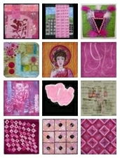
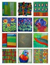
Heading into this piece, I was reminded why we call this a "challenge!" I'm discovering that I'm finding these color challenges harder than our first round of challenges, I think because I'm a word person. Having a color palette to start with, without any more direction than that, really does leave things so wide open for me that I have a hard time settling. Because I can be so literal with words, I LIKE that this pushes me away from that ... but so far, with each color challenge, I've had to fight the urge to think of something (a word) that can then translate into the colors. This is really stretching me, which is a GOOD thing. A really good thing. But along the way, I must confess to feeling some stress around that stretching!
This is the first time in all of our challenges that I have completed two pieces. This one, my favorite of the two, was the second one I started. (You can see the other on
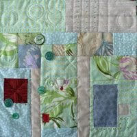
my blog.) I began with a gorgeous piece of fabric dyed by
Judy Robertson of Just Imagination, and with a shiver of fear, I cut smack into the middle of it to get a piece with the striation layers I wanted. The overlaid circles, mostly cotton but some silk duppioni, are fused on.
I've struggled with this. I tried some hand stitching, then ripped it out. I tried adding some seed beads, then pulled them off. I can't shake the sense of it not being finished, but everything I've tried to add seems to take away from it. (I keep hearing Tim Gunn's voice: "Edit wisely!") So, I've decided,that means it's done. Maybe what I'm reacting to is that this doesn't have a high amount of contrast -- and yet that's what I like about this, too.
I really enjoyed the quilting process. And I was delighted that I was able to use the stitch regulator on my new machine for the first time, while I stitched those small circles. Up until this piece, I'd only done practice doodling with the stitch regulator function, finding it slow and awkward compared to my usual free motion quilting. This small quilting design was just the sort of application that makes the stitch regulator useful to me, I think. So that made me happy. Here's a detail of quilt:
I think that this might be a piece I'll really like after I've put it away for a month or so, and then pull it out again. Funny how some pieces are like that!


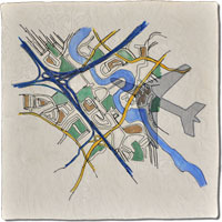
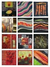


 Rust made me think of autumn leaves. That's why I chose several of my leaves photos as the starting point for the quilt. Mainly a picture of a pond in Japan, where I really liked the way the leaves were floating on the water.


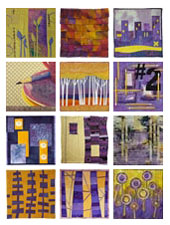
 Garden Gate


