Showing posts with label Illumination. Show all posts

Sunday, March 6, 2011

Book Release Celebration!
Introducing Chapter 5: Illumination & Brenda

The celebrations continue here at Twelve by Twelve and we invite all our readers to join the party by leaving a comment on any (or all!) of the  Book Release Celebration posts. Each comment counts as a separate entry in our celebration giveaway.  You could win a copy of our new book Twelve by Twelve: The International Art Quilt Challenge. The book drawing is closed.  Stay tuned for the winner details.
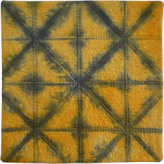
Greetings from Brenda in the "other" Copacabana in Australia. Improvisational piecing is my preferred quilting MO but being part of the Twelve by Twelve project has encouraged me to experiment with a variety of techniques.  In fact, despite having once declared that I would never do shibori again, I went on to incorporate shibiori techniques in four of my pieces in the Theme series.  This includes Radiance, the lantern-inspired feature quilt in chapter five of the book which looks at the Illumination theme in addition to setting out twelve compelling reasons to blog.  

Today's question is: Are you (or were you) inspired to try a new technique from any of the Twelve by Twelve quilts? If so, which one(s)?

Tuesday, December 29, 2009

Just Add Chocolate

If you take Francoise's theme from the first series and mix in her palette from the Colourplay series, you might end up with something like this:

There are no prizes for guessing this photo was taken in Hershey, Pennsylvania where the streetlamps are made in the shape of Hershey's chocolate kisses. So even my theme (illumination) comes into play! Most things are usually better with chocolate...

Thursday, October 22, 2009

Most Bling

The Most Bling. This one was a hard one for me, not because I couldn't think of any quilts with bling, but because they were all mine. I seem to be the one who doesn't quite know when to stop when it comes to embellishment. The other members of the group are much more sophisticated and reserved. Their designs rely upon other strengths. The challenge of finding the most bling did lead me through another wonderful walk through all 144 quilts. And guess what I found, Bling!, and a beautiful, elegant example of it.


Karen's "Enlightenment" from August 2008.


Karen used beautiful sequined Indian fabrics and beads to illustrate the eastern religious idea of illumination signifying enlightenment. The sequins and beads make the piece sparkle!

Thursday, October 15, 2009

Creative Use of Materials

When I learned that my assignment was awarding "The Most Creative Use of Materials" award, I had to think for—oh—about a half a second! Helen, of course. No contest.

Helen sewed and quilted real maps. Helen used real coins. Helen used rolled paper documents. But I think Helen really blew us away when she revealed her "Illumination" piece and it was really illuminated. With real light—that moved—and changed.

Here is what it looks like in daylight. That's a party wand gizmo attached to the front of the piece.


Now, turn out the lights, turn on the wand, and this is what you see.

Pure magic!

Go to her original post here to see more, including a short video of this piece in action, and read what it all means. It is not all sweetness and light.

Helen never fails to surprise, delight, inform and make us think. I am so happy that the 12 x 12 project has brought her into my life!

Wednesday, October 14, 2009

And the "Separated at Birth Award"...

...goes to...

*dah dah da da daaaah*

"I Am More" by Terry and "Latent Colour" by Diane.


It's hard to imagine two more similar quilts being made in these circumstances. Whilst a large view shows just how very different each quilt is from the other, at thumbnail size they are most definitely twins. Amusingly, they also have a younger set of quad siblings - "Pop Art Identity" by Gerrie.


It was a close run competition, this one, but Terry and Diane were clearly the winners because they actually did it twice. Look at their Illumination quilts (Terry's Japanese Lanterns on the left, Diane's Happy Lanterns on the right)...


I have to add another award here (and then very tastelessly award it to myself) because it has been mentioned by more than one Twelve that the following two quilts are also rather closely related. So the Before and After Award goes to Nikki's Twelve quilt "The Kissing Number" and my Passion quilt "Oh". I leave it to you to draw the parallels...

Wednesday, August 26, 2009

12 x Mini Radiance

Today I made the most of the sunshine and dyed twelve mini Radiance works. They are each designed to be six inch square finished (after hand stitching) and to be standalone works but I quite like the composite effect:

Sunday, January 25, 2009

Continuing Illumination

Remember our illumination quilts? Of course you do! I loved that theme so much that I made several more quilts inspired by illuminated manuscripts. I wrote about my process and techniques in the new issue of Quilting Arts magazine.

Here is a close up of my quilt "Vibrant Layers." I loved the process of creating that foiled word.

Here is a detail from "Attitude."
(Actually, neither of those quilts was actually chosen to be included in the article. You can see more pictures on my blog.)

And here is a detail from "Daily Ritual."

I want to thank all the twelves for being such an inspiration and supportive artist community. Our blog is mentioned in the resource section of my article. I hope lots of other art quilt lovers will find their way to our blog to see all your amazing work!

Saturday, August 16, 2008

Just for Fun

Back at the beginning of our Illumination challenge, I was toying with the idea of an illuminated manuscript and how it relates to fabric. The illumination in historic books and bibles is often the initial caps, or first letters on a page or paragraph. In textiles, we find fancy letters on monograms. 

I particularly liked the idea of a monogram because I could do it all by hand while everything I owned (including my two sewing machines) was packed up and sent halfway around the world. Then I got sidetracked by the flashlight quilt. 


In the end, I decided to complete this quilt too. It was a pretty good airplane project since it's so small. I embroidered the "Illuminated" Chi-Rho at about 3000 feet somewhere between Greenland and Helena, Montana (which has nothing to do with the concept of this piece, it's just kinda fun to say).

To round out the heirloom textile feel of this piece, I quilted it by hand and then added the crocheted border. To be honest, although I had finished the embroidery and quilting by our deadline,  I had no way to upload photos to the blog so I took my time with the crochet and finally finished it a week late. So this is more of an aside than an official contribution.


I really like the idea of this and thoroughly enjoyed making it, but in the end, I'm not completely happy with some of the fabric and color choices. If I had it to do again, I'd try a darker "glow" behind the monogram to set it off from the shirt, and then probably make the monogram lighter for contrast. The crocheted border is nice, but although the color is pretty with the plaid of the shirt, I think it draws the eye away from the monogram too much. If this were my "official" quilt for the challenge and if I had the time, I'd do it over, but since it's not, and the idea here is to experiment and learn, I'm not going to worry about it.

Now I DO need to get serious about our Shelter challenge.

:-)

Thursday, August 7, 2008

Radiance Detail

I made a start on a shelter-themed quilt today. Can't say much at this stage. Meanwhile, this is for the people who asked for a detail image of my illumination quilt. Click to enlarge:
Radiance© Brenda Gael Smith

Monday, August 4, 2008

Illumination question

I got an email this morning from someone I don't know about my Illumination quilt. She started by saying how much she liked it, then ended by pointing out that the wire holding the lanterns defies gravity and thinks it "spoils" the piece.

Yup, she's right. The wire, as shown, doesn't work logically. I actually knew that when I was laying it out, but artistically it is a better line. I decided to go with it as shown and let the viewer assume there were unseen things going on that make that wire work! My writer's suggestion was that I run a vertical "wire" from the top of the blue lantern so it looks supported. I think that is too fussy and distracts from the lanterns. But I am asking for input and opinion. Do you think the illogical wire spoils the piece? I can change it if I need to.

Sunday, August 3, 2008

SHINE! Illumination Update

The gallery pages of the Twelve by Twelve website have been updated to display our the illumination theme quilts. Don't they look good together in this collaborative quilt mosaic?!
Twelve by Twelve Illumination Theme QuiltsTake a look at the individual artist gallery pages as well to see each member's collection of quilts.

Friday, August 1, 2008

Meditation

I chose to work on the buddhist meaning of illumination.

My background fabric was shibori-dyed.
I drew a very simple shape of someone sitting and meditating, and with that shape, I made a stencil out of freezer paper. I used oil sticks to print the shapes, and their shadows, on my fabric.
I added a little yellow oil paint in some of the white spots of the dyed fabric and embroidered small stars.

Japanese Lanterns

Oh yeah, we're unlocked! It has been a long day of moving and no access to the computer so it was so exciting to see all the pieces that have been posted. And WHAT A SURPRISE to see Diane's lanterns! I could hardly believe my eyes! We were tuned into the same wavelength, for sure.


There are so many meanings for the word "illumination"—so many really thoughtful ideas. It was hard to finally get to something that worked for me. Illumination as light was always in my mind and somewhere along this process I saw a photograph in a blog of colorful Japanese lanterns in a garden that spoke to me. But I filed the thought away and later when I went looking for the photo couldn't find it again, so I had to rely on my memory, my impressions and my imagination.

I think light is most striking when it shines out of darkness. It draws us to it and speaks to us at a very basic level. One can imagine early men finding comfort and connection to the sight of a far off campfire. I think of turning onto my street, late at night and seeing my porch light glowing in the darkness. All is well. We are home. Right now, as we prepare to move to a new home it is very much on my mind whether this home will welcome us as the old one has and how it will feel in different lights. I long to sit out among the trees in the darkness, under the stars, and I can imagine glowing paper lanterns lighting our way through the shadows.

P.S. My computer is finally up and running at the new house. I have replaced my photo with a larger one. You should be able to click on it to see the piece in greater detail.

Illumination Celebration


Sorry to be so late with my post--we spent the house shopping and I'm only now getting to the computer.

I have to confess, I had so many ideas for this challenge, but just didn't have the time to execute them. If you have stopped by my personal blog you will know that we have spent the last two months getting our house ready to sell and it needed a lot of work. Just imagine four small children, flat paint and white carpet. It is finally done and I have a little time to myself. I took the sewing machine and the kids to my parents' house and got to work. (As a little aside, we sold the house today! Now I have to find a new house and get ready to move.)


My Illumination Celebration inspiration was from photos of fireworks I took on the Fourth of July and a wonderful photo of the sun rising through the trees in my back yard.


I loved the light bursting out from behind the trees. I tried to print the photo on fabric, but the colors just weren't as amazing as real thing. As I tried to paint the scene, the image came to look much more like the fireworks, another source of illumination.

To create my quilt, I painted the background with Dyn-a-flow paints. For the light burst, I used metallic paints. I then added thread painting with metallic thread. The edges I finished with a fuzzy yarn.

Happy Lanterns


I've always loved paper lanterns. Early on, after the "Illumination" theme was announced, I had this idea which had nothing to do with lanterns. I was going to use a photograph I'd taken, and make a quilt about the ongoing process of illumination/awarenesss/education that is parenting.

And then, one day, I stumbled onto a picture of some Chinese lanterns. The desire to translate that into fabric was so immediate and clear that I abandoned the original plan and lept right to this. It was one of those lightening bolts of illumination. (Sorry, I couldn't resist.) There's no cosmic or deep philosophical meaning here ... just gaily colored lanterns illuminating the dark.

These lanterns are made of dupioni silk (I *knew* I'd bought those fat quarters of bright colors for a reason!) The spines and pleats of the lanterns are stitched with heavy-weight Sulky rayon thread. I made the lanterns glow with my favorite Caran D'Ache Neocolor II crayons.
Maybe one of these days I'll get back to that photo and my original idea. But these lanterns made me so happy to work on and I smile every time I see this on my wall... hence, "Happy Lanterns."

Enlightenment

For the theme Illumination, I chose to go with an eastern religious idea of illumination signifying enlightenment. As refered to on my previous post on this subject (6/14/08), enlightenment includes the ideas of clarity, reflection, and serenity. This image of a buddha includes all of that to me. I happen to have a large collection of eastern indian fabrics, including saris that I have been purchasing over the years, and this seemed like the perfect oppurtunity to use some of them. This piece made itself with little help from me. I started with a hand dyed that I used under the Buddha image. I then added some beaded and sequined indian fabric I owned. The paisley dark blue and lavender piece on the left was a particular problem as I ironed it with a very hot iron and melted all the plastic pearls on it. I didn't have any more of this fabric so I ran to my local bead store, bought some more, and stitched them all on. As per my previos post, I also managed to melt my Buddha at one point. Since I had this idea very near the beginning of the challange, I had lots of time to correct mistakes. I'm working on that iron heat setting thing

Blackpool Rocks!

I suspect many of my quilts look better in the dark but in the case of this one - I am prepared to admit it.....


My design inspiration was 'The Illuminations' or 'Blackpool lights'. I confess that I struggled for a few weeks to think how I could get a sense of light into a quilt other than the hackneyed use of piecing lights and darks and I didn't think I had space in twelve inches to do a pieced rendition of The Lights.

I moved on to another theoretical idea - illumination as accademic clarifications. You know - Archimedes in the bath and all that. Jonathan Safran Foer's novel title Everything is Illuminated was rattling around in my head... but how to interpret it.... oh yeah, literally!
Initially I was thinking of something involving the technology you get in keyrings, white lights - may be a theatre makeup mirror.. off I went on a Google search. I found the Glow Company who make a simply amazing range of glow/light-up stuff. I wanted tack and here it was - I kept looking and kept coming back to the rainbow wand. There was time for thought while they measured it for me, in which I realised I wanted to have some kind of message with the quilt - some story or way of passing on a message - some illumination as to the realities of Blackpool.
The wand reminded me of the famous Blackpool tower and I enhanced that my lacing it up with embroidery thread to represent the lattice ironwork of the real thing, but also as a passing nod to the laced up Ann Summers type corsets often seen worn by drunken brides-to-be staggerng down the prom on their hen nights! It also refers to the windturbine brought in in 2007 to help power The Lights in a greener way than before.
The background has nine cross sections of Blackpool Rock but instead of the usual words running through the bar of sticky sweet stuff I have added some of the grimmer ( but true) statistics about Blackpool.
HIV cases rose 50% between 2001 and 2004
12th poorest area in the country
5th highest no. of drug deaths in the land
1 in 12 girls get pregnant before 18
2nd worst life expectancy in the country
Girls do worse at school than boys
Most alcohol linked deaths
4 more homeless children each month
Higher than average teen suicide rate

The circles are coloured in with textile markers ( the only ones I could get in my local art shop. I would have preferred ones with a thinner harder nib which might have negated the need to express the stats in rather truncated English!). I fused the top onto Fast2Fuse to give it a stiff base to support the tower and used a machine stitch to add gold rayon stars which made a mess of the back so it has a false back fused on with just the tower stitching showing ( but even they are not so good so I am not showing!) The edges are satin stitched.

The idea is that the glitz of the lights ( which were originally staged to attract tourists and extend the short 'season') cannot completely cover the grit of reality underneath. Oh, and I really, really needed an excuse to buy a rainbow wand!

PS It works in the light too, in case any of my collaborative colleagues were worried about future exhibitions! (although these videos both post with less light than they play straight from my laptop file)

Radiance

Despite selecting the theme and having a multitude of ideas, illumination remained elusive. Once again, I was attracted to exploring a theme in shibori and I ended up with some dramatic results as shown on my blog. I selected this piece because the motif serendipitously fitted in a 12x12 square and because of its zen feel. I need to work on my handstitching skills but am satisfied with the outcome.

Radiance by Brenda Gael Smith
A lantern in the darkness radiates the promise of life and sanctuary. From St Paul to the Beach Boys, the invocation to shine has been a powerful message throughout the ages. In the 21st century, to be the best person you can be and to let it show, seems just as relevant.

Gilded Pears


Shortly after receiving this challenge, I was leafing through an art and antiques magazine and was struck by still lifes that just seemed to glow. I decided then that this was what I wanted to represent in my challenge piece. I love pears, perhaps because I am shaped like one. They are so voluptuous. I learned that this technique is known as chiaroscuro.
Chiaroscuro (Italian for light-dark) is a term in art for a contrast between light and dark. The term is usually applied to bold contrasts affecting a whole composition, but is also more technically used by artists and art historians or the use of effects representing contrasts of light, not necessarily strong, to achieve a sense of volume in modeling three-dimensional objects such as the human body.
I had some wonderful hand-dyed silk that just screamed pears. On my blog you can see how they looked before I added gold foil. They looked illuminated, even then, but I had to add the foiling, just because I could!! The background is dupioni silk.

I enjoyed this challenge. There were many avenues that I thought of taking, but with my busy schedule, this one was the most executable. (Is that a word?)

Dappled.

A few months ago I watched a fascinating documentary on TV about Impressionism. I have always the loved the way in which Impressionists have depicted light. All those little dabs and pools of colour, combining to make a magical representation of light and movement. The documentary got me thinking again about this and then, shortly afterwards, our challenge theme of Illumination was revealed.

Many years ago I played around with a technique that I saw Yvonne Porcella using, burning the edges of silk to seal it and create little irregularly edged fragments. It seemed like a good way to make "paint dabs". First I used pigment inks to colour white silk and then I sat over a candle, being gassed with malodorous smoke for hours, burning all the cloth I had just coloured! Originally my idea was to build up layers of silk like the layers of paint and that it would become a rich field of colour.But it soon became clear that as I added more and more pieces it was just becoming a big mess of fabric with no cohesion and no clear purpose. The more planning I did, the more fabric I removed.
Dappled
And eventually I ended up with this. I am surprised by how sparse it is.
And a little disarmed. I now think it looks too sparse and needs something more. I'm not sure what. The few sequins and beads added some life and I even toyed with the idea of glitter paint, which I have used successfully before (takes a very light hand and lots of self-control!). As has happened on other ocassions, I now regret not starting earlier and leaving myself time for more than one attempt.(By the way, it's IS square - not as wonky as it looks! Why does that happen in photos??)


This has been the hardest challenge for me so far and I really don't feel that I even came close to meeting it. I can't wait to see the Masterpieces everyone else will have created. My comments won't be here until next week. I am literally leaving right now to teach for a few days.