For this art quilt, I wanted to continue to explore some of the techniques and styles I've been working on lately. The "shelter" theme gave me a wonderful focus and when I finally let go of the need to make a piece of art that was obviously about shelter, I was very inspired by colors, shapes and lines from various shelter images.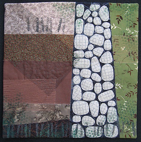
My main inspiration was this photo of an adirondack shelter.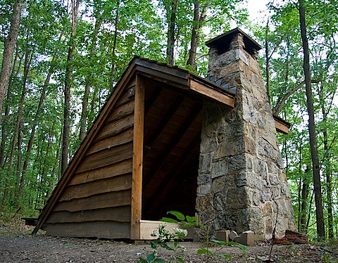
This piece also is very similar to my Construction: Concrete and Stone quilt. You can see it here.
I was really excited to work in the color palette of brown, green and gray. I simplified the shapes in the photo so I could focus on the fabrics and the surface design in the different areas of the composition.

I really enjoyed adding the embroidery -- in both short and long stitches -- but I'm not sure it shows up well enough for it to be effective. It's hard to make design decisions in a 12x12 area. I didn't want anything to stand out too much.
I added a layer of black tulle to reference the shadows created by a roof line. I did a pillowcase finish which worked really well for this piece. I like that clean edge.
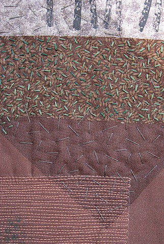
This art quilt has so many elements -- literally and symbolically. I've got paint, commercial fabrics, hand dyed fabrics, thread, floss, tulle, free motion quilting, embroidery, stamping and stenciling and more. Symbolically, there are planks of wood and stacks of stone. I'm thinking about fireplaces, walls, shadows, forests, tall trees and tiny vines. It's about mixing order with irregularity. I'm not sure all that says "shelter." But that was my starting point.


10 comments:
Gaaa! I love the stitching on this. I mean I really love it. And it shows up beautifully, even on my lil laptop monitor. You know what else I love? — the color pallette. So natural and soothing and no purple - hee!
I think you did a great job distilling the elements in your inspiration down to their essential color and texture. I think this says shelter in that it's about the elements used to make one.
Mmm.. I love it too. Love the stones of the chimney, and your hand stitching as well.
Would like to see it from closer. The pictures are not clickable?
So elegant!! The stitching is wonderful and contributes enormously, I think.
Beautiful! So calm and peaceful -- a true shelter in the woods. I love the chimney and the strength it evokes. And the soft falling leaves. You nailed it.
I knew that with everything going on in my life right now, I just couldn't do serene. I had to add the artificial joy. To be able to just sit in the forest and enjoy it for all its beauty! Hopefully soon I will be able to stop saying someday.
Wonderful. That interpretation from photo to abstract is immensely clever. You have captured the real essence of that photo without copying it. And, like everyone else, I love the colors —so warm, earthy and peaceful.
Deborah,
What a wonderful piece! To my eye, it's a very successful balance between abstraction and depiction of structural elements for shelter. It's clear what you're conveying, but it's not an image of any sort of shelter. Beautiful!! I love the stitching and the shadow of the tulle, but I can't stop looking at the stones. Perfect fabric and such great shapes. It's also cool how it's clear that it came from the picture, but not. You are using your personal themes and styles so beautifully!
Wonderful Deborah! When I look at your quilt and then the photo of the Adirondack shelter, I see so much resemblance or similarity in shapes. It's truly a great abstract of that photo.
When I first saw this, before I scrolled down to the inspiration photo I thought it was a stone cairn on a fell. Then I thought of the brick fireplaces we often see in Lakeland houses in the UK. So I was not far off. I commented about interesting angles on Terry's quilt and the same goes here - the left side needed that great design decision to put in the diagonal block which makes the whole quilt work for me
Deborah, this is so earthy and the stitching really makes the piece. You captured shelter beautifully
Post a Comment