Thursday, July 28, 2011

Ready to get messy


Orange was never high on my favorite colors list. I don't know why. Orange is great! Nowadays I love orange, and I'm finding that it sneaks into more and more things in my life.

Although I've been challenging myself to incorporate something from traditional quilting into my Colorplay pieces, I'm giving myself permission not to have to do it this time. My grey piece didn't lend itself to my self imposed rules and the connection to a little known block didn't help. I'm still wishing I had done a mola a la Diane's inspiration -- I can see it in my head.

Anyway, orange is making me want to do a still life of some sort, and still life is making me think of all the painterly techniques I read about in Quilting Arts magazine and never do myself. So, I've done a little research, and am planning on a few days of trying techniques and layering and collaging and seeing what happens. I think this is going to be one of those times that I have to try a bunch of things and work on many parts simultaneously and just see what sticks.

Orange and blue

I have been buying fat quarters. Especially orange. But along with the orange I can't seem to resist these lovely deep blues. I know—complementary colors, though my feeling about complementary colors in general is that there is nothing really that special about those combinations. My orientation toward color theory has always been in knowing how to mix paint colors to get what you want and not so much a guide for combining colors, but I digress.

Interestingly, when I was contemplating what my color challenge to the group would be, my first idea was cobalt blue. Isn't cobalt blue a great color? It looks good with nearly every color and makes other colors look even better when paired with it. But then I decided we had covered blue in a general sense and so I chose orange instead. But I am sure wanting to combine my orange with cobalt blue. Don't be surprised if I do.

Off to the right side you can see a few green fabrics. I think they look pretty great with the blue and orange too. These brights are really working for me right now. I may be working myself into a whole new color palette.

Tuesday, July 26, 2011

Melbourne Book Signing: 1.30pm Thursday

If you are attending the Melbourne Craft & Quilt Fair on Thursday, 28 July (in Australia!), you are invited to join Brenda for a book signing at Can Do Books (Stand E01) at 1.30pm.  The book is for sale for a very reasonable A$22.95, I've packed my favourite autograph pen and smiles are free!

Sunday, July 24, 2011

A Touch of Orange

I had occasion to review some photos from my adventure in the French Pyrenees in 2006.  There are a couple with a touch of orange that have me thinking but who knows what will happen?!

Sunday, July 17, 2011

Thinking about orange


Turns out I take pictures of orange things more than I thought I did...   And now I'll be noticing it even more, I'm sure!

Friday, July 15, 2011

We're not going anywhere!


We have so appreciated the lovely comments we've gotten after our "gray" challenge, but one subject has been mentioned to us rather frequently:  the belief that we're folding up our tents and stealing away.

NOT SO!  Actually, Terry's announcement of orange as our last challenge referred to our last Colorplay challenge!  Trust me, discussions are going on behind the scenes as to what we'll do next.  We do not know what form our next challenge will take, or whether all twelve will continue -- but rest assured there will be something going on.  We've all loved our creative explorations together so much and want to figure out what excites us the most as we move forward.

Meanwhile, we're all working on (because thinking and mulling counts as part of the work, you know) our "orange" challenge.  Helen, Francoise and I will be at the Festival of Quilts in Birmingham in early August with the exhibit of all 144 quilts from the first challenge rounds.  And we're excitedly preparing for an exhibit of both challenge sets (yep, that's 288 quilts) in Houston in November, 2011.

So if we're a bit distracted, we hope you'll understand.  But we'll let you know when we know how we're going to challenge ourselves next! 

Diane

Pumpkin Lasagne

I use orange a fair amount in my work.  For example, here's my entry for the Canberra Quilters Recipe Book/Quilt Competition in 2009. An extra tall slice of Pumpkin Lasagne (click for recipe) - good enough to eat!


Thursday, July 14, 2011

This morning

I went to the market,
and I bought...

Wednesday, July 13, 2011

My Orange Inspiration


I am seeing orange every where today. I had to bring these home with me today.

Colorplay Website Update

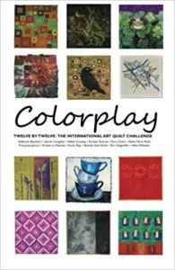
Both the Colorplay gallery and the Artist Colorplay gallery pages of the website have been updated to display the latest Gray challenge works. Here's how the Colorplay mosaic (with the challenge setter's quilt shown) looks so far:
Twelve by Twelve Colorplay Series - 11 of 12

The LAST Color Play Challenge!

What a trip this has been! I am both happy and a little sad to be announcing our last official challenge (at least for now).

I think we should leave them smiling! That is why I have chosen one of my favorite and, in my opinion, happiest colors—ORANGE!

I know there are people who have a hard time with orange. I have never understood that. But if you are one of them, this is your opportunity to get to know it better.

I want to see a strong, saturated orange ranging anywhere from cheddar to flame, but pure and unadulterated.

 
Use any colors you like with it. And, just to be clear, the colors below are NOT what this orange challenge about. I don't want to see peach or terra cotta or rust or any of those dull and wimpy, or earthy oranges. This challenge is about pure, straight-up, ORANGE!


For inspiration, here's the Google Image search page for orange.

I can't wait to see what we do with orange!

Tuesday, July 12, 2011

Gray Colorplay Mosaic

Look at our Gray Colorplay mosaic!

Sound and Vision


This quilt was exquisite in my head! It hasn't lived up to my expectations but I like it anyway. I wanted to make a gray background and quilt it with strong colours to show how wonderfully gray makes other colours zingy. Hmmm.
The background began life as a photo of my ear. Heavily pixellated it became...well...nothing really! The sound waves are quilting lines and it would be amazing to be able to say that they are actually my voice... but I can't ;)
The bright wave is a very beautiful hand-dyed silk floss.

Armorica

I started dyeing grey fabric before really knowing what I wanted to do for this challenge. I got a few nice fabric pieces, especially this one that I thought would be perfect, except that it was much larger than 12x12. I thus had to decide which part of the piece I wanted to select for my grey quilt. (It wasn't the easiest part of the process!)
Then I thought it needed a little more contrast and I added a 3 inch band of darker grey on one side.
I machine quilted the whole piece with straight lines, trying to emphasize the movement I could see in the fabric.
Next came embroidery time! I had picked yellow and green threads for this because I wanted to take inspiration from this picture. But after several attempts, I had to admit that I couldn't find a green that would show well on both fabrics. I turned to a variegated red-pink-orange thread that did work much better.
I'm rather pleased with the result. (It looks better and brighter in real life.)
Here's a detail shot of the quilt.
I'm ready for the next challenge! :-)

The Grey Parrot

My dad used to work in a design office in LA that was all black, white, and grey, with just a touch of red for accent. There was a lot of chrome too (this was in the 80s, of course). When I think grey, I always think of this office first.


They were so committed to this color scheme, that the principal bought an african grey parrot as a color coordinated office pet.


I did not think I would be able to find an appropriate quilt block when I read that Kirsty's palette was "Grey," but surprise, surprise, there's a block called "Gray Goose!" Grey parrot, grey goose, that's close enough. And, when abstracted a bit, it has a geometric 80s look that worked for me. I used a wool suiting fabric, not so much for the designers' suits, but for the low pile grey carpeting in the office. I had a hand dyed fabric with silver stripes that echoed the chrome I remember. There's some silver stitching as well. The parrot -- he's pretty obvious.


I was pretty happy with this outcome until two days ago when Diane showed her mola. I smacked my forehead and wished I had one more week. I would have made a mola version of the chrome and leather Wassily chairs in the office lobby!