I'm playing with the Grayscale tool in Photoshop to remind myself that any design can be made in grays. It's all about value!
Tuesday, June 28, 2011
Thursday, June 23, 2011
Monday, June 20, 2011
Not Quite Gray
This was so close. I had a piece of black fabric in Dorothy Caldwell's class that discharged to white if you left the bleach on long enough. Very cool, I thought, if I leave it on a litttle less time, it will be gray.
When I finished bleaching this, it reminded me of Monument Valley, so I just added a few lines of stitching to bring in the color of some of the rocks there. I put it on the wall to photograph it, and now matter how much I tried to convince myself, it's not gray. It's tan, beige, coffee, khaki, but not gray. So now I'm channeling my inner Dorothy again, and thinking of another class project to try out.
Sunday, June 19, 2011
Book Signing at the Sydney Quilt Show
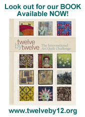
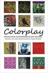
Here in Australia, I've yet to sight our book Twelve by Twelve:The International Art Quilt Challenge in a real live bookstore but that will all change this week at the Sydney Quilt Show in conjunction with the Craft & Quilt Fair (22 -26 June) at Darling Harbour.
Specialist book vendor Can Do Books (Stand H21) will be selling our book and we are celebrating with a book signing at 1pm on Wednesday, 22 June. I hope you can join us. (I'm practising my autograph! and hope to also share some quilts.)
Saturday, June 18, 2011
Festival of Quilts 2011 Features
Join Helen, Françoise and Diane at the Festival of Quilts in Birmingham (11-14 August) and see all 144 art quilts from the Twelve by Twelve Theme Series. We can't wait to share our work with you.
Download: Festival of Quilts Features (10.28MB PDF)
Labels:
Diane,
Exhibition,
Francoise,
Helen
Friday, June 17, 2011
Wednesday, June 15, 2011
Tangled Textiles Today!
A few months ago, you might recall that we were somewhat instrumental in getting a new challenge group up and running. During the 12 days of Twelves we posted, someone asked if others were tempted by reading about our experience to join a group. Various people commented that they were, and so I contacted them and suggested they link up and form their own group. They did so, under the name "Tangled Textiles", and today is the reveal day for their first set of quilts!
Their first them was "games." Go check out their blog and see what delightful things they've come up with in response!
Labels:
Diane
Tuesday, June 14, 2011
Wednesday, June 8, 2011
Making Gray
I have killed two birds with one stone, proverbially speaking. For a City & Guilds exercise, I had to experiment with "paint pounding," where you scrunch up fabric, pound acrylic paint into it and then let it dry all scrunched up. With "gray" just around the corner, I used that with pink mixed in for my experiment.
I used Dynaflow paint since I had that handy, and sort of mashed it on wet scrunched fabric so it looked like this.
You move it, wet and scrunched, into a plastic bag and try to keep it wet for a day or two so the paint has time to settle into the scrunches. Then you take it out, let it dry still scrunched, and press. And voila!
Actually this lower one is from the pinker scrunch pile above:
Monday, June 6, 2011
Great Minds
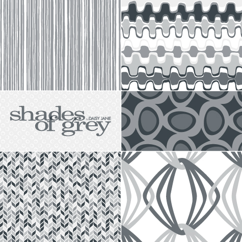
In researching for our current challenge, I came across these graphic prints in the Shades of Grey Range by Daisy Jane: Hmm, do I detect a theme?!
Thursday, June 2, 2011
Spicy Nine Patch Redo
I don't think I have done this before. I have rephotographed a piece, but not reworked it. There was a block with an element that was off-putting to me so I removed it and replaced it with another. I hope this is not too much work for Brenda as my piece needs to be changed in the mosaic. Speaking of the mosaic, the spice mosaic is really beautiful!
Never met a gray I didn't like ;)
Y'all know how much I dig bright, clear colour and the more-the-merrier? Well, I also have a strong love for gray. I believe this colour is under-rated and under-utilised in quilts.It seems to terrify many quilters. You, my friends, are fearless quilters and I know that you will embrace the challenge of making a gray quilt!
Any gray will do - from ash, dove, cinder to graphite and charcoal; warm or cool. Feel free to add other colours but shall we try to keep it predominantly gray?
Ready...steady...GO!!!
Any gray will do - from ash, dove, cinder to graphite and charcoal; warm or cool. Feel free to add other colours but shall we try to keep it predominantly gray?
Ready...steady...GO!!!
Spice Colorplay Website Update
The website has been updated to display our Spice Colorplay quilts. Don't they make a rich, warm and cohesive collection?!
The individual Colorplay Artist Galleries have also been updated. These updates have been prepared on the run. Please e-mail Brenda if you come across any broken links or other glitches.
PS: If you have a postal address in Europe and would like to win your very own copy of the Twelve by Twelve book, pop over to Françoise's blog and leave a comment by 8pm, Friday 3 June Belgian time.
Labels:
Spice
Wednesday, June 1, 2011
Cultivate Choice
When Helen gave us her spicy palette, I didn't know what asafoetida was, so I looked it up. Imagine my surprise when I found out it's myriad uses both culinary and medicinal!
Though I liked the apothecary direction, I kept coming back to asafoetida's relationship to a similar ancient plant called silphium, and silphium's usage in birth control. Maybe it's recent political posturing that has me riled up, but I believe strongly in a woman's right to make her own choices when it comes to her family and her body. So my decision was made.
I decided to try the somewhat subtle route of just showing the plant and letting it's implications wait quietly for discovery. My image of the plant is based on a Roman coin design (silphium was so valued at the time, not only was it depicted on currency, but it was harvested to extinction). I tried to machine stitch the image with fusible thread to which I attempted fusing gold foil, as reference to coins, but it didn't work as well as my test swatch. So, I hand embroidered the image on top and then added a little more gold foil using foil adhesive. I needle felted a wool heart shape is for the heart shape of the seeds (also on coins) and because wool was used in the ancient world as we would now use pads or sponges today (the wool was soaked in silphium "tea" according to an article I read). Finally, the background is upholstery fabric in a design I thought reminiscent of oriental rugs -- a nod to the region in which silphium grew (present day Libya). The border is wrapped fabric scraps because they looked harmonious, and referenced women in both clothing and personal hygiene usage.
It's not my best work in a technical sense and maybe not even in an aesthetic sense, but it's a good story, I think. An abstracted apothecary may have looked better, but this one means more to me.
Burst of Flavor
First of all, I have to say that I have taken all sorts of pictures of this little quilt and I simply can't get the colors to look the way it looks in real life. I think one of the issues is that it's made totally of silk dupioni, and the sheen changes the way the colors reflect. But when you look at this, be aware that the brown in this photo looks fairly accurate but the color bursts are much brighter in person. The yellow is a vibrant marigold, the red is a good shiny red, and the one that looks gold (next to the yellow in the middle) is more caramel colored than it looks here. I apparently have to hone my photography and Photoshop skills to get this looking right, but all I know is that I've spent all afternoon working on this, and if the brown is the right color, the bright colors look dull, and if I make the bright colors look right, the brown turns too red. I'm sorry to post a blah picture and to have to explain -- if I can get it better I'll replace it later. The hand-stitched bits look much brighter in person, too.
Yes, it's STUNNING in real life. If it looks boring here, it's the photography. (Grin.)
That said, I've had a good time working on this -- and look, it's ABSTRACT! Aren't you impressed?! I was thinking about how one uses spices in cooking -- how little bits of spice can go a long way. So that's the general theme at work here -- vibrant notes of spice enhancing larger and plainer set of ingredients.
This is actually the second spice quilt I made. Here's the first one I made:
The colors in this are off also -- yes, it's all dupioni again. And I was working with the same ideas, thinking about adding bits of spice to a recipe and using pops of flavor to brighten a recipe. But as much as I like this (and had a great time making it), it struck me as too similar to my "rust colors" piece. So I went in a different direction and came up with "Burst of Flavor" above.
Thanks, Helen, for a delicious challenge theme!
Spicy Night Out
Okay, maybe this dress is a little sweet to be a spicy night out, but this girl doesn't get out that much. Lately, a night on the town has consisted of chaperoning the elementary school dance, watching the girls take countless trips to the bathroom as a pack and my little guy dance like Justin Beiber with his kindergarten teacher.
This challenge had me stumped. I spent a lot of time thinking about the colors -- thinking in the car, thinking at dance class, thinking while walking the dog -- but I just can't seem to design in my head. I have to use my hands to experiment and play. The kids and dog didn't leave me a lot of time to play. Crazy me thought I would have more time for myself as they got older. I'm learning the hard way that's not the case. I did sneak an afternoon on the computer researching imagery, but didn't come up with much. Next stop on the search was the sewing machine. I went to work free motion quilting and came up with the rough paisley pattern. I thought maybe I would bead and embellish it, but didn't have a real plan in mind. Over the course of 5 days I managed to find the hour needed to quilt the background. Another day's work consisted of pulling out all my spicy paints and setting up my painting station. I snuck in some time for painting in between dropping off the kids at school, walking the dog and heading back to school to pick up my youngest from half day kindergarten. I did have to sacrifice a shower that morning to fit it all in. And then the painted quilt sat there, and sat there, all weekend. I tried laying out some beads, but it lacked a focal point. In desperation yesterday, I went back to the dresses I was playing with for Mother's Day cards a month ago (and relied on Wii Lego Star Wars to babysit). The yellow fabric paper matched the colors of asafoetida and cumin so perfectly I had to use it. I added a little embellishment and there we go. The dress faded into the background a touch, so I added some cumin colored pearlescent power around the edges to create more contrast. I think I need to feather it out a little more now that I see it on the computer screen. Maybe I will sneak that in, maybe I wont.
In the end, I'm really happy with how this one turned out and amazed that I managed to pull it off at the last minute.
Marrakesh 28.4.11
Whenever I think of spices I either think of the great Pakistani run cash and carry near where I work or the spice stalls on the Marrakesh souk. Just outside the souk is the Cafe Argana where I sat on the terrace and ate tagine containing spices. Sadly on 28th April a bomb killed seventeen people of many nationalities and destroyed the cafe. This is my memorial to them with 17 stripes ( dyed with turmeric) and 17 straight and 17 cross stitches.
Is it just me or are the rest of you having trouble photographing these colours? The hand monoprinted fabric with gold accents refuses to look shimmery whatever I do with the camera.
Spicy Nine Patch
This may be the most expensive piece that I have made for our challenges. I kept breaking felting needles, both hand and machine; I bought backing fabric that I never used. I bought lots of fabrics for the collage and used only bits and pieces. I also got a little spendy with the beads!!
I finished this late and I am not happy with the photo so will probably redo that. I felted two 12 inch squares, one with a saffron yellow prefelt base and one with a paprika base. When I had done some felting of large pieces of chiffon and roving, I cut each of them into 4 1/2 inch squares and then felted additional design elements on each square.
I then added perle cotton stitching and beads and trimmed them to under 4 inches. As many of my pieces for previous challenges show, I have a fascination with the grid. I love each of these little squares as little piece of art. My first thought was to attach them to a canvas background, but it looked heavy. I had a piece of reddish organza which I doubled and used it as the base. I was rushed tonight and I think I may not have done the best placement on the grid.
I loved working with these colors - in fact, I wear a lot of these colors. I had to throw in some chartreuse for a little pop. There are more process photos on my blog.
Savory Scatter
I began preparing for the spice challenge by painting some fabrics. I painted two fat quarters and neither were particularly interesting, but I thought I could slice out a chunk and combine it with other fabrics for an interesting composition. That's where I began. The painted piece is the large orange/yellow rectangle just off center.
In my notes for this challenge, I wrote about wanting to create something more spare and simple than my recent work. Also, I wanted to avoid familiar shapes. (No houses or leaves.)
This led to gathering a pile of fabric and stacking, composing, experimenting and editing. I am really pleased with these fabrics. There are only seven pieces and they include commercial prints, a batik, a home dec sample, a tiny bit of felt, and hand painted and stamped fabrics.
As my basic composition took shape, I knew I would add lots of detail with hand embroidery and
embellishments. (Ignoring my earlier idea about spareness and simplicity.) I was delighted to find a small bit of metal that I made in a Dallas Area Fiber Artists workshop a few years ago. I think it adds a great bit of focus, but doesn't take away from the other details.
Savoring India
My all time favorite food is Indian, so when Helen picked these colors, my mind went to all the delicious curries, tandoors and masalas I've eaten. I know that in England there are lots of wonderful Indian restaurants, but we only have a few in Ventura County, so a few years ago my husband and I took some Indian cooking classes at a local woman's house. She sold her own home made spice combinations and we were able to see the various seeds before they were mixed into their wonderful combinations.
My inspiration for this piece came from the seeds I had seen. I started with various fabrics I had manipulated in the past through either rust dyeing or screenprinting. They started out yellow, brown and orange, then after stitching, I threw them in a dye bath of burnt orange. The center leaves didn't have much contrast, so I bleached them out. I hand stitched some smaller seeds on to add a little contrast. Gastronomically speaking, this has been my favorite challenge!
Spice Blend
This is a technique that I first used for some exhibition quilts nearly ten years ago. Why oh why, when I enjoyed making those quilts so much, did I wait so very long before using it again? Heaven only knows! But I did have fun making this quilt. And now I would like to dedicate some time to making more quilts this way. The first quilts that I made were from fabrics that I really didn't like. Ugly dogs of fabrics that I cut into one inch-ish strips. The strips are then sewn string-quilt style directly onto batting. The resulting fabric is cut into pieces, rearranged and the pieces zig-zagged together. I very deliberately don't trim any threads or neaten anything at all - the mess and tangles all add something to the finished quilt. I was surprised to see awful fabrics changed into quilts that I actually really liked! The fabrics for this quilt were more selectively chosen and I tried very hard to keep to the palette - not an easy task because...
...this is not a palette that naturally excites me, I will admit. I'm not a big fan of spice colours alone, however, I do enjoy them very much when they sit beside jacaranda blues, wisteria and lavenders. At first my plan for this quilt included little fragments of those colours scattered throughout. However, once I had pieced the spice fabrics together, there was no need to add more blue/purple - the Kaffe Fassett fabrics that I had used already have just the right amount of those colours in them. I think more blue/purple would have been superfluous and possibly distracting.
I still can't quite believe how much I enjoyed making this one (having left it until the Eleventh Hour, as usual!)!
The Crow
I have a thing for crows and have made quite a few crow quilts, but so far not one for any of my 12 x 12 pieces. I also love, love, love the spicy colors Helen chose for this challenge. I have a lot of good spicy fabrics in my stash to choose from, so I decided to pull some of them for a spicy background, using the fused and over-stitched technique I have been enjoying.
I was comfortably ensconced right in the middle of my comfort zone, both in color and subject matter, but once it was all together it seemed a little lacking. I remembered some wonderful bone beads that I bought a couple years ago for another project and tried adding just a few, including one as the eye of the crow. I am not a big fan of beads on quilts generally, but sometimes they really work. In this instance I think they added just the bits of texture and interest that I needed.
Sunset Tide
A few weeks ago, I was sitting beside an estuary in Wales on a nice and quiet evening. The tide was out and there was an almost perfect symmetry between the far away mountain and the shape of the foreground rock. I did a quick little sketch because I knew I had to make a quilt out of this.
Back home, I did more sketches, simplifying the landscape until I was happy with it. This became my Spice quilt.More pictures on my blog.
Spice of Life Girls
For this challenge, I seemed to be concentrating more on word associations than the colors alone. Sayings and phrases with the word "spice" were rolling around in my head.
The Spice Girls, a popular female singing group from a few years ago, was one of the ideas that popped into my head with my word associations. Another was Spice of Life. At one point they melded together, although I wasn't consciously working toward that end.
As you can see in the photo above, I free-motion stitched the letters L - I - F - E into the spice bottle bodies. Each of these girls has a special spice to life to offer.
L spice is for Love
I spice is for Inspiration
F spice is for Family/Friends
E spice is for Enjoy and Experience
The heads on the Spice of Life Girls are free-motion stitched following a drawing on paper. The background was machine pieced and free-motion quilted. The bodies were fused and machine appliqued.
Bush Tucker Tracks
I loved seeing Diane's spice geography lesson this week. When the European spice traders came to Australia in the 17th century, they surveyed the unpromising landscape and did not linger long. Meanwhile, the indigenous people knew exactly where to find a bounty of food and flavours including yakajirri (bush tomato), quandong, Kakadu plums, wattleseed, pepperberry, lilli pilli, finger limes and lemon myrtle.
PS: This quilt is made from some of my "triad" dyed fabrics. See my tutorial.
Subscribe to:
Posts (Atom)