Monday, January 31, 2011

The getting of wisdom

It's only a month until the next reveal and I still haven't settled on a design. I mentioned this to my husband and he helpfully? remarked that we have plenty of sage in the garden.

Thursday, January 27, 2011

Getting dates right

For anyone who was less than immediately excited about my last post announcing the UK tour in 2012, you can get more excited. Its actually 2011! Yup. This year. Only a few months away now. I've corrected the original post now. Thanks to my husband who actually reads my blogs and spotted my error.

Twelves go on UK Tour!

Good news for all UK followers of this blog - and anyone else who might fancy coming to visit. Our theme series quilts will be on show at two great venues in 2011.

First at the wonderful Midsomer Quilting Shop in Chilcompton not far from Bath. We will be there over the Easter weekend - contact the shop for opening times. I shall be popping down to the shop frequently while the quilts are there so of anyone  who reads this would like to have a coffee and a chocolate biscuit ( the shop provide them for a small charity donation - only one reason I consider them wonderful!) - contact me in advance and we can arrange our visit to co-incide. Hopefully copies of the book will be avilable there too. And if you ask me nciely I might even turn my Illuminated quilt on so you can see it working!
Then, we shall be having out own exhibition stand at Festival Of Quilts at the NEC in August. I shall be there along with Françoise and Diane who plans to travel all the way from the States for the event. Again we would love to meet readers.

See you all there!
Helen.

Wednesday, January 26, 2011

Chocolate alteration

I found a piece of chocolate brown silk in my stash and added some pattern to it using discharge paste.  Believe it or not, those dots are blue, the exact blue I needed for the new challange.


I went back and pulled some more of the colors we are using, and am trying to decide how to alter them.


The green felt on the bottom looks so rich I'm sure it will find it's way into this project.

Monday, January 24, 2011

Inktense pencils to the rescue

It seems like all I do these days is complain about the color schemes my fellow Twelves keep coming up with! Maybe it is because so many have been full-on "schemes" which really tax my imagination! So, as usual, I am uninspired by the green, blue, brown scheme. But in going through my fabrics yesterday I found a small piece I purchased a while back on speculation because it reminded me of porcelain designs. It almost has the challenge colors in it.


The green isn't really green, though. More teal. So I used one of my Inktense pencils in a yellow-green to adjust the color. These go on like a regular color pencil, then you brush a little water over them and they blend and intensify. When dry they are permanent. Very cool medium! Here is the result.

I think I am seeing hints of our scheme here, don't you?


You may see this fabric in my final piece. Maybe not. But it gave me a little more inspiration. I really like the addition of the coral-y red and that yellow-gold. Warms up the palette.

Wednesday, January 19, 2011

Been there, doing that

Sage, light (greeny) blues and very very light almost cream browns?
Just what we have been testing for our downstairs rooms.
I have every brand of sage green testerpot known to man. IOr at least an Englishman Now to find out if you can paint quilts with wall paint :)

Saturday, January 15, 2011

Twelve by Twelve Website Update: Eggplant Gallery

The Twelve by Twelve website has been updated. Check out the Eggplant Colorplay Gallery and the ever-expanding Artist Gallery Pages.  Here's the Eggplant mosaic together with a mosaic showing all of Nikki's colorplay quilts so far:
 
The website now has well over 250 separate pages. Let Brenda know if you come across any broken links or other glitches.

Aubergine Ala Albers


I have rephotographed my pieces in better light and replaced the photos on my original post, here. This is the piece that will be the official Twelve X Twelve quilt. New name and new photo,

Friday, January 14, 2011

New Colors!

I am thrilled to announce our new palette:

Brown, Sage and Blue
Honestly, I was first drawn to this color palette in my kids' orthodontist's office. The interior design incorporated these colors and I thought they were a very interesting and somewhat surprising combo.

Considering that many of us had trouble with the dark hues from the Eggplant palette, I didn't want you to feel like this was another collection of dark colors. So, please feel free to explore everything from light to dark.

Here is another view of my paint chips with the light ends up.
Some of the color names on these chips are inspiring... fudge bar, melted chocolate, grape leaves, blueberry path.

I wish we could all sit together in our studios, go through our stashes and share some color-inspired snacks!

Thursday, January 13, 2011

Eggplant Mosaic

Following the reveal of our Eggplant Colourplay quilts, the website update is well under way. We'll let you know when it's done. In the meantime, here's a peek at the Eggplant mosaic.  As many of us grappled with value in this challenge, I thought it might be interesting to see the mosaic in greyscale too:
  

Queensland Flood Appeal : Quilt Auction

Photobucket


You may have seen Brenda's post below about her quilt for auction to benefit the Quuensland Flood Relief.
Well, I have joined in too This quilt is for auction on my blog here.  where you can see close up details too Its not a Twelve by 12 - in fact it is 31 1/2 by 49 1/2 but I am sure you will alow me to plug the auction here!

Wednesday, January 12, 2011

Queensland Flood Appeal Auction: Make a Bid

As many of our friends and followers will be aware, the state of Queensland in Australia, where Kirsten resides, has been struck by devastating floods.  A third of the State, an area the size of Texas!, has been declared a disaster zone. I am relieved to report that both my family and Kirsty's family are safe and secure but when the waters subside, the community faces a heart breaking clean up and and formidable recovery task.

Australian blogger, Toni Coward of Make it Perfect is coordinating a fantastic initiative which addresses our instincts to make or do something AND raises funds to assist the flood victims. She has organised an online auction with all proceeds going to the Premier's Flood Relief Appeal. You can find the details by clicking on the link below:
Queensland Flood Appeal Auctions
.
I am offering one of my signature art quilts to assist in the fund raising efforts. My offer relies on the generosity of those reading to bid an amount they are willing to pay for the item and commit to pay that amount into the Premier’s Flood Relief Appeal. I am auctioning When the Waters Subside(12x12in)*:
When the Water Subsides

If you would like to add When the Water Subsides to your collection, then the rules for participating in this auction are very simple. Pop over to the Queensland Flood Appeal Auction page on my blog and place your bid - international bidders are welcome. Spread the word.

*Yes, that's one of my three Eggplant pieces - after all I only  need one to go into the official Colourplay collection. My trilemma is now a simple dilemma and I know which way I am leaning.

Chokecherries

  
When I first heard the new colors all I could think of was fruit. Grapes at first, of course, then blackberries, which turn from bright red to burgundy to a deep, eggplant purple. I resisted and kept trying to think of another subject for those colors, but I kept coming back to some kind of fruit. Eventually I thought about chokecherries. I don't know if you live in a place where chokecherries grow. They seem to thrive in dry, hot conditions, usually along river or stream banks and if you were to pick one of the glossy deep purple berries and pop it into your mouth you'd be disappointed. They are not very sweet and have an almost bitter, astringent quality. But if you take them home and add sugar and cook them, they become the most delicious jelly, juice and the raw material for wonderful wine. They remind me of my childhood, picking them in the Idaho mountains near where we lived. When Ray and I were married, my Dad had spend several months making a good supply of chokecherry wine that we served with dinner after the wedding. I will never taste it again, I suppose, but can close my eyes and remember that rich, complex wine. The best my Dad ever made.

My little quilt, above, is the second chokecherry quilt I made for this challenge. I finished the first several days ago and was uncomfortable with it. I couldn't quite put my finger on why, except it just felt a little tight and fussy. Yesterday I got ready to photograph it and I decided I just hated it. It lacks the wildness and earthiness that are the essence of chokecherry. It is dainty and tidy and, well, boring. But I need to show it to you so you can appreciate how much more I like the new version.

Now Approaching Pizza Planet


Okay, you can tell where I've been the last couple of months -- home with the kids. I have no idea how I created anything while I was homeschooling. Christmas break brought my creative life to a stand still. But alas, all good things come to an end and the kids went back to school. Finally, I could get back to the studio.

These colors are my very favorites. I had so much fun creating fabric paper and quilted, painted fabric. I managed to lock myself away and spend an entire weekend quilting circles and spirals and then painting. My latest challenge in the process was finding somewhere for the paint to dry now that we have a giant puppy romping around the house. I ended up skipping the "green" approach and used the clothes dryer with the shoe rack. Penny only stepped in wet paint once and I was able to dry a lot of paint relatively quickly. One day I will have a drying rack, but for now I will just have to pay the electric bill.

I continued with the circle theme I have been exploring the last year. I once again pieced together the squares of quilted, painted fabric with a wide zig-zag. I then cut out fabric paper circles, edged them with gold and free motion stitched them. I love how they dance around the quilt.

Photographing the quilt was once again a challenge. My husband bought me a light studio for Christmas, but it just wasn't working. With the metallic paints and dark, highly textured surface, the camera just couldn't capture everything. The colors were washed out, too bright and just plain wrong. Corners were out of focus. I guess that is what I get for trying to take a picture late at night right before the reveal. I finally gave up and decided to wait for daylight. So this morning I was outside with a blanket of slushy snow, in the wind and rain, trying to protect my quilt from the elements and get a good picture. I think I might need to figure out a better set up soon. (And put a good camera on my wish list!)

For the name, well, as I said I've been surrounded by all things kid. My husband gave me Toy Story Mania for the Wii since I was the Astroblaster champion at Disneyland. Our neighbors gave us Toy Story 3. We have been watching the plight of Buzz Lightyear and the Little Green Men and fighting the evil Emperor Zurg. With all the circles, Pizza Planet just popped into my mind and stuck there. The colors are fitting and reference Emperor Zurg's purple and dark red and of course the Little Green Men. Maybe now I will have to explore the planet and see what other quilts it holds.

Aurora Borealis


I did not have the easiest time with these colors!  In fact, I was downright paralyzed for much of the challenge period as I continued to ponder ideas look at images to see where the colors might lead me.  Finally, I happened upon a photo of the Aurora Borealis, something I've always wanted to see ... and that's what led me to this piece.

What fixed the Aurora Borealis as the image in my mind was the fact that I had bought some small jars of Decolourant Discharge dye at PIQF a few months ago, and I started to think about how cool this could be to use the discharge and dye paint to create the wisps of color in a dark sky.

So out they came, and I had a fun afternoon experimenting with the DeColourant dyes.  I wish now that I'd been patient enough to take pictures of all my sampling -- but one reason it didn't occur to me to do that, I guess, is that for some reason the colors were not as vibrant as I expected.  I experimented with several black fabrics and they all reacted the same.  So the plain look of the discharged and painted fabric was interesting but had far too little contrast and vibrance.

Instead, I decided to use it as a base for thread painting.... and then away I went! (Remember, I gave you a peek of some of the threads I was using?)


The ultimate result is not exactly what I pictured, and to be honest I'm not wild about this piece.  It was much more about process for me than the result.  But I am content with it.  Here's a detail shot:


Nikki, thank you for providing such a fun and challenging set of challenge colors!

Still Life with Eggplant, Burgundy and Emerald

I think it was because I was standing in the middle of the Convention Center in Houston, not far from an exhibit of beautiful Baltimore Album quilts, when Deborah told me of our new color palette (she'd been surfing, I hadn't), that I immediately glommed on to the idea of making my own version of a Baltimore Album block. My posts here and here show a bit of my thought process and fabric auditions.

Nikki's photo, and the names of the colors themselves had me thinking of food and bounty. So I decided that I would work with the literal meanings of eggplant, burgundy, and emerald, even if I didn't stick strictly to the colors themselves. In keeping with my self-imposed rule to keep a close tie to traditional quilts, Baltimore Album, which is typically full of flower baskets and cornucopia (bounty) made sense.


My interpretation was inspired by contemporary applique defined by use of rich or bright colors and lots of pattern. I also looked to painting and collage which often represents bounty in still lifes. While my version is probably more traditional quilt than cubist still life, I like the way it turned out, and am so pleased that, though it was iffy at times, I managed to keep the light Kaffe Fasset fabric with all the circles. I loved it's eggplanty background from the get-go and saw the light circles as representative of eggplant slices.


King of the Castle

We live at the bottom of a very large hill called Castle Hill. For five years I have watched Insane Persons as they walk/cycle/run UP the very steep road that winds its way to the top of the hill. "They are nuts", I have muttered to myself countless times. Well, a few weeks ago I joined them and, after several warm-up attempts, I walked to the top of Castle Hill with my friend, Sarah. A few hundred metres before the top we were passed by a car driven by two other friends.It was dark by the time we reached the top and Kellie and Raoul were sitting on a railing waiting for us. We sat next to them and chatted for a while. Suddenly, in the dark, I felt something hit my hip. As I twisted around to see who had whacked me, The Thing landed heavily on my bare back (clad lightly in a singlet!). I yelped and brushed it away and then, as it fell, I saw it was a Green Tree frog. These fat little fellows are both charming and very beautiful.
The following day I was telling another friend about my encounter and she said, "I didn't know Castle Hill was guarded by attack frogs!"

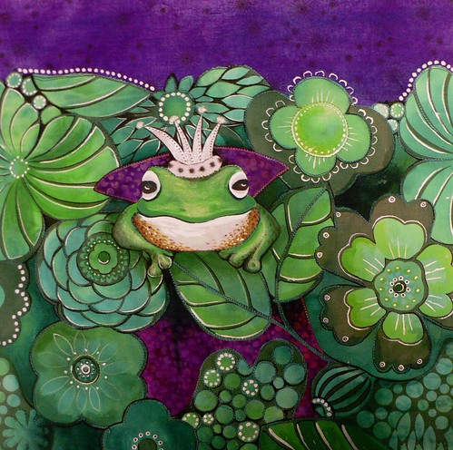
Here he is; the King of the Castle (Hill), the Attack Frog.

king of the castle1

Machine appliqued and quilted. Extensively over-painted commercial fabrics. This one was fun!

Protected?


You may recall how I was oddly inspired by this photo of a priest or diviner's shirt, found in an old design scrapbook and how the song  Do They Know Its Christmas was all over the radio at the time. I got to think about amulets and how they were worn on shirts like this - particularly by the West African Bamana tribe- to protect them from harm whilst hunting. Amulets often have text inscribed in them or an extract of a holy text wrapped up inside them.

Which got me thinking about the plight of those in Africa today who need protection from various forms of pestilence - some natural, many man-made or at least man-exacerbated. AIDS, war, lack of water, lingering post-apartheid poverty. Today there may be less reliance on battered bits of tin to protect and more on International Treaties and Agreements, although one might debate whether the international community is in fact offering much more protection to these people than a battered bit of tin combined with a large dose of faith would.

This quilt uses an eggplant purple batik (which happily has splashes of red wine like spills on the right hand side - or blood like stains if you will!) and a green batik which is only one milli-fraction of a shade brighter than the emeralds on my engagement ring ( both from West Africa - thats the fabrics not the ring) together with some barkcloth. The  barkcloth strips, embellished with traditional amulets of cowrie shells and fabric 'parcels' have been turned on their side to represent scrolls with writing marks in stitch.


Some of these stitches/ 'words' are my western ones. Some are the original stitches which come in the African bark cloth placed there by an indiginous artisan.  A large bead represents the wax seals which authenticate such legal documents.

Abode Aglow

Behold the green and the purple! If you read my blog, you know I am enamored with the combination green and purple. When Nikki picked "eggplant" as our new color palette, I was eager to work with my beloved green and purple. I feel like it is a bit hard to distinguish between various shades of red and purple, or in Nikki's definition "eggplant and wine," but I still loved playing with them.

Abode Aglow
I love working with these house and leaf shapes. I am working on setting them in interesting compositions that are not necessarily realistic. I began by putting the very basic elements together: the wine section at the bottom, the emerald section in the middle and the off white section at the top. Then I "slapped" on the leafy stalks and the eggplant house and began to add details.

I knew the white section at the top was too empty, so I created a freezer paper stencil and sponge painted the zig zag halo over the house. The free motion quilting at the base suggested wavy grass. I fused a piece of organza above the house and used a burning tool to echo those wavy lines. I wasn't pleased with it, so I began to tear off the organza. Of course, I'd perforated it by burning those lines and it peeled off in pieces, leaving the wispy shape at the top of the house. An interesting development; I didn't intend it to look like flames, but it does.

I love to use sheer fabrics in my fabric collages, but I am always trying to consider what is lying beneath the sheer. The cool thing about sheer fabrics is that they change the look of what is underneath. So, if the sheer doesn't really compliment or contrast or change another element in an interesting way, I think it's a bit pointless. I am not so sure I used the organza as effectively as I would have liked on this piece. It sits on top of the painted green halo and creates a new layer there, but I should have explored further.

Then the embroidery! I tied some lavender bits on the stalks. They hang off the quilt about an inch. I like this three-dimensional element. I echoed the zig-zag halo with wine-colored thread and added French knots and a stream of drifting green x's from the house to the edge of the quilt.

I fused a backing onto the quilt, marked the 12x12" square, sewed a straight stitch just inside my marking, then trimmed on the line using a deckle edge rotary cutter. Then I mixed some eggplant acrylic paint and used a sponge to daub paint along the edge. This will keep the edge from fraying. (Not that fraying is always undesirable.) It also added just a tiny line of purple that frames the piece and it colors the bit of batting/white felt that you could see peeking through the layers.

I think this piece is an interesting combination of elements from my shrine-like pieces and my house and leaf/tree pieces. I'll be exploring this more.

Eggplant ala Albers


And, I couldn't make just one!! I hope you all can help me decide which one should be part of the Twelve X Twelve mosaic. The one above is the last one that I made.


The above two pieces are the same fabrics with the wine and green trading places. I love playing with colors to see what happens when they are juxtaposed in different ways. Also, the color is more wine than shows in this photo which I took with my photo lights in the studio. I am going to try to photograph them again with natural light.


I know this is not an emerald green, but I do love that limey green and couldn't help putting it into one of my pieces.


This is the first piece which is organza that is fused to make the composition. I had a problem photographing these and probably should shoot them again with different lighting. This piece is much moodier than shows here in the photo. They are all made from silk fabrics and the sheen sometimes makes it difficult to photograph. (Note: the photos have been replaced and better represent the actual colors.)

I had a difficult two months at the end of 2010 and started the new year bereft of creative ideas. But, when Nikki, posted the colors for this theme, I had a quick flash of Josef Albers' square in a square color studies. I decided to go with that. So, comment away and tell me which one should stay in the eggplant collection

Waiting for sunlight

I had a hard time setting to work with this colour scheme. It was so dark! Too dark for me.
As often when I'm stuck, I went through my photos and picked out a few that I found inspiring. There was an old one of blooming chives, taken in my garden, that I really liked. I wanted to do some hand embroidery for this quilt, and those small flowers were perfect.
I also found inspiration in a few of my other colourplay pieces for the general design of my quilt.
The fabrics are all home-dyed.
After all, this quilt doesn't look that dark, but I'm so ready for a happier palette! (Sorry Nikki! :-) )
Here's a detail shot...
I will post a few more close-ups on my blog.
Line Study

I have a feeling when people start reading this blog, they will have no idea who's it is.  Let me tell you it took five tries to finally come up with a design I liked. I'm keeping the other four to myself as they are really awful.


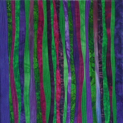
I was rooting around first in my own hand dyed fabric, but nothing really spoke to me, so I moved on to needlefelting various silk waste and yarns I had, then cutting them up again, but the design wasn't good. I then pulled out some commercial fabrics, mainly batiks, and started fooling around with circles and curved lines, like the piece above.  Something about the prints on the fabric made me unhappy so I sulked for a few weeks, then decided I really needed to come up with a design I liked, and try to make the fabrics work with it.  I sketched out a few versions of the design above, and realized I wanted to use solids, to highlight just the design, not the fabric.  Several years ago in Houston, there was a fabric booth that sold these beautiful handdyes and I bought lots, probably 75 fat quarters, that I have never used.  It was perfect for this.  I don't have a name for this, other than Line Study, which I think sums up what this challange was about for me.

The Three Leaves of Eggplant


This is the first quilt I made for this color play challenge. When I set out to create this quilt I had Terry's fusing method in mind to try out. I had read about her method a long time ago and had always wanted to try it. I had Liquid Thread on hand....well, at least I thought I did. I was doomed from the start. My bottle of Liquid Thread was old enough to have gone and dried out. I guess maybe it had an air leak.

So I did the next best thing and used Mistyfuse instead. Since I've worked with Mistyfuse a lot it was easy and quick to create as I had no learning curve with working with a new product.

I first tried creating my leaf designs with a black fabric behind the main fabrics, but the results were so dark there was no definition of the shapes. So I then tried the light colored background. I liked that much better.

When the quilt was first finished I didn't like it. I had chosen a lighter valued purple hand dyed fabric for the three leaves to sit on and that wasn't doing what I thought it would when I had auditioned it. But it was already there and attached. So I contemplated what I could do for a few days.


While I was in contemplation mode on the quilt above, I decided to try another quilt of a totally different design. Last year I had purchased a book by a Japanese quilt artist that I admire. Keiko Goke is a quilter that uses lots of color and design in her quilts and I find her work inspiring and playful. While her book is written in Japanese, there are a few instructions with diagrams of how she created some of her quilts. One of those quilts was ring shapes that were split into sections. I wanted to give it a try.

And so I created Eggplant Rings.


Because I like using so many fabrics to represent one color family I decided to create a new piece of fabric using the many I had in front of me and so I cut and sewed in a liberated fashion. After I had pieces of fabric large enough for my pattern pieces, I cut them to shape and size. I decided to fuse the ring shapes to the background fabric. These ring pieces had so many seams in them already that I didn't want to try and piece curves in a traditional manner.

When I had finished putting the quilt top together, I decided to quilt the rings heavily with a pastel thread so they would show off a bit. Well they didn't show off enough for me and there just wasn't enough contrast for my eye. So I pulled out my Shiva Paint Stiks and started rubbing a white Paint Stik over the ring shapes.

I like how the Paint Stik rubbing brought up the seam lines from the background fabrics.


In the meantime I had gone back to the first quilt and added some textile paint and Paint Stik coloring to the background area and the more I look at it the more I find it has grown on me.

And those are the two quilts I made for this challenge and it was definitely a challenge for me this round. I have chosen to officially submit The Three Leaves of Eggplant for this color play challenge, but really, if everyone claimed the other quilt the better choice, I'd gladly let it be the winner.

My Eggplant Trilemma

I am so relieved that this challenge period is over. I love the rich palette of deep purple, burgundy and emerald but I found the dark values tricky to work with. I've lost count of the half-started pieces but these are the three that I actually finished (shown in order of completion):
The first and third pieces are a continuation of my grass-inspired series (see Grass, Tussock, Savannah etc). They are abstractions of the rushes of Cochrone Lagoon near my home in their glistening glory after the lagoon was drained in mid-2010 (more photos on my blog):
In my own estimation, the first piece is technically better executed than the last piece but suffers a little from being too similar to other works in the series.  I was most unhappy mid-way through the third piece but persevered. The composition needs tweaking but the spiky shoots are a new development for me and show promise for a larger lagoon-grass work. It was also fun to mix more commercial prints into the third piece.

Originally I resolved to only use fabrics from my stash for this challenge but that didn't last long.  I've had fun experimenting with tray dyeing techniques as outlined in the book Tray Dyeing: Exploring Colour, Texture and Special Effects by by Claire Benn and Leslie Morgan. This is what can happen when you mix emerald, violet and burgundy dyes:
I had this piece up on my design wall for a few days trying to work our what to do with it.  Then I squinted and somehow discerned irises vaguely reminiscent of Vincent Van Gogh. Serendipitously, the green and purple section in the middle just happened to measure 12x12 inches and so I quilted in an iris motif. It's kind of subtle but it looks better in real life.

And so I have an "eggplant trilemma".  Which piece would you select for my "official" contribution to this Colourplay challenge?