


For a fleeting moment, I considered merging the two images to make kind of a kiwi companion piece to Terry's Mt Hood in Winter but I wasn't sure how I would deal with the designated palette which, after all, is central to the challenge.
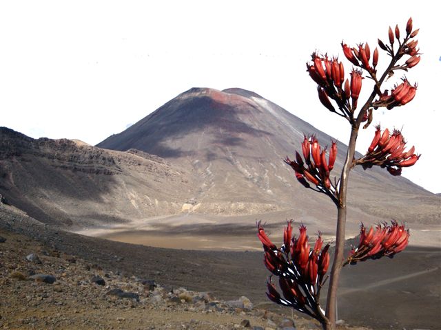

Instead, I decided to focus on the flax flowers which incorporated most of the palette. I stripped out the blue background in Photoshop and manipulated the image to create two sprays and then tried a variety of commercial products and printing methods to create a viable photo transfer. I lost count of the duds I made along the way. Eventually, I decided to try the Citrasolv method and refreshed my hazy understanding of the technique by reading the tutorial on Lisa's blog - Something About Nothing. Magic - it worked! I printed out the colour photos on my laser printer onto white fabric and then painted on a sulphur-coloured chartreuse background before quilting:

I also made a shibori magma piece but have not had a chance to complete the hand-stitching (I don't what I've been doing lately!) and it is not especially photogenic.


13 comments:
A wonderful quilt Brenda. I really like the horizontal section to the left. I look forward to seeing your unfinished shibori piece.
Wonderful images of the flax and your fabrics, as always are gorgeous! I think your mountain idea could have been executed using the palette, in a somewhat unrealistic way and could have been quite spectacular! I am imagining the mountain and sky done in the neutral tones, with the red and green plant form in front.
I love that right side shibori piece - yum yum. I also love the coloration in the green piece.
Love what you obtained with the Citra Solv! I didn't know it could do that, I'll have to buy double as much now, some for the cleaning and some for this.
Great Work!
-Amanda
Brenda, this piece surprises and delights me. I would not have identified this as yours, perhaps because I've not seen you work with an image so specifically in these challenges. But I like this very much! I love the shibori border and I love the contrast between the floral laciness and the strong stripes. I also really like how you've incorporated a piece of your cultural history into this. (The green piece is also very striking!) This makes me want to experiment with the citrasolve method and I will be going off to check the blog reference!
I would not have guessed these were yours either, but that's the point of this, isn't it -- to stretch ourselves?! I like that you used so much green on teh second one since it's exactly the opposite ratio of color than what I had in my mind and therefore a fun surprise. However, I think I like the redder piece best because not only does the shibori look fiery, but the stripes remind me of the striped pattern of traditional Maori piu piu skirt (http://www.blackpearldesigns.net/maori-piupiu.html) made from flax.
The shibori makes this piece, it is so beautiful. I used Citrasolve years ago and I know it can work really well, as you've shown here.
Since I had already made a linear work in a similar palette for the Passion theme, and had even made a volcano piece for the Passion theme, I was keen to take the challenge in a different direction. I will definitely experiment with Citrasolve photo transfers again sometnime as it was BY FAR the most effective and economical method that I tested.
Kristin - the piu piu is indeed another kiwi connection that I had not thought of.
along that vein, the angular quilting of the green piece reminds me of tukutuku panels
http://www.tepapa.govt.nz/new-zealand-art-toitepapa/NZ/Originalstyle.html
I am with the others - at first I dod not associate this with you but then I thought: Shibori! I should kave known! I note that you selected from the palette rather than trying to use them all - was that deliberate or what the quilt 'told you to do'?
For those interested in exploring Citra-solv - they have an artist's website here: http://www.citra-solv.com/
Thanks for that link, Gerrie -- looks like good info there. I can't wait to try this.
I love how the veins of color in the background fabric emphasize the lines of the branches. That flax photo is lovely and I love your interpretation of it! Is there a tiny bit of green in that shibori?! It seems to be creeping in as a tiny perfect complement.
Post a Comment