I have a
whole series of quilts inspired by the organic splendour and variety of grasses and this seemed like a splendid occasion to add a touch of chartreuse to the collection. When I was visiting Kirsty for the Australian launch of our BOOK, I spied a rich chartreuse and brown pair of fabrics in her shop. I started sewing them together in strata layers. I then cross cut some strips and added insertions to make two quilts. The first was
Chocolate & Pistachio, the second is
Bamboo:
 |
| Bamboo by Brenda Gael Smith |
It's fascinating to see how small changes in proportions can radically change the positive and negative space in a piece.
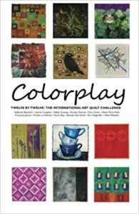
Bamboo is much more gentle on the eye in real life than this photo would suggest. You'll just have to view the
Colourplay quilts at Houston to see if you agree!


15 comments:
Chartreuse and brown is one of my favourite colour combos - gorgeous!
Love the name! At first, I thought it was the name of a brand, then when I opened the blog (not just the thumbnail from the Blogger updates list on my dashboard I started to laugh out loud as I recognized it as bamboo immediately! How fun!
Lisa Quintana
This is like one of those optical illusions like the vase which is really a pair of heads. For a good five mins I could only see the grid of the chocolate colured lines and the quilt looked harsh and quite industrial. I checked out Chocolate and Pistacio again and could not work out why you didn't prefer that one as your reveal quilt. Then I flicked back, sat back from the screen and - wham! Bamboo! NOW I get it ! And love it.
I flipped back and forth also and was surprised by how much you changed the image with the placement of the lines. Very cool Brenda.
The chartreuse and brown is a great combo! I love how you created this.
This is a perfect addition to your lines work, Brenda, and it instantly conjures bamboo for me even without the title. It's got your trademark elegant simplicity.
Yes, what Diane said! It's such a great exercise to look at both this piece and the chocolate & pistachio piece and see how such a subtle change can make such a dramatic difference. I like this departure, though it would be fun to see your "Chocolate" interpreted in many different color combinations. I could also easily imagine a Brenda Gael Smith grass and lines show soon.
So totally bamboo!
I really like this one, but I liked the first one, Chocolate & Pistachio, too. I'd like to see them next to each other.
Having seen the 'conception' of this piece (so to speak!), I'm fascinated with where you ended up, Brenda. To be so obviously bamboo with just two colours and (very deceptively) simple piecing is rather extraordinary.
As usual, you are such a master at piecing lovely curved lines and subtle variation is width. I know this is carefully planned. The work is well worth it. This is a lovely piece!
Very striking and graphic. Like, Gerrie's I could see this printed as yardage. It would be stunning!
I love the way you really achived to make bamboo with only two colours. BeautifuL!
Thanks for your comments everyone. I chose Bamboo as my official contribution to this challenge since the Chocolate & Pistachio piece is very similar to dark Organic Chocolate from the Theme series.
Bamboo shoots and chocolate! Yummy! ;-)
What a great quilt Brenda!
Post a Comment