Thursday, September 30, 2010
Wednesday, September 29, 2010
Twelve by Twelve Book Available for Pre-Order
Our 176 page book entitled Twelve by Twelve: The International Art Quilt Challenge is now AVAILABLE FOR PRE-ORDER from suppliers such as Barnes & Noble, Amazon and the Book Depository.
Labels:
Book,
Lark Crafts
Sunday, September 26, 2010
Saturday, September 25, 2010
Rusty Nails
I found some nails wrapped in a diagonal packet left over from the contractors.
I couldn't resist wrapping them in vinegar soaked fabrics. I think now I will unwrap them and march them along vertically, or maybe horizontally :)
Wednesday, September 22, 2010
Rusty Silk
I have been playing with wrapping vinegar soaked silk on a rusty pipe. I think this will make its way into my next piece. Have no idea where I am going from here!!
Rusty Flowers
With all the rain while I was in the North Island in New Zealand, it seemed ideal conditions for rust - even flowers...
Saturday, September 18, 2010
Finished
I can hardly believe that I am finished with my "rust and Patina" piece. I was excited, had nothing pressing ahead of it, so I jumped right in. I was determined to do something different and really challenge myself to move outside my comfort zone with this piece. I think you will be surprised. Not that I think it is great. It may be just a little too, as Terri said, "matchy-matchy" but there are elements that I was happy with.
The big thing was that I did not use any commercial fabrics. I painted fabrics, trying to achieve the feeling of rust and patina and really, I think the fabric turned out beautiful. Knowing what to do with it at that point was the real challenge. I can hardly wait to share it and see what you all have done. Here is a tiny little bit, just to give you a taste.
First Steps
The first thing I do when starting a new project is to brainstorm in my sketchbook. It's not very pretty, usually done with whatever writing implement is within reach. This is just a conversation between me and myself. I tend to jot down word associations, references to photos or books I have, or I sketch a sort of shorthand of a composition. Sometimes I stick in images torn from magazines, or sticky notes written when inspiration stuck and my sketchbook was not around.
Sometimes I get as far as coloring in something, but that's rare since I do the bulk of the decision-making with actual fabrics and it's so difficult to replicate those kind of relationships in pencil or paint. This time it did work since the colors don't need to be specific at this point. We'll see where it goes from here...
Labels:
Inspiration,
Kristin,
Rusty
Friday, September 17, 2010
Rusty in My Past
Here are a couple of examples of rusty quilts I've created in the past. The first one is a wall hanging I created for my bathroom after a bathroom makeover. There is no patina coloring in this one.
The next quilt was a small quilt, perhaps 6" x 6". I had made several of these for a give away.
I'm still thinking on this color theme and so far am undecided what I will do. But the wheels are turning and I'm hoping to start playing with these colors soon.
The next quilt was a small quilt, perhaps 6" x 6". I had made several of these for a give away.
I'm still thinking on this color theme and so far am undecided what I will do. But the wheels are turning and I'm hoping to start playing with these colors soon.
Thursday, September 16, 2010
Twelve by Twelve @ Christchurch 17-19 September
Thanks to assistance from the very kind Julia, who not only met me at the airport but brought a spirit level with her!, the Twelve by Twelve exhibition was installed in good time ready for the opening of the inaugural Craft & Quilt Fair at Christchurch tomorrow. Show hours are 10am-4.30pm, Friday 17 September - Sunday 19 September. I'll be giving floor talks twice daily at 11am and 2pm.
Labels:
Brenda,
Exhibition
Wednesday, September 15, 2010
Ideas from Home Depot
While wandering the isles of Home Depot, I saw these tiles and couldn't resist their rusty color. The dark blue is a little too blue, but others in the mosaic are a soft green. I really have no idea what, if anything, I'm going to do with them, but I couldn't resist bringing them home for inspiration.
Tuesday, September 14, 2010
Grand designs
Before the Twelve by Twelve exhibition opens at the Craft & Quilt Fair at Christchurch on Friday 17 September, I am catching up with university friends who live in New Zealand's national capital - Wellington. I'm on the look out for inspiration for the next Colorplay challenge - Rusty - and found the new Supreme Court building has the copper tones well and truly covered with its amazing copper and beech panelled courtroom in the shape of a cone from the native kauri tree.
As Helen Frances from The Australian newspaper puts it in her article Guilty of Good Design:
The organic iconography of the new building sends a clear message that NZ's justice system is firmly rooted in home soil. There are no classical Greek columns, acanthus leaves or acorns. The exterior bronze screens depict windblown forms of rata and pohutukawa trees, representative of the country's North and South Islands, symbolising leadership, longevity and strength.
Sunday, September 12, 2010
Whose bright idea?
The Australian sports team will soon be off to the Commonwealth Games in India. Whose bright idea were these uniforms? Maybe Terri is moonlighting on the design team. They're lucky it wasn't me or they might have ended up with lorikeet colours!
New Zealand QUILTER: Magazine Issue 73 September 2010
As we celebrate our group's third anniversary, my favourite quilting magazine New Zealand QUILTER features an article highlighting a selection of quilts from the Passion theme. See issue 73:
Published quarterly, New Zealand QUILTER showcases the best of New Zealand contemporary and traditional quilting. New Zealand QUILTER also presents the Made in New Zealand II exhibition which will be on display at the Craft & Quilt Fair at Christchurch (17-19 September).
Saturday, September 11, 2010
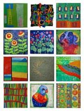
Updated Lorikeet Mosaic
It's been another busy and exciting day at the Craft & Quilt Fair in Hamilton. Thank you to everyone who stopped by the Twelve by Twelve exhibition for your thoughtful and enthusiastic comments. I'm now warmly esconced in Kirsty's childhood home with access to the internet and have had an opportunity to update the Lorikeet mosaic. Kirsty's Bleep Bloop looks right at home too:
I've also updated Kirsty's Colourplay gallery page.
Friday, September 10, 2010
Some thoughts on the nature of an art challenge
Something interesting happened with the latest reveal of our "lorikeet colours" challenge. There was an anonymous comment left on my post of my two responses to the challenge. It said:
So now that I have gotten that off my chest I thought it might be useful to talk a little about the nature of an art challenge. These are my thoughts and I invite the other Twelves to comment and disagree if they feel differently.
First, this project was started for the purpose of having fun. We never envisioned a book, or exhibits. Personally, I didn't even think about other people looking at what we posted. The twelve of us were here to experiment together. The other stuff, and especially other people's interest in our project, has been the frosting on an already quite tasty cake.
The only "rule" we have imposed upon ourselves was the 12" x 12" size. Art is not about rules. The point was to take the idea presented in the challenge and let our imaginations run with it. The theme is a starting point and the fun is seeing how differently, or sometimes amazingly similarly, each of us responds. I like working from a challenge theme because it gives me a starting point, but where I end up is my determination, not dictated by rules.
It is not a competition. In my opinion if the art is made for the purpose of determining who best followed the rules and solved the problem it ceases being art and becomes a game. This isn't a game.
We love your comments. And I will say that criticism is welcome—tell us what you like and what you don't like, and why, but keep it about the art. I don't think we need challenge rules imposed on us from outside. And really, folks, anonymous comments, especially rude ones, are not nice.
"Your colours are all wrong - they are not lorikeet colours."I admit I was a little taken aback. I think we have all gotten quite used to getting really supportive and lovely comments. We are spoiled, I know. Not every piece is wonderful, but then that isn't really the point, and among ourselves I know we always are looking more for imagination, creativity, discovery, growth, than perfection, and hope that is what our challenges bring out. So, that comment—I laughed it off and made my own comments about "artistic license" and choosing the less "wrong" piece for the final choice. Then I got a second anonymous comment.
Well, to address the comment—yes, a black and white piece would be "accepted." Anything we do in response to a challenge is accepted, because there is no concept of acceptable and unacceptable in our group. I can readily envision a very humorous explanation of why a black and white piece was inspired by the lorikeets! And just to clarify, I referred to my piece being "wrong" with my tongue firmly planted in my cheek, because the corollary to the "acceptable/unacceptable" understanding is that nothing we make is right or wrong. It just is what it is."I agree with Anonymous actually and to use artistic license I'm going to do a black and white piece - do you think it would be accepted?
"But Anonymous you did actually prove a point as the artist has agreed that one piece was 'more wrong' than the other!"
So now that I have gotten that off my chest I thought it might be useful to talk a little about the nature of an art challenge. These are my thoughts and I invite the other Twelves to comment and disagree if they feel differently.
First, this project was started for the purpose of having fun. We never envisioned a book, or exhibits. Personally, I didn't even think about other people looking at what we posted. The twelve of us were here to experiment together. The other stuff, and especially other people's interest in our project, has been the frosting on an already quite tasty cake.
The only "rule" we have imposed upon ourselves was the 12" x 12" size. Art is not about rules. The point was to take the idea presented in the challenge and let our imaginations run with it. The theme is a starting point and the fun is seeing how differently, or sometimes amazingly similarly, each of us responds. I like working from a challenge theme because it gives me a starting point, but where I end up is my determination, not dictated by rules.
It is not a competition. In my opinion if the art is made for the purpose of determining who best followed the rules and solved the problem it ceases being art and becomes a game. This isn't a game.
We love your comments. And I will say that criticism is welcome—tell us what you like and what you don't like, and why, but keep it about the art. I don't think we need challenge rules imposed on us from outside. And really, folks, anonymous comments, especially rude ones, are not nice.
Thursday, September 9, 2010
Bleep Bloop
Am I ashamed or proud to be the first Twelve to be so colossally LATE? I'm not sure...But I do know that I have STEELED myself and not peeked (even once) at your quilts, so that I wasn't influenced. I'm sure you can imagine how difficult that has been!
Rainbow lorikeets are pretty spectacular and one would think it easy to make that colour combination work but, Brenda, oh my goodness, I struggled! Then, one day, a breakthrough - the answer was in my handbag the whole time! I was pulling papers out of my bag and there I found this sketch that I did when we were in Melbourne at AQC, the first time all of our quilts were exhibited.
At the time it was an idea for a range of shot cottons that had caught my eye, but I could easily see it working with our lorikeet colours, so, here it is...
The background is little nine pateches, cut wonky and the applique is all machine stitched - a combo of satin stitch, fly stitch, triple stitch and free-motion. I couldn't bear to not add something extra, so it is red, yellow, blue, green and metallic gold :) I resisted the almost overpowering urge to add black and white. And hot pink. And orange. And turquoise.
'Bleep Bloop' is frequently in the subject line of emails that my son sends to me; some nonsense for when you are too lazy to write a real subject title. It kind of fits with these flowers that could well be Martian and quite probably have little voices.
Now to catch up with the Wonders you have made...
Wednesday, September 8, 2010
Twelve by Twelve @ Hamilton
The Twelve by Twelve exhibition opened at the Craft & Quilt Fair in Hamilton yesterday and attracted a steady stream of admirers throughout the day. We have been allocated a large exhibition space which allows each theme to be presented in distinctive sets. There's also space to display my Colourplay quilts so far along with posters of the cover of our forthcoming book. The show continues until Sunday 12 September before travelling onto Christchurch. Stop by if you can!
Labels:
Brenda,
Exhibition
New Zealand Exhibitions: September 2010
The Twelve by Twelve exhibition of 144 works from the Theme Series opens today at the Craft & Quilt Fair, Claudelands, Hamilton, New Zealand and continues until Sunday 12 September. Brenda will be presenting floortalks at 11am and 2pm daily. Come along and say hello!
Also the Craft & Quilt Fair at Westpac Arena in Christchurch is proceeding as planned from 17-19 September. The Twelve by Twelve quilts will be on exhibition there too!
Labels:
Brenda,
Exhibition
Monday, September 6, 2010
Patina
I am loving this new color challenge. It is so right up my color alley! These really are favorite colors of mine. The blue-green patina on copper is something I really love. It has taken me several tries to figure out how to achieve it, but I finally have.
A number of years ago I built this bird feeder and covered the roof with copper sheeting in the hopes that it would develop a lovely green patina. It stands on a copper pipe, high enough that cats can't get to the birds. I was under the impression that if I put it out in the weather the patina would just happen over time. It didn't. The copper turned dark and just didn't look like much. When we moved it to our new house, I got interested once again in trying to develop the green patina and read that salt water would do the trick. I filled a spray bottle with salt water and doused it good. Nothing. Then someone told me to try a vinegar solution. I refilled my spray bottle with vinegar and water and sprayed it. It began to patinate (did you know that was a word? It is.) almost immediately. Unfortunately the little birds like to sit on the finial and poop onto the copper roof, which has an effect on the patina, but actually I am quite happy with its aged appearance at this point.
I then turned my spray bottle onto this copper salmon. I love how he patinated.
The salmon, by the way, is my design and my brother cut him from copper using a water knife that he used in his business. Unfortunately for me (good for my brother) he sold his business along with the water knife. It was a pretty fun tool that cut metal, guided by computer. I could send him my Illustrator drawings and the machine would cut it perfectly, any size I wanted. We had a small garden art business for a couple of years, selling these.
I think I developed my taste for the patina many years ago when we purchased this bronze duck, which was already patinaed. The color is a little different, which makes me think bronze patinates a little differently than pure copper.
Doesn't he look great with the brick? Lots of inspiration for our new challenge around my house.
Saturday, September 4, 2010
Anniversary Present
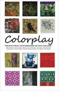
All twelve of us are delighted to celebrate the third anniversary of our challenge by showing you the very first look at the cover of our new book! It is being lovingly crafted by the talented folks at Lark Books and we all couldn't be happier. We're told that it'll be available in March, 2011. That's just six months away!
I was startled when Brenda pointed out that this is our third anniversary. We make a total of twelve quilts every other month, so it means that in the first round we made 144 quilts. Here we are, 5 challenges into our second round (Colorplay!) and we've made 60 more quilts.
I continue to be amazed and delighted by what we, as a group, have accomplished. I mean, just consider these facts: We've all remained committed to the project, and when we finished round 1 over two years, we all happily agreed to keep going. Everyone has met deadlines (barring the occasional emergency which couldn't be helped), and we all genuinely like each other more the more we work together. We've had exhibit opportunities and articles we'd never imagined to focus on our work. And a book! We all thank our lucky stars that when someone said "Wouldn't it be fun to have a book?" Brenda nodded and said "I'll explore it and get started on a proposal." We know that even more fun is ahead, as we hope to all meet at a big quilt show in the not-too-far-away-future.
We are a good example of how unexpectedly wonderful things can happen when you are motivated by passion and curiosity, and supported by good friends.
Thank you all for following our exploits, encouraging us with your comments, and playing along with our challenges. We can't wait to share our book with you and will be pinching ourselves when we finally get to hold it in our hands!
Labels:
Book,
Diane,
Lark Crafts
Friday, September 3, 2010
Thursday, September 2, 2010
Rusty
Wednesday, September 1, 2010
Decision made
Thanks for the input on my two Lorikeet color pieces. After seeing how each looks along with the others, it seemed quite clear to me that what was missing in my first piece, though I am quite fond of it, is the color that was the point of the challenge. I even had an anonymous commenter who said I had gotten it all wrong, and maybe she (he?) was referring to both of my pieces, but I think the first is the more wrong one. So "Night Garden" is my official work for this challenge.
But just for laughs I decided to have a little fun with the "Oh, those colors" piece. I hope Brenda doesn't mind that I used her lorikeet photo. I couldn't resist. It was perfect.
A Riot of Colour!
The Twelve by Twelve website has now been updated with the Lorikeet Colourplay quilts. What a riot of colour!
The Colorplay Gallery shows mosaics for all of the Colorplay challenges so far (hover the mouse over the thumbnails and see the display to the right). It's also interesting to see the individual artist Colorplay gallery pages: Deborah, Gerrie, Helen, Kirsten, Terry, Diane, Francoise, Kristin, Karen, Brenda, Terri and Nikki.
(Please e-mail me if you find any broken links or other glitches.)
Circle Symphony
Circles, Circles, Circles! I seem to be a bit obsessed with circles lately. They are just a fun way to play with color and texture. And what amazing colors to play with this round. They are so full of life and energy. Orange is even starting to grow on me.
To create this quilt I once again quilted a bunch of white fabric and then pulled out the paints. I spent an entire day making fabric paper in bright orange, yellow, green and blue. The house was filled with drying paint and the kids had to watch their step so we didn't have really big mess. Once dry, I cut out circles in all the different colors and sizes, layering them to explore the different color combinations. Finally, I added the copper washers and beads because I couldn't help myself.
Lorikeet in Flight
Wow, those lorikeet colors are intense. And while they look fantastic on the bird, they were way out of my comfort zone. That's good though. That's one of the things this challenge group is all about. So, I set out to wrap my head around bright green, orange and a purply blue. Although I knew I didn't have to stick with a bird theme, I did anyway. The only other thing the colors said to me was "tropical flowers," and that's been done to death.
"Lorikeet in Flight (detail)"
What did speak to me was the riot of color in motion when a flock of lorikeets take flight. Since I've been trying to keep my colorplay quilts simple and inspired by traditional quilts, I thought about feathers in quilting. I thought about big stitches in bright colors. I made a whole cloth quilt (not hard at 12" x 12") with machine stitched, rather traditional, feathers on a green and black cross woven silk. Ideally, the silk would have been brighter, but I couldn't find one with the right combination of greens. When Brenda posted her photo of a bird in flight and I saw that the underside of it's feathers were black, then I knew that a black and green fabric could be the perfect foil for the bright hand stitching to come.
"Little Bird Dreams of Flight (detail)"
I liked the feather quilting, but the piece just didn't feel like "me." It was too quilt show and not enough art. So, back to the drawing board I went. This time I focused on birds, not feathers. How could I have missed all that inspiration? Flying Geese! Turkey Tracks! Goose and Goslings! Crows Foot! Nest and Fledgeling! Dove in a Window! Circling Swallow! So what did all these bird blocks have in common? Triangles. A few sketches later I decided to make a simple pieced "bird" with lots of background on which to make big bright stitches conveying motion. That felt more graphic than my previous quilt which looked like a free motion quilting class exercise.
"Little Bird Dreams of Flight"
As long as I had all my fun threads out for my pieced bird, I finished up the traditional feathers too. Guess what?! The one that feels more me, and more like abstract art -- the one with the traditional quilted feathers!
"Lorikeet in Flight"
I stretched this one around a 12" x 12" canvas frame and I love the final product! I can totally see it with a Saarinen pedestal table and shag rug. ;-)
Moving
I am not a last minute person. Given a deadline I deduct a week, set that as the 'real deadline' and aim to finish early. And I always do.
Of course I am not a person who has ever moved house either. Whilst the move did go very smoothly, given that I had minimal time off work, the packing, the unpacking and the decisions about which of the many rennovations should begin first and how they would be done and where we would buy the necessary items crowded out all time for quilting. If you don't count the four days I absented myself to go to Festival of Quilts. Which was all about other people's quilts and not at all about actually making one.
So perhaps it is not suprising that my quilt turned out to be a last minute one about moving house.
We do not have any broadband in the house at presnet due to the spectactularly useless service from our phone provider. So the quilt was completed at lunch time and after work on the reveal day, photographed and cropped on my personal laptop and tranferred to the work internet system via memory stick to be uploaded with a few hours of Californian time to go. Thank God for time differences.
Of course I am not a person who has ever moved house either. Whilst the move did go very smoothly, given that I had minimal time off work, the packing, the unpacking and the decisions about which of the many rennovations should begin first and how they would be done and where we would buy the necessary items crowded out all time for quilting. If you don't count the four days I absented myself to go to Festival of Quilts. Which was all about other people's quilts and not at all about actually making one.
So perhaps it is not suprising that my quilt turned out to be a last minute one about moving house.
And with all quilting items in inaccessible boxes, apart from one carton of lorikeet themed cloth and thread separately packed, I had to be a little inventve with my embellishments.
The blue houses on this quilt represent both all the ones we saw, considered and rejected and all the houses which surround us in our new community. The yellow tags are made from greetings cards pushed through the door by our new neighbours, some of whom welcomed us without even knowing our names. The orange band represents the warmth of the home we will create once I get rid of the ubiqitous white anaglypta wall paper and faded brown carpets. But that home will carry memories of the only other home my husband and I ever shared and so I have kept the key for that house together with some thread wraped nails. You may remember the unusual source of inspiration for this quilt. Well, one of the hardest things about leaving that house was leaving items my Dad had made for it - fitted furniture, patio and pergola - as he is not able to do so much phsycial work now. So, the screws from the desk which saw me through three stages in my career and was latterly used as my temporary studio have come with us and six now adorn this quilt. The green vine stitching and the orange petal stitching represent the wonderful garden which we acquired with the house, the upkeep of which represents a whole new challenge in my life.
Labikeet
I did not have an easy time getting started with these colors. While I work with bright colors often and have a lot of them in my stash, this assortment of colors had me stuck. I had lots of ideas and looked at a lot of lorikeet pictures, I just couldn't land on anything that struck me. Funny how naming a color palette by the "thing" with those colors parks my mind on that thing!
But at some point, while looking at the wonderful markings on lorikeets (I sure do love Google Images), I thought "I wonder what other animals would look like if they had these colors." That sparked my imagination, and it was an easy decision to turn our Lab/Weimaraner Gemma mix into a "Labikeet."
I took Gemma's picture (I was waving a treat just out of the frame, hence the intent gaze). I recently got Susan Carlson's "Serendipity Quilts," which details her loose "free cutting" version of fabric collage images, and inspired by that I set out to superimpose those lorikeet colors onto Gemma.
This was trickier than I thought it would be -- especially getting the eyes to look halfway decent -- but I had a lot of fun doing it. Carlson's process involves gluing (not fusing) bits of fabric down, and then trapping then all under tulle. I guess I'm not as liberal with the glue as this process requires, because I struggled with pieces moving around a bit under the tulle as I started to quilt. But I'm very happy with the result. Check over on my blog for more details about the process and in -progress photos.
Gemma was dozing at my feet during most of the construction process ... not terribly excited about being immortalized in fabric as a Labikeet, perhaps, or maybe just exhausted by the burden of being my model!
Summer in Japan
It was not an easy colour scheme for me. It's not that I don't like bright colours, but so many of them at the same time in such a small quilt... And I must admit that this lorikeet green didn't really excite me. But I was confident some ideas would emerge during my trip in Japan this summer.
Actually, I found out that Japan in August has many different shades of green. The one I liked the best was the bright green of the small rice fields. When I came back home, I decided my quilt would be a simple imaginary landscape based on the beautiful sceneries I had seen during my stay.
I also wanted my quilt to make reference to my mother as her weak health was a constant worry for me while I was away. I printed her silhouette several times on a piece of red fabric and placed it at the left of my landscape.
I liked that quilt a lot but, in the end, I just didn't feel like showing it. So I replaced my mom's silhouette by a single leaf shape, a ginkgo leaf, as there are so many ginkgo trees in Japan and they are seen as a symbol of resilience.
I'll post more photos on my blog later today.
Deconstructed Lorikeet
I had very few of these colors in my stash of fabric. I was about to paint some fabric when I noticed that I had all of the colors in my wool roving stash. I decided to felt the piece. I wanted to machine felt it, but I broke an attachment so I thought I would try my hand at nuno (wet)felting.
The felted piece was attached to a 12 by 12 inch square of felt. I then beaded and stitched with perle cotton. This is probably the most embellished piece I have ever constructed!!
You can see how I did the nuno felting on my blog, Crazy for Fiber. Here is a detail shot.
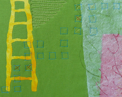
Yellow Ladder
In the two months since our last reveal, I didn't spend much time thinking about the upcoming theme. I was busy with the excitement and stress of moving from Texas to Maryland. I knew I would have time to focus on my lorikeet quilt after the kids went back to school on August 24.
It felt refreshing to set aside creative commitments and wait for the looming deadline. When I began to generate ideas for this round, several thoughts ran through my head. Inexplicably, I thought of the ladder sculpture at the Modern Art Museum of Fort Worth. It just popped into my head and said "use me."
Funny. I've only been to the Modern once. The ladder wasn't even my favorite piece. I didn't know the artist or the title. But the image was so strong. Why? I'm still wondering. But, I embraced it and cut out a yellow ladder.
I debated keeping the composition very spare versus adding mixed media elements that I love: hand stitching, sheer layers, hand writing, etc. I decided in order to incorporate the full collection of colors from the lorikeet theme, I would need to add more elements. Plus, that's the kind of fiber art I like to create... layers and variety and dissimilar elements that complement each other. The ladder was just the kernel of inspiration.
The sheer section is some kind of non-woven polyester fiber. (Similar to what you'd find covering the base of your mattress box springs.) I wanted to explore using a heating tool to burn through the fiber to reveal the fabric underneath. I really like the effect. I'll explore this in the future with other fibers.
In the inspirational sculpture, the ladder is floating off the ground. In my piece I wanted to refer to the feeling of floating with the gap between the bottom of the ladder and the blue felt piece at the base of the composition. Sometimes you have to take a big leap before beginning an assent. Or get someone to help you up.
(I did learn more about the ladder piece in Fort Worth. You can read about it here.)
Oh, those colors
Beautiful, those lorikeet colors! When Brenda announced the theme I commented, "this makes me happy." But when I actually started to plan my piece I found it so much more difficult than I expected. While the colors are beautiful, they are STRONG. They are intense. They are starkly contrasting. None of these attributes are ones that I generally work with.
I thought about the lorikeets and how beautiful and vivid they are as they flash about and it occurred to me that perhaps my approach to the colors should be as "flashes" and bits of frolicking color, rather than a full-on onslaught of intense color. So I went for a field of neutral color with a horizon dancing with tiny blocks of the lorikeet colors.
I really enjoyed making this piece and I find it wonderfully clean and cheerful and a bit of a change from my usual work, but it nagged at me that perhaps I was not really doing justice to the theme colors, so I made another piece.
I thought about the lorikeets and how beautiful and vivid they are as they flash about and it occurred to me that perhaps my approach to the colors should be as "flashes" and bits of frolicking color, rather than a full-on onslaught of intense color. So I went for a field of neutral color with a horizon dancing with tiny blocks of the lorikeet colors.
"Oh, those Colors"
I really enjoyed making this piece and I find it wonderfully clean and cheerful and a bit of a change from my usual work, but it nagged at me that perhaps I was not really doing justice to the theme colors, so I made another piece.
"Night Garden"
Could this be any different from the first one? Another out-of-character piece for me, but with more familiar elements. I like it too. Which one do I like the best? I am still undecided today as I reveal them. I think I am still leaning toward the first one, but, hmmmm, I just don't know. Help me decide!
What I really love about both of these pieces is that they were a chance to experiment—perhaps a little more than I usually do.
Lorikeet Circus
After weeks of observing lorikeets and trying to capture them on the camera, I've come to the conclusion that they form the circus of the bird world. They are cheeky clowns; they are acrobats; they are trapeze artists; and they are tightrope walkers. Above all, they are bright and cheerful and I smile as I watch their antics:
I was very happy with my other lorikeet-inspired piece Dreamlines #4 but I selected Lorikeet Circus as my official contribution because of its colour and movement. What do you think?
Lorikeet Circus © 2010 Brenda Gael Smith
I was very happy with my other lorikeet-inspired piece Dreamlines #4 but I selected Lorikeet Circus as my official contribution because of its colour and movement. What do you think?
A Lorikeet in North Dakota
When Brenda announced the lorikeet theme, I was so drawn to the photograph of the lorikeet bird. I love birds and enjoy attracting them to my yard and spotting new varieties. Of course, I don’t think I’ll ever spot a lorikeet in my yard, so I have to enjoy them only in the photos I see.
I tried to come up with some ideas on this color theme, but my mind kept drifting back to the bird. I decided I just had to create that bird and sought permission from Brenda to use her photo as my starting point. This will probably be the only lorikeet in North Dakota. I guess I could take the quilt outside and declare I’ve seen a lorikeet in my yard.
My quilt is created with many fabrics that I prepared with Mistyfuse. I then cut the shapes and fused them to the batting. It is free-motion quilted and I played with using two fabrics to create the binding. It’s sort of like piping, but without the piping…just folded fabric.
Subscribe to:
Posts (Atom)