Wednesday, July 28, 2010

Is it a sign?

I found this on sale yesterday. Is it a sign?

Wednesday, July 21, 2010

It's not easy being green

As Françoise has remarked, lorikeet green is "very very... green..."  I've found some greens in my stash but I feel an urge to dye coming over me...

Monday, July 19, 2010

Spotted in New Zealand Quilter Magazine...

Come and see the Twelve by Twelve exhibition in New Zealand:

Tuesday, July 13, 2010

Lorikeets at Quilt Encounter

I'm currently teaching at Quilt Encounter, a fabulous 1-6 day retreat organised by the South Australian Quilters Guild. My slideshow presentation about the Twelve by Twelve project was well-received on Monday evening and the twelve art quilts from the Chocolate theme attracted many admiring comments.

Now there's a whole new group of people who will be the following our Colorplay challenge. I wonder if they will share their freshly dyed fabrics...

Am I done yet?


Found this in my stash of commercial fabrics today. What do you think?

Wednesday, July 7, 2010

Purple Yellow Website Update

The website has now been updated to display our latest complementary colorplay challenge - Purple Yellow. The individual artist galleries have also been updated. For example, here is Terri's Colorplay gallery so far. Due to limited internet access while I am travelling, I have not been able to update and check all of the navigation.  Undoubtedly there will be some glitches here and there. Please e-mail me and I will fix them when I have better internet access again.

You never know..

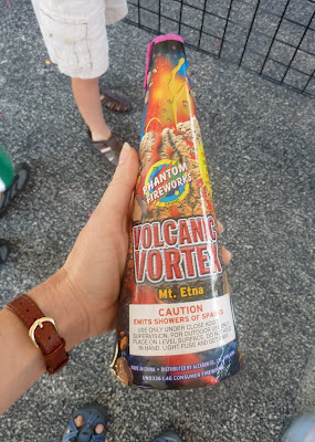
where you might find a 12x12 reference! I found this at the roadside fireworks stand while we were visiting Illinois.
I think it's so funny that the packaging really does include Kristin's color palette from our Kilauea challenge: red, orange, chartreuse, black and grays.

In fact, there was a whole box of "volcanic vortex" fireworks, each named for a different volcano. Ultimately, we chose Mt Etna.
When Claire was about three months old, Jeff was on a six-month deployment with the US Navy in Sicily. Baby Claire and I went to visit him and we enjoyed many wonderful Italian adventures including hiking up Mt Etna. (That was before digital cameras, otherwise, I'd include a photo.)

Friday, July 2, 2010

The Rainbow Connection

If I have to choose a single hue, like many redheads, I would say that my favourite colour is green.  However, I am drawn to many other colours in the spectrum and, as my logo for Serendipity Patchwork & Quilting indicates, am quite partial to rainbows.  I've been collecting rainbow images for a while but rainbows are strangely elusive (I don't live in Portland!). This rainbow photo was taken a couple of years ago from my studio:
I often look out my window for inspiration and choosing the next colourplay challenge was no exception. There is abundant bird life at Copacabana - kookaburras, galahs, herons, rosellas, corellas, wattle birds, fairy wrens, sea eagles, pelicans, black swans and more. One of the most common bird species in my neighbourhood is rainbow lorikeets - they squawk, swoop and soar across the valley and feed on the banksia flowers around the house. Like rainbows, they can be difficult to catch on the camera - they are constanly moving and hide in the foilage.  Glynis kindly made these feeding images available for me:

 
And I snapped this lorikeet with my new camera and prepared this palette for our next challenge - predominantly green with generous highlights of blue; orange-red and orange-yellow. Please don't feel limited to bird imagery - just enjoy those wonderful pure saturated colours.

Coincidentally, Kermit shares some of this palette (and Blondie doesn't seem to mind). Let the swooping and soaring begin!

Thursday, July 1, 2010

Our Purple Patch

Pending the updating of the Twelve by Twelve website, and Helen's nomination of her "official" work for this challenge, here is an interim mosaic of the purple and yellow pieces. I am intrigued to see that so many of us incorporated linear elements in our compositions:
I have the next challenge all lined up and will announce it later today.

It's Complementary

Just as Karen announced our new theme, I looked at my first three Colorplay quilts and saw that I might have the beginnings of a simple/traditional block theme starting. The idea of opposites attracting immediately made me think of the "Robbing Peter to Pay Paul" block. In the traditional block, the two fabrics used for one block swap places for teh next block. Usually the block is a simple Drunkard's Path quarter circle in a square, or it's a square with a curved section cut out of each side.


I didn't want to just make a block, but I did want to reference the concept. After a false start, I realized that a simple rectangle in a rectangle could do the trick. It looks abstract and not immediately like a quilt block, and still each side is the opposite of the other.


One side is yellow, the other purple. One side is near solid, the other is highly patched. One side is matte cotton, the other is shiny, soft, rich, pattered silk. One side is machine quilted, the other is hand quilted. One side is stitched vertically, the other horizontally. I might even add beading to the edge of the purple side, but I've been traveling and haven't had a chance to find and add the right ones.

All the fabrics came from my stash (who knew I had so many purple silks?) and the perfect buttery yellow foil to the purples was a napkin of all things! As I cut and arranged my pieces, I missed the drawn thread edge of the original napkin. So, I added it back in with a little purple silk peeking through. Sure, it means that the sides aren't strictly opposite, but it complements the couched gold cord on the opposite side nicely.

Lollipop Forest


Thankfully, this challenge came together like a dream, because my family has definetly been plotting against me getting anything accomplished over the last two months. This was our first year in public school, so I had no idea how crazy the end of the year activities can be. Then throw in birthdays, vacation bible school, two camping trips and a spur of the momment trip to Portland to buy an Airstream trailer (I wish there had been time to see you Gerrie and Terry), and I feel like I'm at a carnival desperately keeping all the rides going. I never realized how easy it was when they were little. Now, all I want is a little time alone to create. Luckily, I was able to find it a few minutes at a time.

I've had the idea for these quilts in my mind for months, based on some mini quilts I created for Art-O-Mat. I wanted to put them together to create something larger than 2"x3". I started with a plain white piece of fabric and quilted it like crazy with circles and spirals. I would get lost in the process and the whirl of the machine would block out the chaos of the family. Next I brought out the paints and painted the circles purple and the spirals yellow. The paint was very watery so the colors blended wonderfully. I then added fabric paper circles and free motions stitching. The edges are finished with deep purple yarn, couched with gold thread. I just love the energy of the contrasting colors and rich texture, and the swirling circles are very much my life right now.

I had lots of quilted and painted fabric created for this project just waiting to be played with, so I quickly threw together this flower quilt. Our summer has been slow coming in the Pacific Northwest, so it is a reminder that summer blooms are on the way!

Sunset


Last January, the Portland Art Museum had a show titled China Design Now, an exhibit of the varied design and architecture of modern China. In the show were some objects that were covered in organza pojagi pockets which overlapped. I was so taken by the whimsical nature of these objects. I filed it away as a future project.

For this piece, I painted silk organza with yellow and purple paint — the piece that I posted earlier. I cut 2 and half inch strips which I sewed together and then cut again into squares which I turned into the pockets. Each side of these pockets is different. Each one is like a beautiful miniature composition. I arranged them in an overlapping composition and stitched them to the background which had been previously finished with a pillowcase backing. This will all be explained on my personal blog later today.

My only nagging feeling about this is finishing the top. I felt I needed to do something. I ended up sewing a line of purple and gold beads as a finish. I would like to have come up with something more elegant.

Here is a detail:

The Pointy End

The challenge for me this time was very much around finding some free time to make a quilt! My first thought was heartsease. My second thought was Johnny-jump-ups (same thing). Then, pansies. Eventually I moved on to irises. Finally I decided there would be no flowers in my quilt.
I sat.Stared around the room. Nothing. The problem, I thought, is that I really DON'T like violet and yellow together. Time to think more broadly about that purple...maybe lavender, maybe amethyst...
Wait! Up on the top shelf of the dresser! There are two little cups that I bought in a thrift shop a few weeks ago.I bought them because I love the colours together.
Here they are...


A whole heap of photos later, I had a tightly cropped image that I liked and some printed copies for a pattern.


And then, the quilt. Abstracted almost to obscurity :D and not as successful as I had hoped. Maybe next time.

#2


Those of us here in the United States have probably used the #2 pencil for most of our lives.  It's the ubiquitous yellow wooden pencil with soft dark lead that we were given in school.  Most of us carried them in our backpacks and pencil boxes, and we bought a new supply every September.  It's the pencil we were required to use for standardized "fill in the box" test forms, and they were required when I took the bar exam.  I have such strong associations triggered by this simple object -- most of them good -- so this piece celebrates the #2 pencil.

(By the way, is it the same in other countries?  Is the yellow pencil the same, called by another name?  Do you have an equivalent writing instrument that you associate with school?)

The background piece is hand-dyed fabric -- the first of the summer season!  The scribbled squares were "art parts" I had from an old project, drawn with acrylic paint and a tjanting tool and then washed with acrylic paint.  The purple just happened to match the background fabric rather perfectly, and they are fused onto the background.  I had fun drawing and painting the pencil shapes on white fabric -- they are fused as well.  I quilted it and faced it with a simple facing.

I didn't have an immediate purple/yellow idea, I must confess, and a lot of time passed while I contemplated the possibilities for this challenge.  Finally, I started thinking about yellow things, and purple things, without dwelling on purple and yellow together.  Once I thought about the #2 pencil, I knew I had my concept.  Re-discovering those scribbled squares in a basket made me very happy!

My grandmother's garden

I used two pictures taken in my garden as the inspiration for this piece, a picture of a lilac tree and one of simple little daisies growing in the grass. The fabrics are hand dyed and screen printed.
I especially like this lilac tree because it's a grandbaby of a tree which stood in my grandmother's garden when I was a little girl. I remember that this beautiful garden was full of vegetables, fruits, simple flowers and unpretentious shrubs and trees.After quilting, I started embroidering flowers by hand here and there in the quilt, but I finally unpicked them because they just didn't really add anything. After all, I prefer to keep it simple, as it is now.I've posted more detail pictures on my blog...

Aspens - yellow and purple

I love Aspen trees and have long thought about making an aspen quilt, but it has been done—a lot. Our Gerrie has made a whole series of aspen pieces. Most artists focus on the graphic qualities of the unusual bark, with its  black markings on pure white bark. But I chose to focus on the way the leaves turn gloriously yellow in the fall.

I grew up in southern Idaho among groves of aspen. I remember a place at the camp where I started going as a camper at age 8 and went every year until I was in college, first as a camper, later as a counselor. Just across the creek and a bit away from the main camp there was a thick aspen grove with a clearing in the center of it with logs for sitting. It was designated as a "quiet place" where campers could sit quietly and escape or unwind from the frantic camp activity. It was a place I liked to go to write my letters to my family and nurse my homesickness. The only sound was the slight rustle of the leaves, which spun in the slightest breeze, giving the impression of them shimmering.

Our family had a cabin on a lake that spanned the Idaho-Wyoming border. In the fall the aspens turned the most brilliant yellow, while the mountain maple were an equally brilliant red. The patches of each on the hillsides were breathtaking. Walking through one of the aspen groves was like walking under a solid canopy of glittering yellow.

So it was this feeling I was working toward.

I started with this sketch.


The yellow was a given. The purple seemed natural enough, since the shadows and shade of that solid canopy could certainly be shades of purples. I considered adding some black detail to the tree trunks, but they worked better for me without it, and lent more attention to the leafy canopy. I always find complementary color schemes difficult to work with. With the colors being opposite one another on the color wheel, it means they contain no color elements in common. To me this makes it harder to make those colors "speak" to one another. By adding some warm red to each of the complements, I felt they began to reach out to each other. My plan had been to print the dots on the yellow leafy areas, then quilt around the dots, as I did in the background, but once it was all together more quilting didn't seem necessary. In fact it felt like it would make it all too fussy and precise and the printed dots really reminded me of that shimmering leaf quality I remember so well.

So this is my contribution to the vast body of aspen-themed artworks! I hope I brought some of my own experience and point of view to a well-loved subject.

Completely carried away....

You know how I hate yellow? And purple is not all that fabulous? Well, it turns out, together they are kind of inspiring. So  I have four quilts to show off.
Two are, in my mind, top contenders to be picked as my official one but I would like your comments on that before I decide. In order of construction then...

Purple Rain protest


I am sure that many people were humming Prince's Purple Rain as they considered this challenge but did you know there was a Purple Rain Protest in the apartheid years in South Africa?  During the Cape Town protest the Police turned a water cannon filled with purple dye on the protesters to mark them out for easy arrest later. One of the protestors climbed on the canon and turned it away from the people and sprayed the dye all over the city centre buildings turning them purple.

I had been pondering with previous quilts of mine whether they only made any sense if there was a way for the viewer to also be the reader of the story behind them, whether by way of blog or a wall notice if the quilts were displayed. Well this time I thought I would go for the blatant route and just wrote on the quilt what it was about using a gel pen. Purple ink of course. I am delighted with the way, unless you are up close, the writing just adds pattern. I forgot to take photos when the strips were plain yellow ( I added the writing as the final touch after quilting) but believe me, visually, even without interpreting the meaning the words add so much.
IMHO - ahem!
I am less sure about durabilty and am now contemplating the airbrush route a la Susan Shie.

I promised a happy theme this time and of course the happy story is that the protests did lead to free elections as represented by the yellow cross.

The Purple Shall Rule.


During the protest the demonstrators carried banners and placards reading 'The People shall Govern'. When the day was over, and many present had been drenched in the dye,  it was found that a pice of graffitti had been written on the side of the Old City Hall reading, 'The Purple Shall Govern'. I immediately envisaged the yellow crosses as earings worm by an African woman.

The good thing about this quilt is that by entire accident I found that hemp string is stiff and makes the earrings ( and I am sure in the future other embellishments!) hang in a kind of 3D way. The bad thing about this quilt is that when I was writing I got the quote wrong and refered to 'The Purple shall Rule'  rather than govern. Ah well. If I hadn't confessed you would never have known would you?!


It's in your hands now


This is a mini-version of a quilt Idea I have had buzzing round ny head since Nelson Mandela's  46664 birthday concert/party in Hyde Park. The key line in his speech was 'It's in your hands now' referring to his withdrawal from public life and the passing of the mantle to the next generation.


Township Jazz


Three quilts on my design board looked silly. Clearly a fourth was required. I already blogged about the purple saxophone...it kind of had to be done.  I like to listen to South African Township music. I just like the rythms and melodies. But during the apartheid years the township music was very much a part of the protests - I bet you all know exiled musician Hugh Masekla's 'Bring Him Back Home'.
Don't frown at me. You do. You just might not know you do:
Watch him perform it here

Well I went to the house Mr Mandela went home to in Soweto - I was there just after his release and it was a very happy time, as was the time I spent making these quilts. Yellow or no. I really enjoyed finding a way to use the same fabric/ beads and symbols in each quilt but in a different way.

Don't Step On The Cracks


A couple of months ago I ran across a blog called Art With a Needle by Kathleen Loomis. I have no memory of what the catalyst was that took me to this blog, but I’m glad I found my way there.

Kathleen generously shares some of her quilting techniques and her Quilt Date for April post was very intriguing. I knew at some point I wanted to give the technique a try. And at some point it dawned on me that I should try this technique on my purple-yellow quilt.

I started my experiment by piecing together several different yellow fabrics. The resulting yellow base was approximately 24 inches square. I started big because I knew it would shrink with each purple strip added. By the time I deemed there were enough thin purple strips criss-crossing over the piece, it was down to around 15 to 17 inches square.

I then took several purple fabrics and cut varying widths of strips and pieced them together. Next I placed the purple strip piece on top of the yellow piece and started slicing randomly through both with my rotary cutter.

I rearranged the slices, pieced them together and then quilted it. The edge is finished with couched eyelash yarns.

Culmination

Lots of thoughts were swirling about in my brain as I began working on this piece. I am feeling that my work is a bit predictable lately. I've been using my favorite techniques, motifs and colors as crutches. As I began to work on this piece, I tried to push myself outside of my comfort zone. It felt awful and the work was equally awful.

Since I'm in the midst of moving, house hunting, house selling and generally preparing for a major upheaval in my life, I finally gave myself permission to lean on the crutch of hand stitching and leaf shapes. Ah. What a relief. It was fun to make and I'm pleased with the results. A bumpy start, but a good result.

I hope our move goes as well. Bumps are to be expected, but I am hopeful for the end result. The culmination.

Culmination
There are tiny bits of freshness here. I think my hand embroidery is more energetic than some of my previous work. I like the interesting mix of elements --- fused, painted, stitched. I think I could have gone farther with that. Maybe next time.
Just three different fabrics in this piece. I pulled out lots of purple and yellow from my stash, but these were the only ones that really wanted to play together.

A Botanical Complement

It's remarkable how often the complementary colours of purple and yellow appear in flowers - pansies, iris, crocus and so on. There hasn't been much studio time this past couple of months but this didn't stop me from trying out a few different ideas. This was my design wall yesterday:
The quilt I really want to make is still in my head but I put the finishing touches on this lupin-inspired piece a couple of minutes before 1 July California time.

Kyoto Revisited

With my studio packed up, and being out of the country for two weeks, this piece was a challenge. I knew I need to get a good start on it before we left.  I had a piece of deconstructed screen print that I just loved in purple and yellow, so I used that as a starting point.  Often when you use complementary colors in dye, you end up with mud, but this piece didn't do that, so I lucked out.


I think I was channeling our trip, because I started laying this out and the temples we had seen in Japan on an earlier trip came to mind. Then when I was studying it, the Golden Pavilion in Kyoto popped into my head. So this is my abstracted memory of past travels.