Saturday, December 12, 2009

Pretty In Pink


When Diane first picked this color to play with, I groaned a little at the thought as I don't tend to use pink much in my work. I was, however, able to overcome my despair, and turn it into an opportunity to explore something I wouldn't ordinarily have done.  I rarely wear pink, I do however sometimes choose pink for my nail polish color.  Last time I had a pedicure I started looking at the bottles of polish and saw all the cute names they give these colors. I wanted to  use these names as a background to highlight some pink polishes, so I typed them up in the computer using different fonts, and printed it out on white background fabric on my husband's extra wide printer.  I had my background, and I knew I wanted to show polish dripping down, but wasn't sure how to go about this.  I ended up setting up a little stage with a white sheet background and taking several photos of spilling nail polish.


After deciding on the above photo, I took it to photoshop and made it black and white, and then printed it out on my thermofax.  After printing it with black paint on a sheer fabric, I just got out my water color pencils and colored it in, easy - peasy!  To finish it up, I machine stitched around some of the edges of the bottles and put a pillowcase backing on it.
I do think that using color as our "theme" is going to be interesting and I'm looking forward to the next challange

Pink Refractions


Pink Refractions, the quilt that wasn't sure it wanted to be made! I had the desire to explore pink using prequilted and painted fabrics from the beginning of the challenge. Somehow important to dos kept popping up and delaying me from starting. That's fine, we had an extra 12 days this challenge. Then I had several custom orders for cards, notebooks, a journal and a mini quilt at the beginning of December. Not to mention field trips, concerts and office parties. Finally, early this week, the time came to get work. And what happened next, the sewing machine started acting up while free motion quilting. The thread was shredding and it was making a clunking sound. Not good, but I did my best to keep my frustrations at bay and kept going. I didn't have time to take it in for service. I made it through the quilting, painted the fabric, cut the strips and went to sew them together. The feed dogs didn't advance the fabric. No forward motion. The machine was down. Thankfully, we gave my daughter a little Brother from Costco for her birthday last month. Annaliese gracefully let me borrow her machine, "as long as you don't break it Mom!" I was able to finish shortly after dinner last night. Next challenge, I'll start earlier -- I promise!?


Despite all the headaches and tears, I like how the quilt turned out. I'm one of the few Twelves that likes pink. I have pink clothes and touches of pink in my decorating. Plus, three young girls, although they are now starting to outgrow the intense pink desire. I'm even planning on decorating for Christmas with pink and green. I love how the quilt dances and glows with the different shades of pink. The texture of the quilting further splits the light and adds to the appeal. Now that I have a bunch of pink painted and quilted fabric, I plan on further exploring the theme. In all of my free time of course.

Big Pink


Big Pink is the nickname given to the second tallest building in downtown Portland seen in this photo. The US Bancorp Tower is the second tallest skyscraper in Portland, Oregon. The windows can absorb or reflect light depending upon how much light is upon them, while the surrounding granite may appear darker or lighter than the window pieces depending upon the time of day. The building can be described as being pink, orange, purple, or even gray all in the same day. Pietro Belushi was a consulting architect and chose the windows and granite surface for their reflective properties.


This was my second attempt at portraying this. My first attempt did not have enough detail of the interesting grid that you see from the eastern side of the building. Because Big Pink is the US Bancorp building, I decided to use the money/credit card business in the details of the building. I created a thermofax screen with dollar signs and a Bancorp stock graph which I screened onto pink fabric that I had painted with metallic paints.


For the windows, I found some free clip art of a fake credit card which I changed to hot pink. I printed different sizes of the card on Lutradur that was treated with Golden's digital ground. After the Lutradur dried, I painted the cards with Golden glossy gel medium, to give them a shine.


As you can see from the photo of Big Pink, it dominates the skyline and I wanted to show that in this piece so the other buildings are done very simply in neutral colors. I also decided to make Big Pink go off the edges of the 12 inch square.

I am not thrilled and ecstatic with this piece. It is somewhat of a departure for me. I must admit that when I hung it on the wall to photograph and stood back, I actually saw Big Pink so on some level, it is successful. Attaching all those credit cards was the most difficult task of this piece. I guess it bothers me that they are not perfectly gridded, but it is what it is. Right?

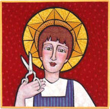
St. Rose and her Pinking Shears

OK, let me explain.

I was having a hard time with the pink theme. Don't like pink. I started working on a design for a little pink house, but I did not like the design. I went to bed one night feeling anxious about my pink quilt, feeling feverish and sniffly and I didn't sleep well, but when I did sleep I had some pretty strange dreams. In one of my more vivid dreams a face from a quilt I made several years ago appeared. It was a quilt called "Patron Saint" and it was a saintly figure holding a pair of scissors. Since I love scissors, collect old scissors and think they are the best tool ever invented, I have adopted my little saint and she hangs on the wall and watches over me as I sew.

In my dream the scissor saint had come to life. She held up her scissors and said, "you know, I have pinking shears too." And, indeed, the shears in her hand were not regular scissors but pinking shears. PINKing shears—get it?? Doesn't the brain go to interesting places when we are asleep? It was, of course, my devious subconscious attempting to skirt the actual color pink and come up with a tricky device. But, once awake, my rational brain said, "No. This is a color challenge, not a word challenge." Still, having gone to all the trouble of informing my dream, I decided St. Rose (as I was now calling her) and her pinking shears deserved a place on the final piece and she would just have to be dressed in pink to make it all work. So here she is. She does look a bit pained by her pink attire, don't you think?

And just to further explain—I am not Catholic, but I have a small fascination with saints. I think it may have started when I had my tonsils out in a Catholic hospital at age 5. The nun who took care of me told me that my name was the name of her favorite saint, St. Teresa of the Roses, and that was quite a special name to possess. As an avid childhood reader I went through of phase of reading biographies of saints and sobbing through The Song of Bernadette. I love the Byzantine icon images of saints and have emulated that stylized, flat style for a lot of my work. I started calling my piece St. Rose simply because of the pink color connection. Then I Googled to discover the real St. Rose of Lima, the first saint in the new world, and was quite surprised to find that she is a patroness of embroiderers and lacemakers and supported her family as a teenager with her exquisite needlework.

Do you see a similarity between my St. Rose and this one? I did not find this image until after my piece was finished.

Owning Pink

Oddly, I have embraced pink more as an adult than I did as a kid. Maybe it's more confidence in myself as a woman. Instead of feeling confined to the girliness it connotes, I can celebrate it. That's what my piece is about -- being strong in one's femininity.


I take a women's kickboxing class twice a week for the fantastic workout if provides. At least half the women in class have pink boxing gloves and wrist wraps. It's not unusual to see pink T-shirts either. These are not prissy woman-girls who glow rather than sweat. They are regular women with regular jobs and they (we) pack a mean punch (and sweat a lot).


So with this piece I celebrate both the inner and outer strength of women. It's made of (pink!) leather like my kickboxing gloves, and black velvet like that other symbol of classic femininity, the little black dress. For a little added oomph, it's embellished with crystal beads, sequins and french knots ('cause I think deep down we all like a little sparkle). Pow!

Dripping in Diamonds

The Argyle Diamond mine in the rugged and remote East Kimberley region of Western Australia is the world's primary source of rare pink diamonds which attract, on average, 20 times the price of an equivalent white diamond. Argyle pink diamonds come in a range of stunning hues and intensities, from a purplish pink to a blush pink champagne. I endeavoured to capture this range in my dyeing exercise. However, I found it challenging to incorporate many different values into a small work whilst still retaining the diamond shapes inspired by the Argyle pattern from Scotland which is derived from the tartan of clan Campbell.

This quilt wanted to be a diamond, not square, but eventually I coaxed it into shape.


Argyle Diamonds © 2009 Brenda Gael Smith

A rose in autumn

When we decided to work on a "Colorplay" series, I thought this was the perfect opportunity to just do that: play with colours, and experiment with different surface design processes, and not worry too much about the meaning of my quilts.
But almost as soon as Diane said "pink", I thought "rose", (pink in French). And an epicurean poem by Pierre de Ronsard kept coming to my mind... "Mignonne, allons voir si la rose...", where he compares the brevity of youth to the fragility of a rose.
In the meantime, I stuck to my idea of simply experimenting with colours and surface design, not willing to embark on philosophical and complicated thoughts about my age, my growing children, my wrinkles, my cute granddaughter, my emptying nest...
I held on and I started to screenprint fabric with pink and turquoise dyes. I experimented and played on the design wall with the resulting fabrics ... One of the pieces I got made me think of fading rose petals...
Then, one day I found a tiny pink rosebud in the garden. I took a few pictures, burned two screens, and decided to incorporate it into my quilt.
But you know, I just made a pink quilt. And I like it.
More detail pictures on my blog.

Pink Pencil Experiment

I had so much fun creating this quilt. I like pink more than I thought I did. What a surprise!I returned to my favorite general composition concept of a shrine/altar format. (It will play nicely with my Dandelion and Water quilts.) I also knew I wanted to incorporate sheer fabrics, surface design, handwriting, embroidery and some unusual embellishments. I went about gathering and auditioning materials.
I found a scrap of the exact same pink fabric to which I had added handwriting and used in my Chair quilt. I loved the sheer piece with the velvet floral motif. My friend Hannah let me glean from her stash on my trip to Maine, including the pink and white floral print I used on each side. The pink pencil seemed a fun embellishment. Plus, it's linear and conveys a message of creativity.Pink is very peppy and fun. Seeing that pile of fuchsia, magenta, blush and rose on the table in my studio, I just couldn't help but get a bright, enthusiastic feeling. Don't you think? I thought I didn't really like pink. Of course, I also thought I didn't like asparagus, until I had a few spears that were grilled to perfection at Jasper's.

It's good to experiment.

Thursday, December 10, 2009

Prediction

I'm finishing up my pink piece and I've been thinking about the reveal tomorrow. I think it's been more challenging than I anticipated to switch from the concept of a word for our theme to a color for the theme.

Since a lot of my work is abstract, it may have been easier for me to just yank out a bunch of my pink fabrics and put together a composition. (Ahem. That's exactly what I did.)But, I have a prediction...

I imagine that some of the other twelves will reveal quilts that are inspired by the meanings, implications and symbols associated with the color pink. I know Gerrie was working on a quilt inspired by a building known as "Big Pink." So, is that an embrace of the color or the meaning? Or both? It doesn't really matter since I think she's revised since then.

Will we see quilts about breasts or breast cancer? Will there be quilts commenting on femininity? Is someone getting a pink slip? (I hope not.) Are there some cute baby girl items being sewn on quilts? Does pink still make people ponder homosexuality?

Obviously, these ideas all run together. It's impossible to say exactly where inspiration comes from and what it means. Diane wrote a post asking about our aversions to pink and why it seems many of the Twelves grumbled a bit at the color (including me). After pondering a bit, I concluded that there are not too many colors that carry so much symbolism. (I think black is heavy also -- evil, darkness, grief, etc. And green certainly has gained a lot of symbolism lately.) Considering all the "baggage" that comes up with pink, I am so eager to see how it's represented -- or nor -- in our first reveal of the ColorPlay Series!

See you tomorrow! I'll be the one with the pink quilt.

**That picture above is my very small collection of pink fabrics. It's squeezed in with the oranges and the purples. Luckily it doesn't take much yardage to create a 12x12" art quilt.

Sunday, December 6, 2009

Sing Along with the Twelves

Just to get you in the Christmas spirit, I think I'd plant this little song for you to sing to yourself as you go about your holiday sewing chores:

On the 12th day of Christmas, my quilting friend gave to me:

Twelve yards of cotton...

Eleven bags of batting...

Ten Shiva paintstiks...

Nine tins of straight pins...

Eight balls of roving...

Seven pre-wound bobbins...

Six needle threaders...

Five Olfa blades!

Four spools of thread,

Three Ott lights,

Two teflon sheets,

And an idea for Twelve by Twelve!

Sing it loud and sing it proud, sisters!

The Value of Pink(s)

While it is not my favourite colour (that honour belongs to green), I have no grudge against pink and have made many quilts using pink. However, this is one of the few times that I have tried to make a quilt using ONLY pink. No dipping into complementary green hues; no sliding into analagous purples or oranges; just pink in all its glory. I dyed up a full gradation from soft blush to deep plum. However, when it came to putting my pink piece together, I found that I discarded many middle value fabrics. With only 12x12 inches of quilt estate, I needed the contrast of the dark and light values to give definition to my design. Bring on 12 December so that I can share it with you!

In the meantime, here are some photos taken in Golden Gate park before the fog rolled in.

Rose prints

This tiny rose was looking somewhat different a few days ago...
I made two screens from the picture, and used them to print some of my pink fabric...
Now, I'm almost finished wih my pink quilt.

Friday, December 4, 2009

Happy in Healdsburg

While in California visiting family, my husband and I took the opportunity to return to Healdsburg to spend a very pleasant evening with Diane and her husband. It's two years since our last visit and so much has happened in the meantime. Somewhere in the non-stop talking, we managed to snap this picture:

Tuesday, December 1, 2009

About this pink thing...


I've been working on my "Pink" challenge piece, and reading everyone's comments about how you've been working on yours... and I can't help but notice the strong sentiments this color seems to provoke.

I selected "pink" for a couple of reasons. For one thing, I notice that it's a color a lot of people avoid and I'm not sure why. As someone said early on, it's just "light red!" So it makes me wonder -- is it that it's a pastel color, and we're bold women who tend to use bold colors? Is it that it is the stereotypical color of girlie femininity and our feminist tendencies cause us to avoid that association? Maybe it's that "pink" can be associated with cutsie and sweet, and that's not an arena we want to find ourselves in? Maybe as girls (or "women formerly known as girls") we were so over-exposed to pink in our childhoods that we avoid it now? For those of you who dislike the color pink, do you have an understanding about why? I'd be interested to know if you can articulate the reasons for your reactions.

In any event, the main factor in my choosing this was that I knew it would push almost everyone out of their comfort zones. One of the aspects I've loved about our challenges is seeing the directions people choose, and especially being surprised by someone's piece just when I think I'll be able to predict something. So I'm sorry if this challenge topic has been stressful for some -- think of it as a little bit of a tug on your comfort zone boundaries. And I know that I will encounter the same feeling as we move forward!

Speaking of comfort zones, I've decide to try to push mine in this new Colorplay circuit. You've seen how I tend to go straight for a direct and literal interpretation. I've decided to push myself this time around to work more abstractly -- no representational images allowed. (Feel free to call me on that later when I forget my little self-imposed personal challenge!) So I'm headed in a very different direction and I know it will keep me especially challenged as we move forward.

I'm looking forward to December 12!