Thursday, July 28, 2011

Ready to get messy


Orange was never high on my favorite colors list. I don't know why. Orange is great! Nowadays I love orange, and I'm finding that it sneaks into more and more things in my life.

Although I've been challenging myself to incorporate something from traditional quilting into my Colorplay pieces, I'm giving myself permission not to have to do it this time. My grey piece didn't lend itself to my self imposed rules and the connection to a little known block didn't help. I'm still wishing I had done a mola a la Diane's inspiration -- I can see it in my head.

Anyway, orange is making me want to do a still life of some sort, and still life is making me think of all the painterly techniques I read about in Quilting Arts magazine and never do myself. So, I've done a little research, and am planning on a few days of trying techniques and layering and collaging and seeing what happens. I think this is going to be one of those times that I have to try a bunch of things and work on many parts simultaneously and just see what sticks.

Orange and blue

I have been buying fat quarters. Especially orange. But along with the orange I can't seem to resist these lovely deep blues. I know—complementary colors, though my feeling about complementary colors in general is that there is nothing really that special about those combinations. My orientation toward color theory has always been in knowing how to mix paint colors to get what you want and not so much a guide for combining colors, but I digress.

Interestingly, when I was contemplating what my color challenge to the group would be, my first idea was cobalt blue. Isn't cobalt blue a great color? It looks good with nearly every color and makes other colors look even better when paired with it. But then I decided we had covered blue in a general sense and so I chose orange instead. But I am sure wanting to combine my orange with cobalt blue. Don't be surprised if I do.

Off to the right side you can see a few green fabrics. I think they look pretty great with the blue and orange too. These brights are really working for me right now. I may be working myself into a whole new color palette.

Tuesday, July 26, 2011

Melbourne Book Signing: 1.30pm Thursday

If you are attending the Melbourne Craft & Quilt Fair on Thursday, 28 July (in Australia!), you are invited to join Brenda for a book signing at Can Do Books (Stand E01) at 1.30pm.  The book is for sale for a very reasonable A$22.95, I've packed my favourite autograph pen and smiles are free!

Sunday, July 24, 2011

A Touch of Orange

I had occasion to review some photos from my adventure in the French Pyrenees in 2006.  There are a couple with a touch of orange that have me thinking but who knows what will happen?!

Sunday, July 17, 2011

Thinking about orange


Turns out I take pictures of orange things more than I thought I did...   And now I'll be noticing it even more, I'm sure!

Friday, July 15, 2011

We're not going anywhere!


We have so appreciated the lovely comments we've gotten after our "gray" challenge, but one subject has been mentioned to us rather frequently:  the belief that we're folding up our tents and stealing away.

NOT SO!  Actually, Terry's announcement of orange as our last challenge referred to our last Colorplay challenge!  Trust me, discussions are going on behind the scenes as to what we'll do next.  We do not know what form our next challenge will take, or whether all twelve will continue -- but rest assured there will be something going on.  We've all loved our creative explorations together so much and want to figure out what excites us the most as we move forward.

Meanwhile, we're all working on (because thinking and mulling counts as part of the work, you know) our "orange" challenge.  Helen, Francoise and I will be at the Festival of Quilts in Birmingham in early August with the exhibit of all 144 quilts from the first challenge rounds.  And we're excitedly preparing for an exhibit of both challenge sets (yep, that's 288 quilts) in Houston in November, 2011.

So if we're a bit distracted, we hope you'll understand.  But we'll let you know when we know how we're going to challenge ourselves next! 

Diane

Pumpkin Lasagne

I use orange a fair amount in my work.  For example, here's my entry for the Canberra Quilters Recipe Book/Quilt Competition in 2009. An extra tall slice of Pumpkin Lasagne (click for recipe) - good enough to eat!


Thursday, July 14, 2011

This morning

I went to the market,
and I bought...

Wednesday, July 13, 2011

My Orange Inspiration


I am seeing orange every where today. I had to bring these home with me today.

Colorplay Website Update

Both the Colorplay gallery and the Artist Colorplay gallery pages of the website have been updated to display the latest Gray challenge works. Here's how the Colorplay mosaic (with the challenge setter's quilt shown) looks so far:
Twelve by Twelve Colorplay Series - 11 of 12

The LAST Color Play Challenge!

What a trip this has been! I am both happy and a little sad to be announcing our last official challenge (at least for now).

I think we should leave them smiling! That is why I have chosen one of my favorite and, in my opinion, happiest colors—ORANGE!

I know there are people who have a hard time with orange. I have never understood that. But if you are one of them, this is your opportunity to get to know it better.

I want to see a strong, saturated orange ranging anywhere from cheddar to flame, but pure and unadulterated.

 
Use any colors you like with it. And, just to be clear, the colors below are NOT what this orange challenge about. I don't want to see peach or terra cotta or rust or any of those dull and wimpy, or earthy oranges. This challenge is about pure, straight-up, ORANGE!


For inspiration, here's the Google Image search page for orange.

I can't wait to see what we do with orange!

Tuesday, July 12, 2011

Sound and Vision


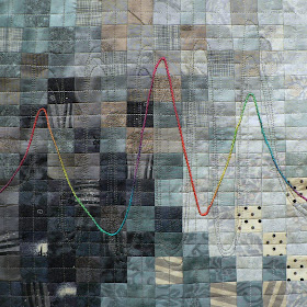
This quilt was exquisite in my head! It hasn't lived up to my expectations but I like it anyway. I wanted to make a gray background and quilt it with strong colours to show how wonderfully gray makes other colours zingy. Hmmm.
The background began life as a photo of my ear. Heavily pixellated it became...well...nothing really! The sound waves are quilting lines and it would be amazing to be able to say that they are actually my voice... but I can't ;)
The bright wave is a very beautiful hand-dyed silk floss.

Armorica

I started dyeing grey fabric before really knowing what I wanted to do for this challenge. I got a few nice fabric pieces, especially this one that I thought would be perfect, except that it was much larger than 12x12. I thus had to decide which part of the piece I wanted to select for my grey quilt. (It wasn't the easiest part of the process!)
Then I thought it needed a little more contrast and I added a 3 inch band of darker grey on one side.
I machine quilted the whole piece with straight lines, trying to emphasize the movement I could see in the fabric.
Next came embroidery time! I had picked yellow and green threads for this because I wanted to take inspiration from this picture. But after several attempts, I had to admit that I couldn't find a green that would show well on both fabrics. I turned to a variegated red-pink-orange thread that did work much better.
I'm rather pleased with the result. (It looks better and brighter in real life.)
Here's a detail shot of the quilt.
I'm ready for the next challenge! :-)

The Grey Parrot

My dad used to work in a design office in LA that was all black, white, and grey, with just a touch of red for accent. There was a lot of chrome too (this was in the 80s, of course). When I think grey, I always think of this office first.


They were so committed to this color scheme, that the principal bought an african grey parrot as a color coordinated office pet.


I did not think I would be able to find an appropriate quilt block when I read that Kirsty's palette was "Grey," but surprise, surprise, there's a block called "Gray Goose!" Grey parrot, grey goose, that's close enough. And, when abstracted a bit, it has a geometric 80s look that worked for me. I used a wool suiting fabric, not so much for the designers' suits, but for the low pile grey carpeting in the office. I had a hand dyed fabric with silver stripes that echoed the chrome I remember. There's some silver stitching as well. The parrot -- he's pretty obvious.


I was pretty happy with this outcome until two days ago when Diane showed her mola. I smacked my forehead and wished I had one more week. I would have made a mola version of the chrome and leather Wassily chairs in the office lobby!

Border Crossing 2

This quilt is about the expereince of immigration and inspired by kuba cloths. Kuba cloth ( Or Bakuba Cloth)  originates from the Democratic Republic of Congo (DRC) and  are of two general forms, those, like this one which are made from cut pile raffia and are based on geometric patterns which subtly 'morph' and 'warp' as the cloth progresses. Others like this one are based on appliqued shapes. 

One day last week I was reading a book about these cloths and  thinking about how, frequently, one society attempts to understand another one by reading the clues in their cultural artifacts. In my work I come accross immigrants frequently. At one time it was people fleeing political instablity - many in fact came from war torn DRC. Now it is the Asian community of East Lancashire whose immigrant roots started with the need for labour in the local cotton mills and continues with the culture of family arranged marriage from the 'home village'.


The left hand side of this quilt represents the familiar 'home state'. It is traditional and slow with hand stitching and an ordered pattern. But it is not as stable as it maybe looks on first glance. Under the familar, political or personal disharmony is beginning. The pieces of the pattern are changing and disintegrating, pushing the immigrant out and into the right hand side of the quilt.
Here, in the 'western world, the quilt is faster and more mechanised, with machine stitching. The shapes are not unrelated to the home state side becuase societies are basically concerned with the same things - family life, economic prosperity, law and order and so on. Individulas in both places simply want food, shelter, love, community.  But, in the new country these concerns are arranged in different ways. Systems of governance are organised differently. In both places there are courts for example, but the immigrant finds the new system confusing and scattered and hard to navigate. I remember in particular one asylum seeker from the DCR who was highly educated and spoke four languages fluently and whose extended family had been killed for poltical reasons. From a country where basic survival demands hard labour he was totally baffled as to why in the UK he was not allowed to have a work permit so he could be self supporting but at the same time was castigated in the press as a 'benefits scrounge'.

Even the means of communication are different. On the left the shapes are grey cloth to represent the kuba cloth. Some academics postulate that the patterns in the cloths may have had meanings to the makers and those who wore them. But here in the UK meaning is not woven into textiles, rather it is communicated in words. Not only are the words unafmilar but the way in which the words are presented is the exact opposite of the soft pilable cloth each caressed for months by the embroiderer and which have lasted for centuries. Rather, the grey shapes on the right are  more ephemeral paper, to be precise a newspaper picture of a Kindle with its hard case and remotely transmitted material.


If you were wondering about the title,  this quilt is part of a series I have commenced. The original  Border Crossing is my Saqa auction quilt for this year.  (see here for description)

On a lighter note: for those of you who read about my disappearing Elephant muse it turns out he did not run away at all but was just portrait shy. All Sunday while I made this, with the patio doors wide open to the sun, I was entertained by the trumpeting of the elephants who live across the fields behind us.

Immigrants themselves I guess.

City Garden


The name City Garden came to me when I was almost done with this quilt. As I looked at it, the gray colors reminded me of pavement, cement, and buildings and these colors/materials are very prominent in a city. The green rectangle seemed somewhat garden-like with its shape. While I've never lived in a large city, I have heard that there are coop or community gardens that people can take part in. It would seem to me to be a rather odd sight to see a patch of green plant-life in the midst of all the gray tones from the streets, sidewalks and buildings.


My quilt is made from both hand dyed and commercial fabrics. I have screen printed a fun, doodled square design onto the hand dyed fabrics. I bleached one of the hand dyed fabrics after it was screen printed and that resulted in the green fabric. It is free-motion machine quilted and hand stitched in the green rectangle area. The vertical hand stitching in the green fabric is meant to resemble rows of vegetables or flowers growing in the garden. White fabric applique shapes (that mimic the screened square design) are fused on the left side of the quilt and free-motion embroidered. I used a faced edge finish.

In Light Of

As I began working on this quilt, I had in mind Kirsty's suggestion to use "predominately gray."

I began -- as I always do -- by pulling out a stack of fabrics. I went all the way from black to white and anything in between. Ultimately I chose just six fabrics. The print on the left has a bit of blue and the print on the right has a bit of green, so I allowed myself threads and floss in those two colors.

I added the branch shape with paint and a freezer paper stencil. But I was still searching for a theme or motif that fit with the color palette. I settled upon the idea of words on a page, columns of text, or papers full of paragraphs. I decided to make tiny books as embellishments. Each tiny book is made from two rectangles stitched down the middle, essentially creating 8 pages. In my first attempt, I used fabric I had printed with text on only one side. That meant every other "page" was blank. No good. I was able to run a second piece of pre-treated fabric through my printer on both sides to create doubled sided pages.

Some of the pages are upside down suggesting that they are not meant to be read, but rather act as a symbol of study, or story or communication. I think my title suggests an open mind or a change of opinion or a bit of growth. Plus, the word "light" emphasizes the moon shape stitched at the top and the selection of light and dark fabrics. (Too contrived?)

I struggled with stitching both by hand and by machine. Everything ended up a bit indistinct because of my color choices. Maybe the branch and the books provide enough contrast. Sometimes gray gets muddy. I suppose I was right in the "gray area" between obvious and subtle.

June in the Northwest


June is suppose to be a time for playing outside and running in the sun.  That hasn't been the case this year.  Most mornings we wake to cold gray skies.  The temperatures top out in the sixties.  Everyone is wondering if we will ever see the sun again.  My kids have given up waiting for the heat and now play outside with the hose at the first sun break, never mind what the thermometer says.

Pinwheels always make me think of carefree summer days.  Gray pinwheels are the perfect portrait of spring and early summer this year.  I did add a touch of silver for those few time the sun has poked out and the silver lining of at least nobody is complaining about being hot this year.

Northwest Winter


For me the winter in the Northwest exemplifies gray. I had some photos of my son and his wife, Jayme, taken during the winter at the Oregon Garden.


I love the shape of the bare trees and the bleak landscape with the golden grass. I created sketches of these photos in Photoshop to use in this piece.

The solo tree on the bottom was used to make a thermofax screen and the trees were screened on to silk organza. I have some more photos on my blog. The top photo was first printed on Jacquard's Extravorganza, but the gray color I got was not working with my other elements.

I was using some gray silk organza shibori for the background. I took a piece of that and backed it with a full page self stick label and ran it through my Epson printer to print the photo and loved the result. I decided to add the smaller photo as another element. I like how you see a far away view and then a close up.

I decided to add a bit of color in the grasses as a nod to the grass in the original photos. Here is a detail shot.


One thing I learned after doing this challenge — there are many shades of gray!!

Fog Creeps In


I knew right away that I wanted to do a piece about fog when Kirsten announced that our newest challenge was going to be gray.  Growing up in the San Francisco bay area, I'm intimately acquainted with fog in all its forms -- from light and wispy to the solid wall of thick cottony fog I've encountered all my life driving into San Francisco on a summer day.

But how to illustrate fog?  I wanted to suggest that sense of seeing bits of color and form through dense fog ... the way fog moves and hints at something hidden in it.  I was considering different ways of going at that idea, when I decided to experiment and try the processes that led to this.  I'll detail the steps over on my blog, but suffice it to say this started with hand-dyed fabric, then was machine quilted, discharged, washed and dried (for more crinkles), then painted.

Thinking of fog brought to mind the Carl Sandburg poem we've always said to Caroline as we drove to San Francisco and encountered billows of fog blowing across the highway as we approached the Golden Gate Bridge:

The fog creeps in on little cat feet.
It sit on silent haunches,
Looking over harbor and city,
And then moves on.

Here's a detail of the creeping cat, which is overlaid with some tulle:

Study in Gray

 This quilt came about as a result of a class I took with Dorothy Caldwell earlier this year.  One of the exercises she had us do in class was to burn holes in organdy with an incense stick.  At the time I thought I would never use this technique, but when I was organizing the class notes recently, I thought let's give it a try.


I started with a piece of white organdy then painted it gray.  I used a piece of red/black fabric underneath and drew the lines I wanted with a fabric pencil. To get the holes, I lit some incense and held it up to the organdy.  It turns out this is quite time consuming as the end of the incense falls off repeatedly.  The piece didn't have enough contrast for me, so I added the yellow french knots.  I made a few marks I didn't intend to, and just decided, as I think Dorothy would do, to make little x's through them. The close up below shows one of the unintended areas.


I love working with gray, and I need to remember to use it more often.  Thanks for the great color choice Kirsten

Black + White = Gray

 My gray quilt doesn't actually have a bit of gray in it. As a graphic designer I often dealt with "grayscale" which is the effect, in printing, of shades of gray, achieved by printing black dots on white paper. The proportion of black to white, and the size of the black dots, determines the shade of gray you perceive. There is no gray ink in commercial printing. We also talk about text on pages as gray, with different typefaces and different spacing creating different shades of gray on the page. So I chose to create my "gray" piece by using black and white in different mixtures.


In this detail, you can see that the filigree-like figure is made up of printed text. This is actual print on paper (Time magazine as it happens) laminated to cotton fabric, making it sewable. The shadow behind the design was created by cutting the same design from tightly woven black cotton fabric, then placing a layer of loosely woven white cheesecloth over it to create a fine white grid pattern over the black.

This piece was my second "gray" piece. The first, below, was an interesting experiment, but less successful, in my opinion, as a finished piece. I went through my stash of solid colored fabrics one evening, in relatively low light, and pulled out four that looked gray. I stamped a repeating design on swatches of each of the "grays" and constructed my little piece. The next day I looked at the swatches in clear daylight and what had looked gray the night before was not necessarily neutral gray in the light of day! The purple was the biggest surprise. It had looked to be a very flat, colorless gray laying among all the stronger colors in my stash.

The name of this one is "Gray is relative" which is something I think we all discovered in the course of working with the color.

Suits & Mourning

For this challenge, I resolved to use only fabrics from my modest gray stashSuits is the result.

As a corporate and regulatory lawyer in the big smoke, I became accustomed to being surrounded by men in gray suits and women in little black dresses.  Now, when I return to the city, I am struck by the waves of pedestrians in subdued attire, a stark contrast to the more casual vibe where I live at Copacabana where even the pharmacist has been spotted in board shorts.
Suits by Brenda Gael Smith
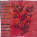
Up until yesterday, Suits was the only piece I made for this challenge.  However, I am convinced that gray works best with other hues as highlights.  Even before Diane shared her gray and red mola, I had prepared some red and gray pohutukawa flower monoprints to create Tangi, a companion piece to Kia Kaha which I have donated to the SAQA Benefit Auction.
Tangi by Brenda Gael Smith
By way of background, the pohutukawa tree is native to New Zealand and is reknown for its resilience in harsh coastal condition and its beauty.  In the summer, pohutukawas produce a mass of vibrant crimson flowers before the stamens fall off and moulder in the rockpools below. In Maori, the indigenous language of New Zealand, tangi is a verb (to cry, mourn, weep, weep over) and a noun ( sound, pitch, intonation, mourning, grief, sorrow, weeping, lament, salute, wave).  In 2010/2011, the pohutukawa season was bookended by two events causing national grief - the Pike River mine disaster in which 29 men lost their lives and the February earthquake in Christchurch which killed 181 people.

I'm inclined to nominate Suits as my official contribution but wanted to share both pieces with you all.  Here's how they each look with my Colourplay quilts so far.  I'm looking forward to seeing the other contributions to our gray colourplay collection.


Sunday, July 10, 2011

Gray Mola


Since we've had gray as our focus (stay tuned for tomorrow's reveal!!) I've been noticing a lot of gray -- especially how nice a background it can make.  And then today, while looking for something in the closet, I came across this mola from Mexico, I think, that my mother-in-law had in her things when she died.  As the only Textile Obsessed person in the family, it and others came to me. 

But isn't it striking?  Gray, red and white make a very strong combination.

Saturday, July 9, 2011

Gray sneak peek.


Wow, am I happy that I got this piece done early. Life at my house is a bit of madness as I have two of my grown children here plus a partner and an adorable chihuahua. My studio is a staging area for the work so I don't spend much time there right now. Can't wait for the reveal on Tuesday.

Thursday, July 7, 2011

Photo Transfers

THANK YOU to everyone who joined me for my presentation to Canberra Quilters last night. For those that were interested in the photo transfer technique used used on my two quilts  Harakeke#1 and Harakeke#2 made for the Kilauea challenge, here is my blog post all about Photo Transfers with Orange Power.
Harakeke #1  Harakeke #2 by Brenda Gael Smith